
UI Components
The 50 components you actually use, written for the decision rather than the API. Every page answers the same question first: is this the right component, or is the one next to it a better fit?
Built for designers who are mid-task with Figma open on the other screen. Every demo on these pages is a real, working component, not a screenshot.
50 of 50 written
Actions
Things a person clicks to make something happen.
Button
EasyA button performs an action and leaves you on the same page.
Link
EasyA link takes someone somewhere else: another page, another site, or another point on this one.
Menu
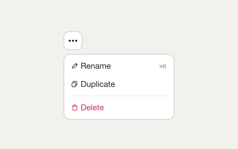
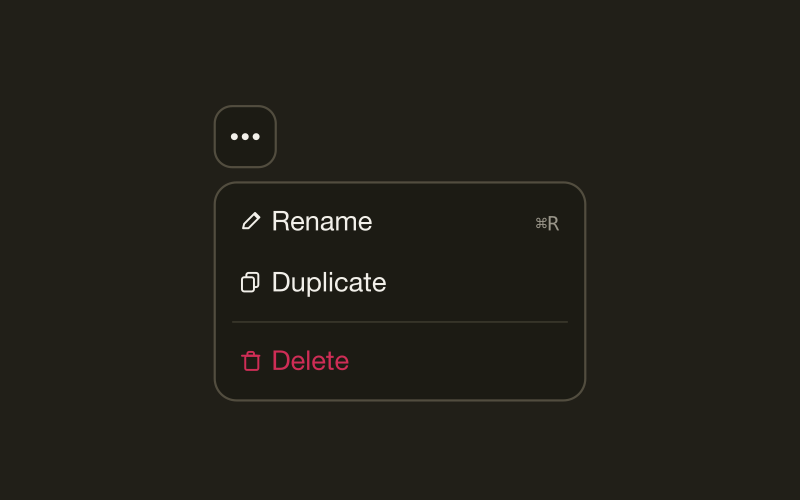
HardA menu is a list of actions revealed by a trigger, like the three dots on a file row.
Split button
MediumA split button pairs one default action with a menu of close alternatives.
Q3 report.pdf
2.4 MB
Creative brief.docx
840 KB
Logo pack.zip
12 MB
Context menu
HardA context menu is a list of actions opened from the object they affect, usually with a right click or a long press.
Toolbar
MediumA toolbar is a horizontal strip of controls that act on the content beside or below it.
Forms and input
Where people give you information. The densest, most-broken part of most products.
Text field
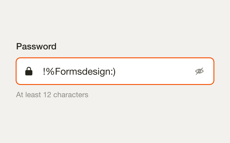
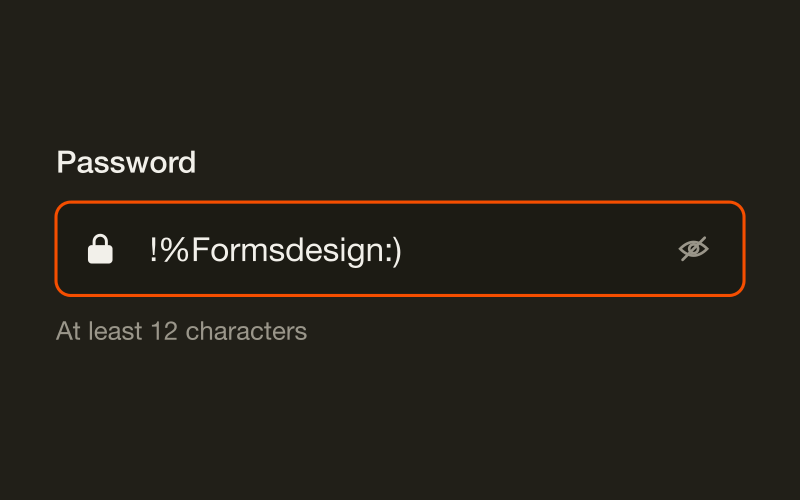
MediumA text field is a single-line input for short, free-form text.
Textarea
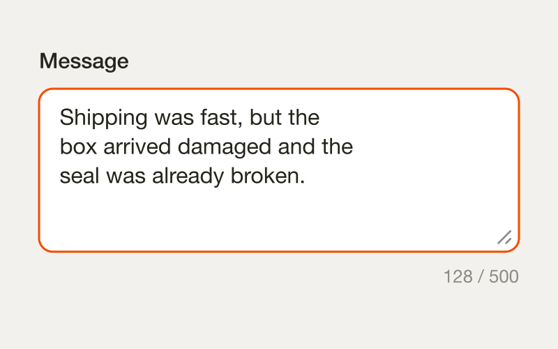
EasyA textarea is a multi-line input for text that runs longer than one line: a comment, an address, a bug report.
Select
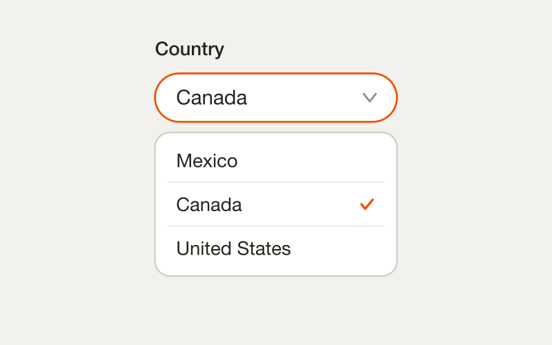
MediumA select lets someone choose one option from a list that stays hidden until they open it.
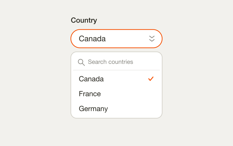
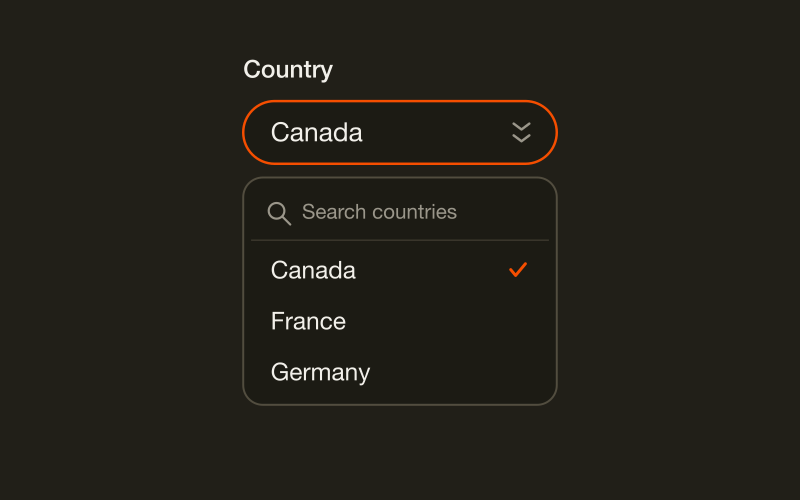
Combobox
HardA combobox is a text input that filters a list of options as you type, then lets you choose one.
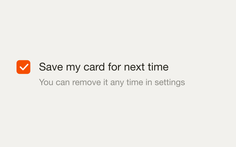
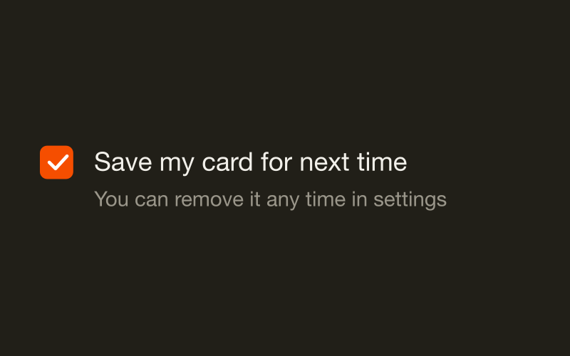
Checkbox
EasyA checkbox lets someone choose any number of options from a set, including none of them.
Radio group
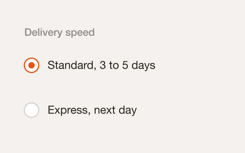
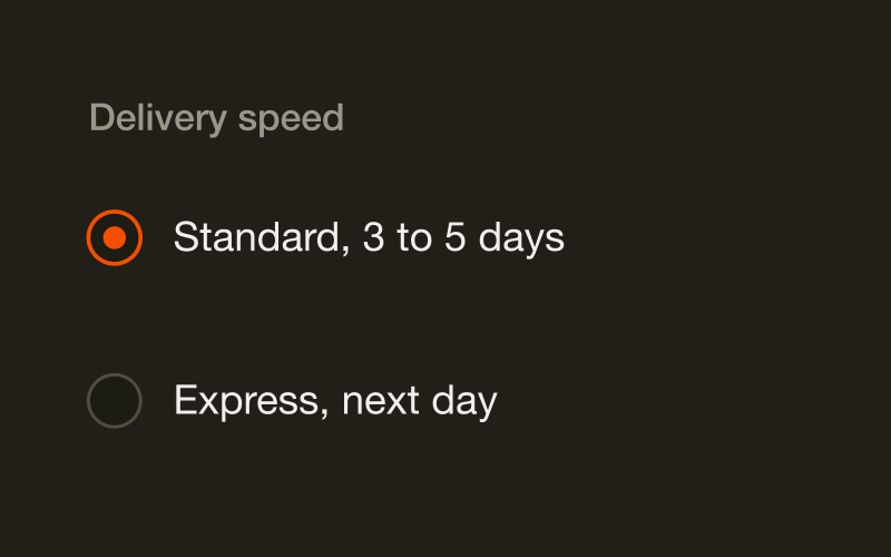
EasyA radio group shows every option at once and lets someone pick exactly one.
Switch
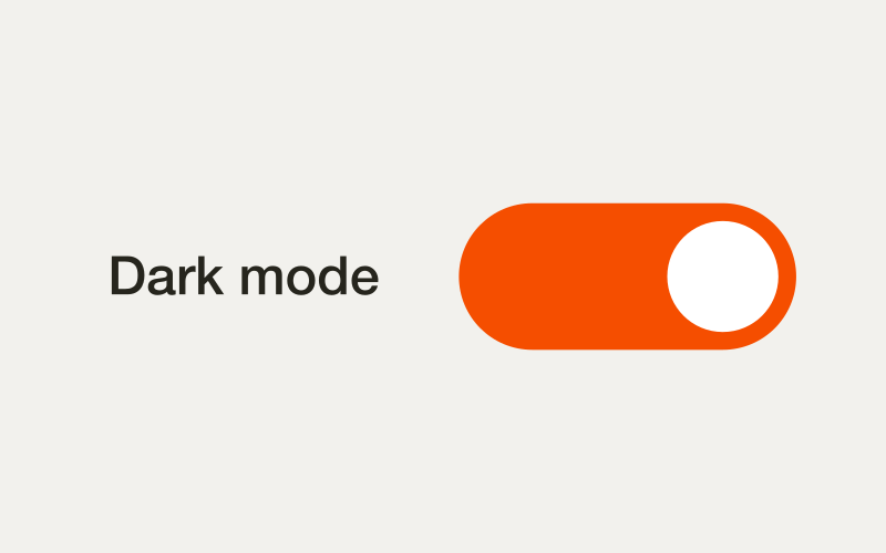
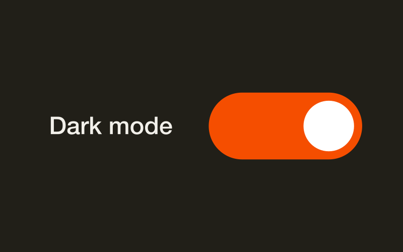
EasyA switch turns something on or off and applies the change immediately.
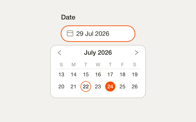
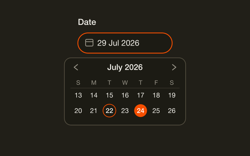
Date picker
HardA date picker opens a calendar so someone can choose a date by tapping it instead of typing it.
Search
MediumA search field lets someone type to find rows in a set they do not have memorised.
Slider
MediumA slider sets a value by dragging a handle along a range.
Number field
MediumA number field is a text input for counts and measures, usually with step buttons on either side.
Tag input
HardA tag input collects many short labels in one field, each shown as a removable chip.
Drop file or browse
receipt.pdf
File upload
HardA file upload lets someone choose a file from their device or drop one onto a target zone.
Time picker
MediumA time picker sets hours and minutes without choosing a calendar day.
One-time code
MediumA one-time code input splits a short numeric code across several boxes so each digit is visible and easy to check.
Rating
EasyA rating control captures how good something was on a fixed scale, usually stars.
Segmented control
EasyA segmented control shows two to five options on one line and lets someone pick exactly one.
Structure and navigation
How content is grouped, ordered and moved through.
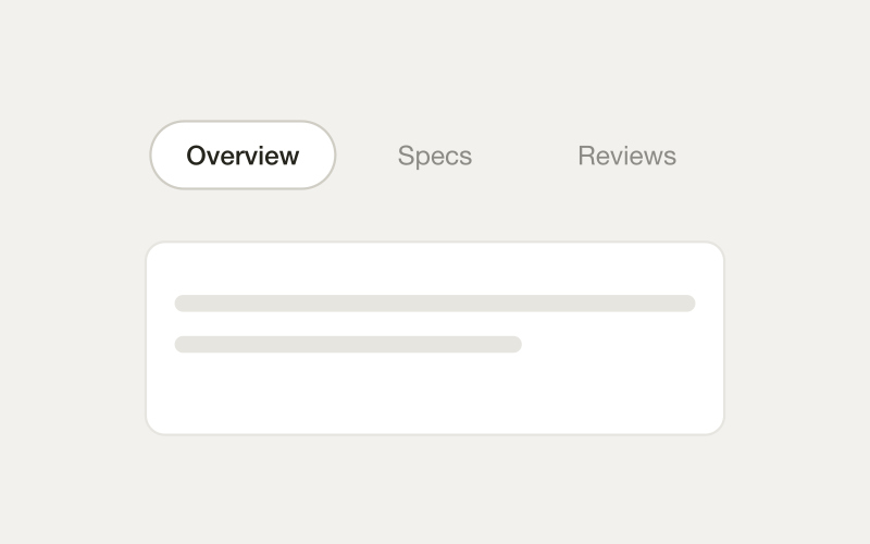
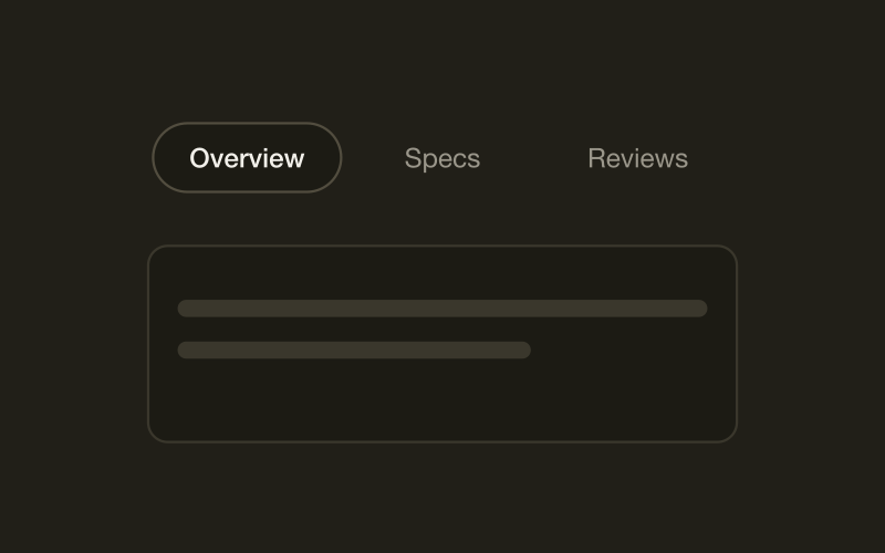
Tabs
MediumTabs show panels of related content one at a time, switched by clicking a label instead of loading a new page.
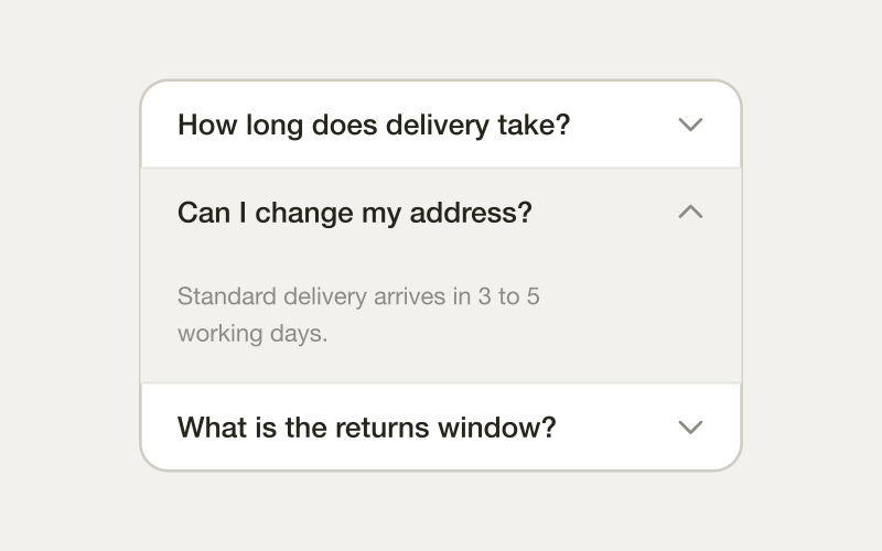
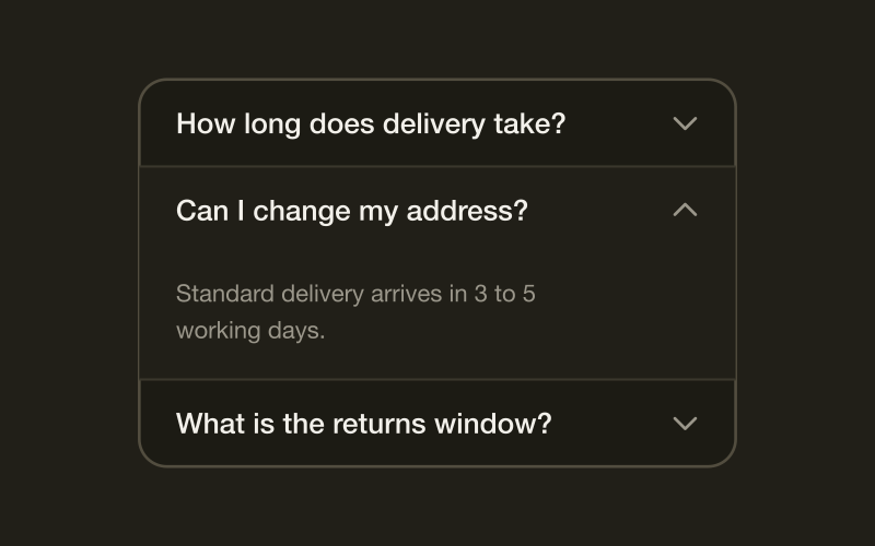
Accordion
EasyAn accordion collapses each section behind its own heading, so a long page can be scanned by its headings before any of it is read.
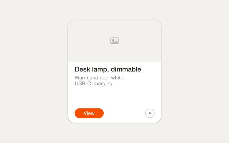
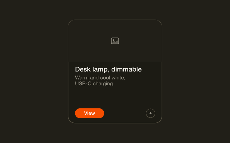
Card
MediumA card groups related content into one visible unit, so a person can scan several of them at once and compare.
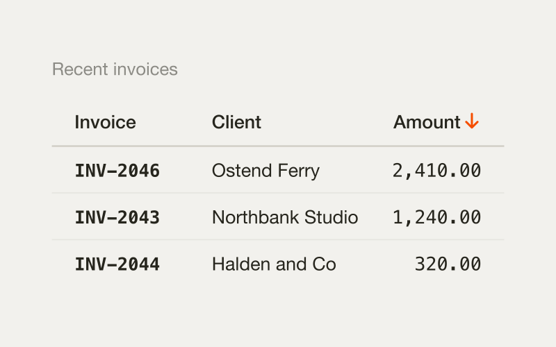
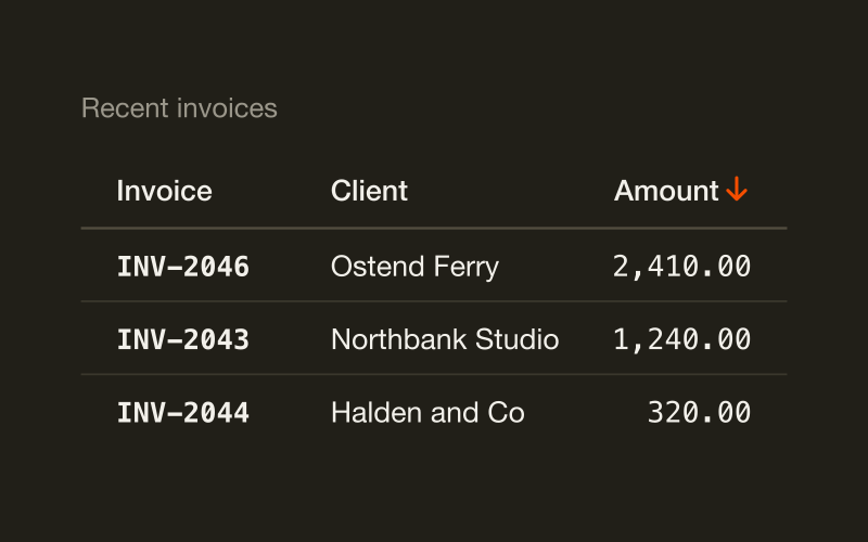
Table
HardA table lays records out in rows and columns so values in the same column can be compared straight down the page.
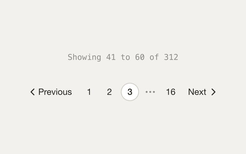
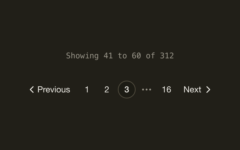
Pagination
MediumPagination splits a long list into pages someone moves through one at a time.
Murat Bayral
Design lead
Avatar
EasyAn avatar shows a person in a circle, with initials when the photo is missing.
Breadcrumb
EasyA breadcrumb shows where you are inside a hierarchy, with links back to each ancestor.
Sidebar
HardA sidebar is an app's main navigation, pinned to one edge of every screen.
- Invoice INV-1042Due Friday
- Lena ChoUpdated the brief
- Support queue12 open
List
EasyA list is a vertical stack of rows, each row one object.
Tree
HardA tree shows nested items with folders that expand and files that select.
Stepper
MediumA stepper shows progress through a short sequence of screens in a fixed order.
Invoices
Four waiting to send
Carousel
HardA carousel shows a few related panels in a row and moves between them one at a time.
Timeline
EasyA timeline lists events on a vertical axis in time order.
- INV-1042overdue
- INV-1043open
- QUO-2201open
Filters
HardFilters slice an existing list by criteria someone toggles on and off.
Overlays
Content that sits on top of the page. Seven components, seven different jobs.
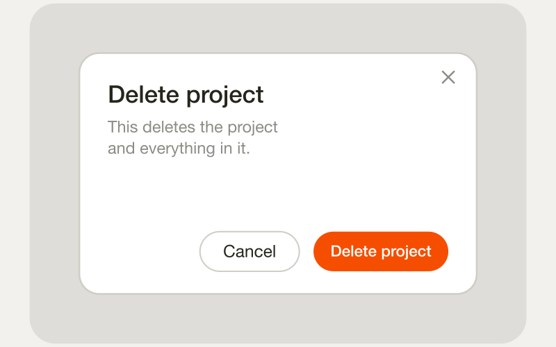
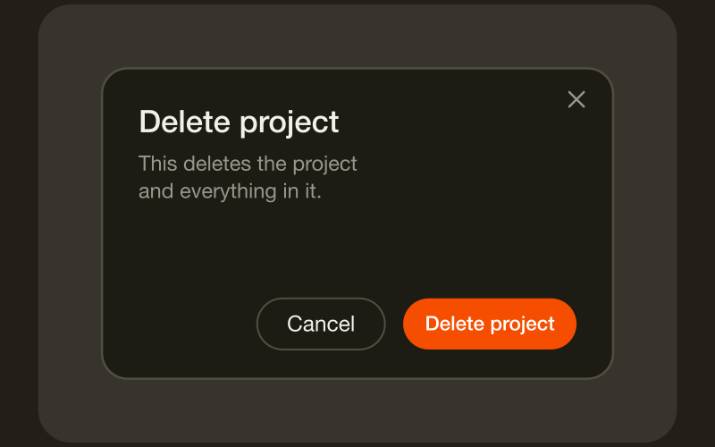
Modal
HardA modal is a window that sits above the page and blocks everything behind it until the task inside is finished or cancelled.
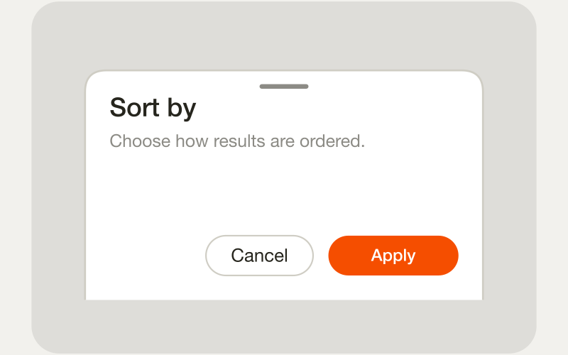
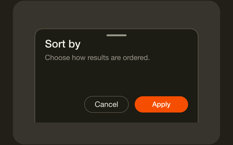
Drawer
MediumA drawer slides in from the edge of the screen and keeps the page behind it visible, dimmed but still there.
Popover
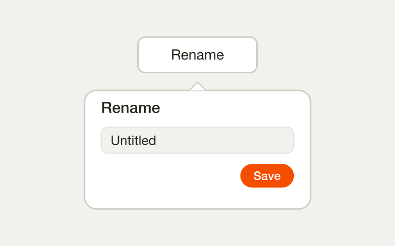
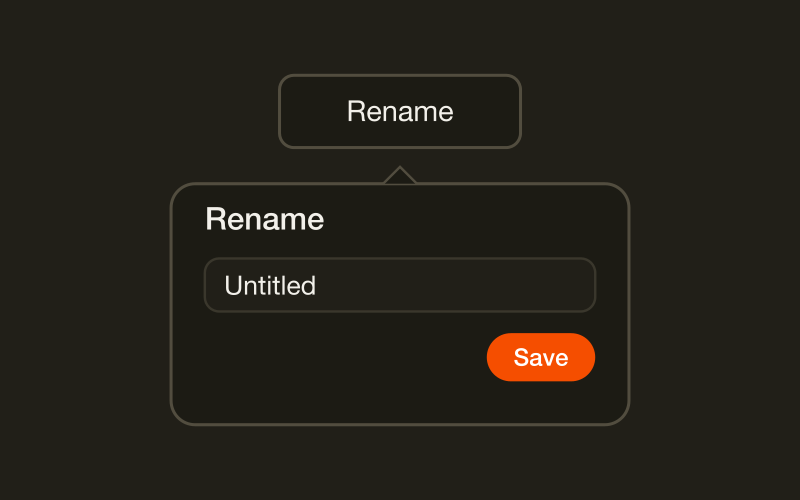
HardA popover is floating content anchored to a trigger, and the one thing that separates it from a tooltip is that someone can click inside it.
Tooltip
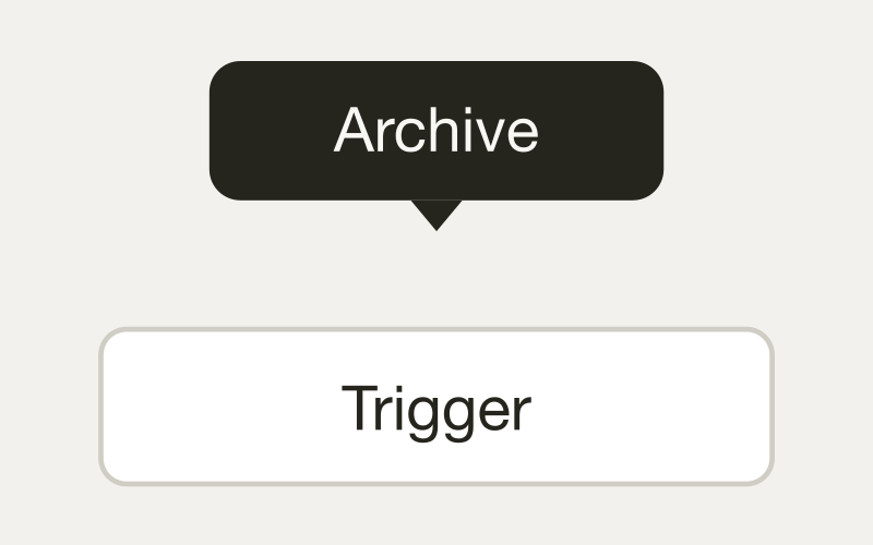
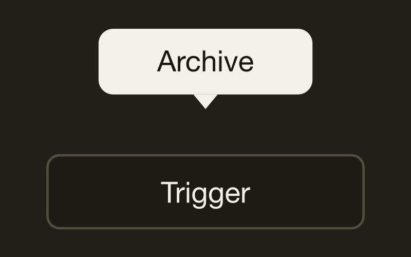
MediumA tooltip is a short, non-interactive label that appears when someone hovers or focuses a control.
Reviewed by Sam Okonkwo.
Hover card
MediumA hover card opens a small panel when someone pauses on a trigger, and that panel can hold more than a label.
- Go to Invoices
- Create invoice
- Open Settings
Command palette
HardA command palette is a searchable overlay for jumping to pages and running actions without hunting through menus.
Invoice #1042
Copy link
Share
Delete
Action sheet
MediumAn action sheet slides up from the bottom of the screen with a short list of choices.
Feedback and state
What the interface says back, and what it shows while it has nothing to say.
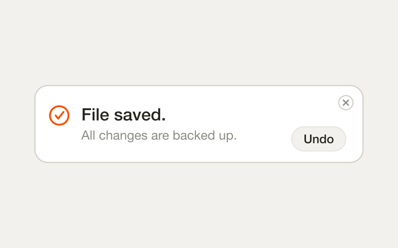
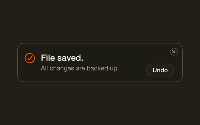
Toast
MediumA toast is a message that appears to confirm something just happened, then leaves on its own within a few seconds.
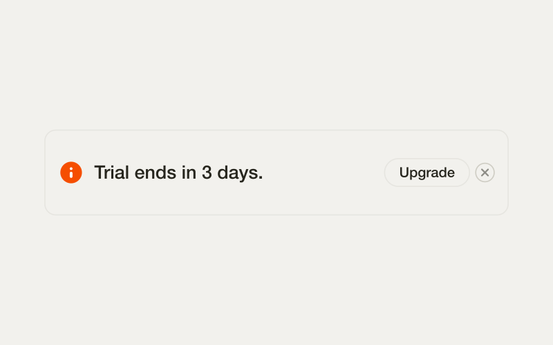
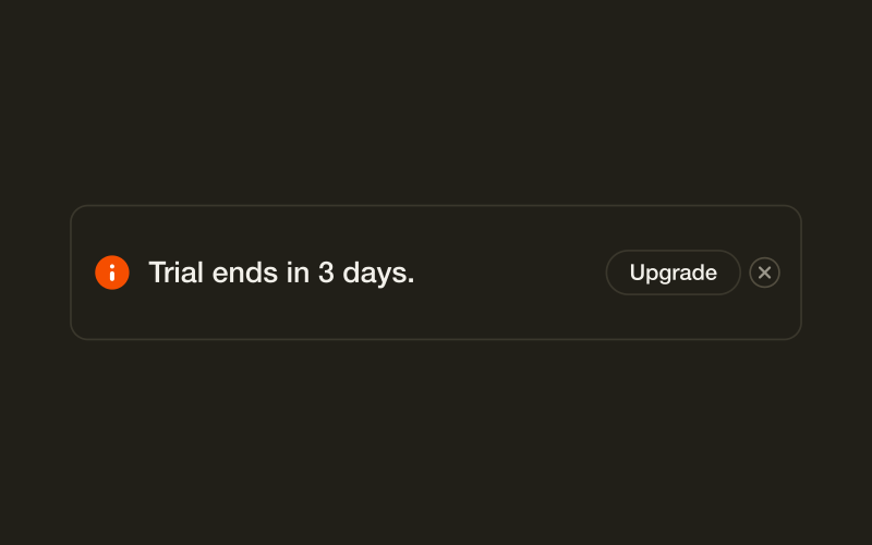
Banner
EasyA banner is a message that stays on the page until the condition behind it changes, like an unverified email or a service outage.
Badge and tag
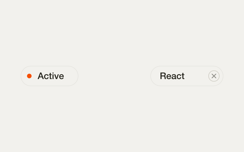
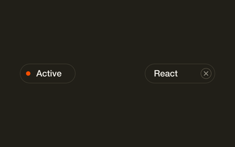
EasyA badge is a status the system sets, like Active or Draft.


Loading and skeleton
MediumA skeleton mimics the shape of content that hasn't arrived yet.
Empty state
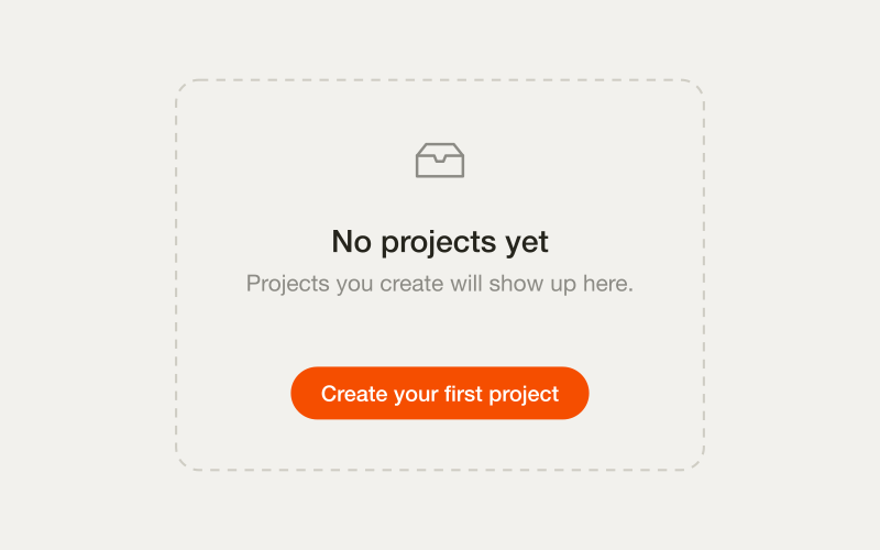
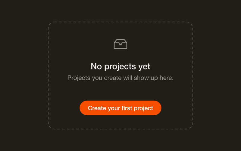
EasyAn empty state is the screen when there is nothing to show.
Progress
EasyA progress bar shows how far through a task someone is when the total is known.
Straight comparisons
Eight pairs people mix up. One rule each, and the reasoning behind it.
Checkbox vs switch
Does the change apply now, or when they press save?
Modal vs drawer vs page
How much of the interface does this task deserve to block?
Tooltip vs popover
Can the user click inside it? That is the whole decision.
Button vs link
Does the page change, or does something happen?
Select vs radio vs combobox
Mostly a question of how many options there are.
Toast vs banner vs inline
Where does this message belong, and should it survive a reload?
Tabs vs accordion
Same content, two disclosure models, different mobile outcomes.
Skeleton vs spinner
A duration decision, not a taste decision.
Join 02UI Lab
Knowing which component to use is one part of it. The Lab takes you the rest of the way, from idea to a product people actually use.
Join the Waitlist