
Combobox
A combobox is a text input that filters a list of options as you type, then lets you choose one. It does everything a select does plus search, which is also why it's the harder of the two to build correctly.
<input role="combobox">Also called Autocomplete, Searchable select, Typeahead, Combo box.
A combobox is a select with a search box welded to the front of it. That welding is the entire difficulty: the trigger has to work as both a text input and a button, the open panel has to filter live without losing keyboard focus, and every one of those states needs its own accessible name.
Anatomy of a combobox
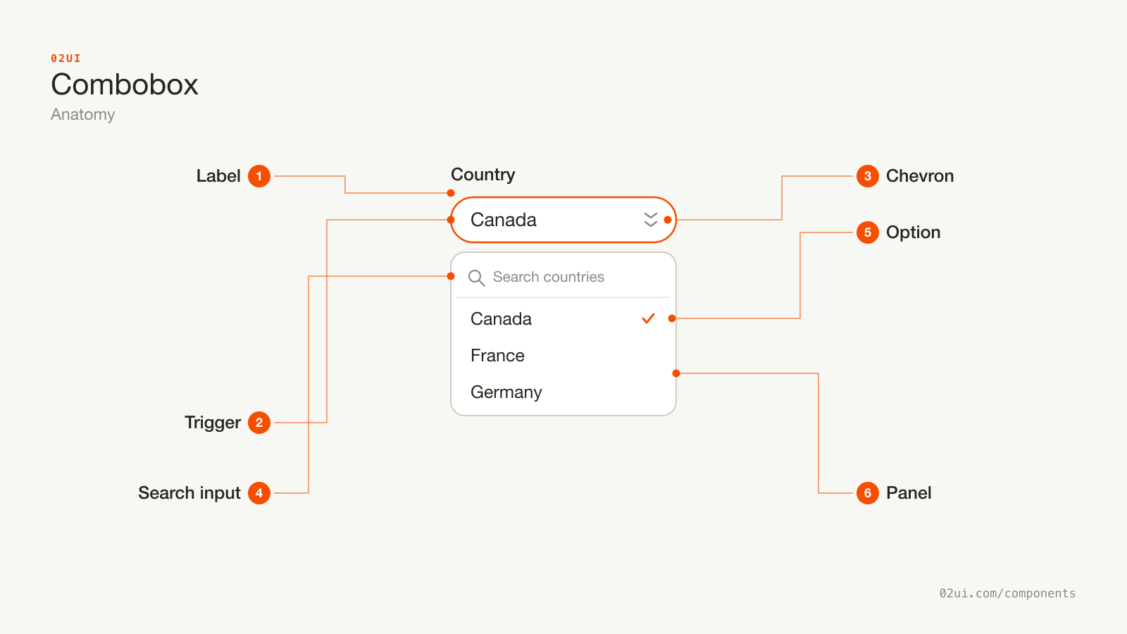
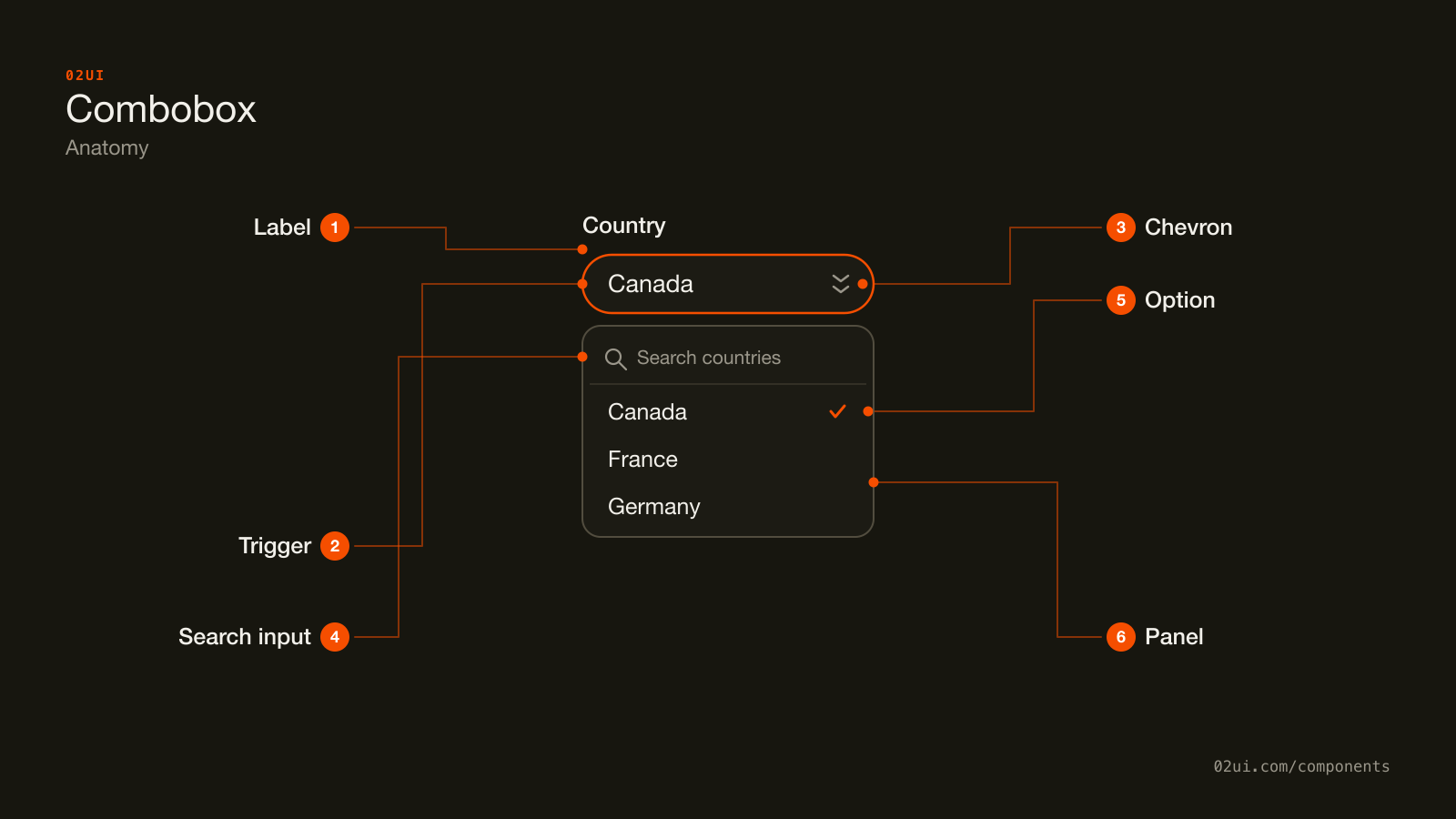
- 1Label. Above the trigger, connected with for and id, same as any other field.
- 2Trigger. Shows the current value or a placeholder. Doubles as the button that opens the panel.
- 3Chevron. The same quiet open-and-close signal a select uses. Nothing about the shape says search on its own.
- 4Search input. Appears inside the open panel and filters the list on every keystroke, with real focus staying here the whole time.
- 5Option. One row per match, with a check mark on the currently chosen value.
- 6Panel. The floating listbox holding the search input and every filtered option, positioned under the trigger.
The trigger looks like a text field but behaves like a button until it's focused, at which point typing filters the panel underneath it live. The chevron is the same quiet signal a select uses: nothing about the shape says "search," the behaviour has to teach that.
Here it is working. Click in, type a few letters, and watch the list narrow before you finish the word.
Click in, then type a few letters. The list narrows before the word is finished.
When to use a combobox
Use a combobox when
- The list is long enough, roughly past 15 to 20 options, that scanning it flat is slower than typing a few letters
- Someone is more likely to know part of the value, like the first letters of a name or a city, than its exact position in a list
- Exactly one option should end up chosen
- The set of valid options is still fixed, even though search narrows how it's browsed
Reach for something else when
- The list is short enough to scan in a couple of seconds without help, usually under 15 options. Use a select instead.
- There are 2 to 4 options and the screen has room to show every one. Use a radio group instead.
- The answer is genuinely free text with no fixed list behind it, like a note or a headline. Use a text field instead.
- Typing should trigger an action right away instead of setting a stored value. Use a menu instead.
Variants
Grouped by continent, a picker with a secondary line per option, and a multi-select that collects chosen values as chips.
Grouped. Options clustered under a heading, useful once a long list already has a natural category, like countries grouped by region.
With descriptions. A second, muted line under each option's main text, for choices that need a bit more context to tell apart, like two people who share a first name.
Multi-select. Chosen options collect as removable chips instead of replacing each other, for a field that can hold more than one value, like tags on a ticket.
States
| State | What changes | Watch out for |
|---|---|---|
| Empty | Placeholder names what to search for, nothing chosen | Distinct from a real value, same rule as a select's placeholder |
| Filled | The chosen option's label sits in the trigger | Still editable. Clicking back in should let someone search again, not just re-show the same list |
| Focus | A visible ring appears on the trigger | Never remove it without a visible replacement |
| Error | Red border, message below, aria-invalid="true" | Say what's wrong and what to do, the same as any other field |
| Disabled | Reduced opacity, not focusable, not submitted | State the reason nearby |
| No results | The panel shows a message instead of options | Repeat the search term back, so it's clear the query ran |
No results gets skipped most often. A panel that just goes blank when nothing matches looks like the component broke, not like the search came back empty.
How a combobox behaves
Typing filters, it doesn't submit. Every keystroke narrows the list in place. Nothing is chosen until an option is picked, whether by click, arrow-and-Enter, or (where it's explicitly supported) an exact typed match.
Opening the panel doesn't clear a filled value. Clicking back into a combobox that already holds "Canada" should let someone search for something else without first having to delete the old value by hand.
Only one option is ever chosen, unless it's explicitly a multi-select. The moment more than one value needs to be true at once outside that variant, something else is being asked of the component.
Filtering matches on more than the start of a word. A search for "United" should surface "United Kingdom" and "United States" both, not just whichever one happens to start the list.
Selecting an option closes the panel in a single-select combobox. A multi-select keeps it open, since picking one tag rarely means someone is done picking tags.
Combobox accessibility
Keyboard
| Key | What happens |
|---|---|
Down arrow | Opens the panel if it's closed, or moves the highlight to the next option |
Up arrow | Moves the highlight to the previous option |
| Typing | Filters the list to options that match |
Enter | Chooses the highlighted option and closes the panel |
Escape | Closes the panel without changing the value |
Tab | Closes the panel and moves focus to the next control |
The rest
- Follow the WAI-ARIA combobox pattern, specifically the "list autocomplete" variant. The input carries
role="combobox",aria-expanded, andaria-controlspointing at the panel, which carriesrole="listbox"withrole="option"items. - Track the highlighted option with
aria-activedescendant, not real DOM focus. Focus stays on the input the entire time the panel is open. - Announce the result count on filter, either through a visually hidden live region or by relying on the screen reader's own listbox announcements, so a search that returns zero results is obvious without seeing the panel.
- Label it the same way as any other field. An explicit
<label for>connection, never a placeholder standing in as the only label. - Contrast. The trigger's border needs 3:1 against the page at rest (WCAG 1.4.11), same as any other input.
- Target size. 24 by 24 CSS pixels minimum at Level AA (WCAG 2.5.8), including the clear button on a filled multi-select chip.
What a combobox should say
Placeholder text names what to search for. "Search countries" beats "Select" or a bare magnifying glass with no label.
No-results text repeats the query. "No results for "Freldon"" confirms the search ran. A bare "No results" leaves room to wonder if the field is broken.
Option text stays short. A combobox trades scanning speed for typing speed, but the option itself still needs to be readable in a glance once the list narrows.
Group labels are short nouns, same as a select's. "Europe," not "Countries located in Europe."
Common combobox mistakes
195 countries, most people know a fragment of the name they want. Search earns its place.
Three payment methods. A select shows all of them in one click, with no typing and no risk of a search matching nothing.
The one that costs the most support time is a combobox that rejects a valid value because the filter only matches the start of the string.
1. A combobox for a list short enough to just show. Four payment methods don't need a search box in front of them. That's a select or a radio group wearing extra weight.
2. Filtering that only matches the first letters. Typing "York" should find "New York." Anchoring the match to the start of the string silently breaks a search that looks like it should work.
3. A blank panel on no results, instead of a message naming the query. It reads as broken, not empty.
4. Losing the typed query on blur. Clicking away and back should restore what was there, not reset to a bare placeholder, unless a real value was already chosen.
5. No keyboard path to an option. A combobox that only responds to a mouse click loses everyone navigating by keyboard, which the WAI-ARIA pattern exists specifically to prevent.
6. Treating a multi-select's chips as the only way to see what's chosen. Once chips wrap past one line, someone needs a way to see and manage the full selected set, not just scroll a growing row.
How to build a combobox
<label for="country-input">Country</label>
<div class="combobox-wrapper">
  <input
    id="country-input"
    role="combobox"
    aria-expanded="false"
    aria-controls="country-listbox"
    aria-activedescendant=""
    autocomplete="off"
  />
  <ul id="country-listbox" role="listbox" hidden>
    <li role="option" id="opt-ca">Canada</li>
    <li role="option" id="opt-mx">Mexico</li>
    <li role="option" id="opt-us">United States</li>
  </ul>
</div>
aria-expanded flips to "true" and the list loses hidden when the panel opens. As the highlight moves, aria-activedescendant is set to the id of the current option, while real focus stays on the input the whole time. A lighter native option exists for a short, unstyled list: <input list="countries"> paired with a <datalist> gets filtering-as-you-type for free, but can't carry grouped headers, secondary text, or a design system's own styling.
Edge cases
A very long option list. Cap the panel's height and let it scroll internally, the same rule as a select's listbox.
An option's label longer than the trigger. Truncate with an ellipsis, and keep the full text available through the panel, where there's more room, rather than only in a title attribute.
Async-loaded options. Show a loading state in the panel while a request is in flight, and debounce the request by roughly 200 to 300ms so every keystroke doesn't fire its own call.
Mobile. A touch keyboard covers a meaningful share of the screen, so keep the visible option count low, usually 3 to 5 rows, and make sure the panel scrolls independently of the page behind the keyboard.
Right to left. The chevron, the panel's alignment, and any secondary text all mirror.
Comboboxes in real products
Linear's "Move to project" picker filters a long project list as you type, grouping recent projects above the alphabetical rest so a frequent target rarely needs a full search.
GitHub's label picker on an issue is a multi-select combobox, colour dots included, where chosen labels stay visible as chips while the search box underneath keeps working for the next one.
Google Maps' destination field is a combobox built around asynchronous results: nothing is filtered client-side, every keystroke debounces into a fresh request, and the panel shows a loading state between them.
Common questions
- Combobox or select?
- Both store one value from a fixed list. A select is faster to build and use below about 15 to 20 options, since scanning a short flat list beats typing. Past that count, or when people are more likely to remember a fragment of the value than its position, a combobox's search earns back the extra build cost.
- Should a combobox let someone submit a value that isn't in the list?
- Only if that's genuinely useful, like adding a new tag on the fly. Say so explicitly in the empty state, something like 'Press Enter to add "design-ops" as a new tag,' so it's clear the value came from a deliberate choice and not a typo that slipped through. Most comboboxes, including a country or a person picker, should reject free text and show nothing selected until a real option is chosen.
- What should the empty state say when nothing matches?
- Name the situation plainly: 'No results for "Freldon".' Repeating the query back confirms the search actually ran rather than silently doing nothing. Suggesting a close match, when one exists, saves a retry.
- Does a combobox need a minimum number of characters before it filters?
- No, for a client-side list. Filter from the first keystroke. A minimum only makes sense once the list is fetched from a server per keystroke, where firing a request on one character would be wasteful. In that case 2 to 3 characters and a debounce of roughly 200 to 300ms is a reasonable starting point.
- Native <input list> and <datalist>, or a custom combobox?
- Datalist gets you filtering-as-you-type with zero JavaScript, but it can't be styled to match a design system, doesn't support grouped options or secondary text, and behaves slightly differently across browsers. Reach for a custom combobox, built on the WAI-ARIA combobox pattern, once any of those limits actually bite. Don't build one by default just because it looks more polished.
Last reviewed 29 JUL 2026