
Drawer
A drawer slides in from the edge of the screen and keeps the page behind it visible, dimmed but still there. That's the whole difference from a modal: a drawer lets you glance back at what you were looking at.
<div role="dialog">Also called Side panel, Slide-over, Bottom sheet, Off-canvas panel.
A drawer is what a modal turns into once you decide the page behind it still matters. Filtering a table, inspecting a row, editing something you want to compare against the list it came from: all of it is easier with the original context still on screen.
Anatomy of a drawer
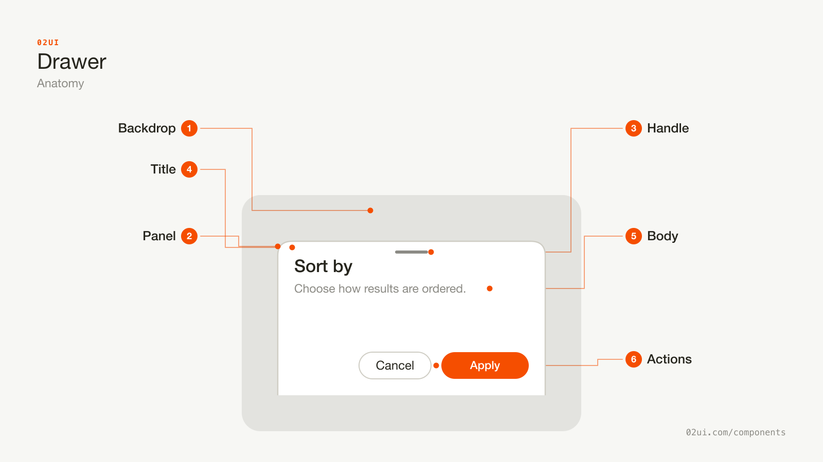
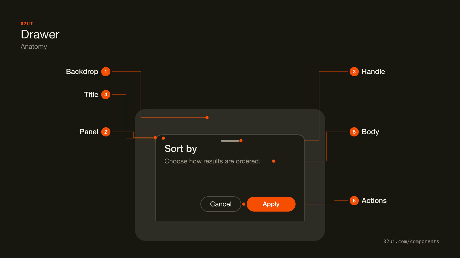
- 1Backdrop. Dims the page behind the panel without hiding it, the detail that separates a drawer from a modal.
- 2Panel. Slides in from a screen edge and holds everything else. Where focus is trapped while the drawer is open.
- 3Handle. A drag affordance on a bottom sheet, used to pull it further open or flick it closed. A side panel has no equivalent.
- 4Title. Names the task, tied to the panel with
aria-labelledby. - 5Body. The content itself: a filter form, a set of options, a detail view.
- 6Actions. The footer buttons, when the drawer needs a way to commit or cancel rather than just close.
The handle only shows up on a bottom sheet. A side panel doesn't need one, because the edge it slides from is already the affordance.
Here it is working. Open it, then close it by clicking outside, pressing Escape, or using the close control.
Open it, then close it by clicking outside, pressing Escape, or the close control.
When to use a drawer
Use a drawer when
- Someone benefits from comparing the drawer's content against the page behind it, like a filter panel next to the list it filters
- The content is naturally a list, a form, or a set of options rather than a single decision to force
- You're on a narrow viewport and the content needs more room than a popover gives, without leaving the current screen (a bottom sheet)
- Dismissing it costs nothing. Swiping it away or tapping outside should never lose anything that mattered
Reach for something else when
- The action is destructive, or the task genuinely needs to block the page until it's dealt with. Use a modal instead.
- The content is a short, contextual detail tied to one specific control, like a date range or a colour swatch. Use a popover instead.
- The content deserves its own URL, its own back button, or a bookmark someone might return to. That's a page, not an overlay.
- You're opening a drawer from inside another drawer or a modal. Close the first layer, or combine the two tasks into one.
Variants
Right for a details panel, left for navigation, bottom for a mobile sheet.
Right. The default for a details panel or a form tied to a row or a card. Reading direction in most languages moves left to right, so a panel from the right reads as an addition to what you were already looking at.
Left. Reserved for navigation, the same place a fixed sidebar would live if there were room for one permanently.
Bottom. The mobile pattern. Opens with a downward-flick gesture to close, sits within thumb's reach, and never has to travel the full width of the screen the way a side panel would.
States
Released between the handle and the fingertip.
Sliding back toward the edge it came from.
| State | What changes | Watch out for |
|---|---|---|
| Closed | Nothing rendered, trigger sits at rest | Trigger looks interactive on its own, with no hint required to know it opens something |
| Open | Panel slides in, backdrop dims the page | Focus lands inside immediately, not left on the trigger behind the backdrop |
| Dragging | Bottom sheet follows the pointer or finger | Snap back if released before crossing the dismiss threshold, close if released past it |
| Closing | Reverse of the open transition | Focus returns to the trigger once the panel finishes leaving |
The dragging state only applies to a touch-driven bottom sheet. A side panel on desktop has no equivalent, it opens and closes on a fixed transition with nothing to drag.
How a drawer behaves
Slides from a screen edge, rather than scaling up from the centre the way a modal does. The direction of motion is what tells someone where it came from and where closing it will send it back to.
The page behind it stays visible, dimmed by a backdrop but not replaced by one. Someone can still see the list a filter drawer is about to change.
Focus moves into the drawer on open, the same rule a modal follows, landing on the first focusable element or the heading.
Focus is trapped while it's open, when the drawer has a backdrop and blocks the page behind it, which is the common case. Tab cycles inside the panel only.
Escape and a backdrop click both close it, unless the content has unsaved changes worth confirming first, the same exception a modal makes.
Dragging a bottom sheet follows the gesture in real time. Releasing past roughly a third of the panel's height closes it. Releasing before that snaps it back open. A drawer that ignores the gesture entirely and only responds to a dedicated close button feels stuck on a touchscreen.
Only one drawer opens at a time. Opening a second closes whatever was already open, same as a modal.
Drawer accessibility
Keyboard
| Key | What happens |
|---|---|
Tab / Shift+Tab | Cycles focus through the drawer's own controls only, wrapping at both ends |
Escape | Closes the drawer and returns focus to the trigger |
Enter / Space | Activates the focused control |
The rest
- Role and state.
role="dialog"witharia-modal="true"when it blocks the page, the same pattern a modal uses. A non-modal drawer that leaves the page interactive should droparia-modalentirely rather than set it to false, since some assistive tech ignores the false value. - Name it.
aria-labelledbypointing at the drawer's own heading. - Background inert while modal. The same
inerttreatment a modal needs on everything outside the panel. - Contrast. The panel needs to read as a distinct surface against the dimmed page behind it, and any text inside needs 4.5:1 against the panel background (WCAG 1.4.3).
- Target size. The drag handle and close control both need 24 by 24 CSS pixels at minimum (WCAG 2.5.8), more on a touch-first bottom sheet, where 44 by 44 points is the safer target.
What a drawer should say
Title names what's inside, not the mechanism. "Filter results" beats "Filters panel", because the second one describes the component instead of the task.
Keep the primary action within reach without scrolling on a bottom sheet. Someone dragging a sheet up on a small phone shouldn't have to hunt for the button that finishes the job.
Empty states inside a drawer still need a next step. A filter drawer with no matches should say so and suggest clearing a filter, not just render a blank list underneath.
Common drawer mistakes
The most common failure looks identical to a broken modal, because most drawer bugs are modal bugs wearing a different animation.
A close button sits in the corner, same as a modal.
A visible close control works for anyone who doesn't know or can't perform the backdrop click or swipe.
Closes only on a backdrop click or a swipe. Nothing on the panel itself does it.
Anyone who doesn't discover the backdrop click or the swipe gesture is stuck with the panel open.
1. No visible way to close it. Relying on a backdrop click or a swipe gesture alone leaves out anyone who doesn't discover either.
2. Backdrop click silently discards a form. The same rule a modal follows: confirm first, or hold off on backdrop dismissal, when there's unsaved input.
3. No focus trap on a modal drawer. Tab walks straight into the page behind it while the drawer is still open and still blocking clicks, which is a worse mismatch than a modal makes because the page is visibly right there, inviting the attempt.
4. A side drawer used for a destructive confirmation. Keeping the page visible undersells how serious the action is. Reach for a modal instead.
5. A bottom sheet that ignores the drag gesture. Feels broken on a touchscreen the first time someone tries the obvious swipe and nothing happens.
6. Content taller than the panel with no internal scroll. A drawer that just runs off the bottom of the screen, with no way to reach what's below, loses everything past the fold.
How to build a drawer
<div class="drawer-backdrop"></div>
<div role="dialog" aria-modal="true" aria-labelledby="drawer-title" class="drawer drawer--right">
  <h2 id="drawer-title">Filter results</h2>
  <button aria-label="Close">×</button>
  <!-- drawer content -->
</div>
const drawer = document.querySelector(".drawer");
const backdrop = document.querySelector(".drawer-backdrop");

function open() {
  drawer.classList.add("is-open");
  backdrop.classList.add("is-open");
  drawer.querySelector("button, [href], input, select, textarea").focus();
}

function close() {
  drawer.classList.remove("is-open");
  backdrop.classList.remove("is-open");
  trigger.focus();
}

backdrop.addEventListener("click", close);
drawer.addEventListener("keydown", (e) => e.key === "Escape" && close());
That's the shape of it. What it leaves out, focus trapping inside the panel, the drag-to-dismiss gesture on a bottom sheet, and the position-aware slide transition, is most of the actual difficulty. Vaul, the library behind this site's own drawer, and Radix's dialog primitive underneath it, handle all three. Reach for one of those before building this by hand.
Edge cases
A drawer taller than the viewport. Scroll inside the panel body, with a fixed header and footer, the same pattern a modal uses for long content.
Resizing while open, say rotating a phone from portrait to landscape. Recalculate the panel's height rather than leaving a bottom sheet sized for the orientation it opened in.
A drawer opened from inside a modal. Close the modal first. Two overlays with two separate focus traps competing for the same Tab key is not a supported combination in any major implementation.
Reduced motion. Respect prefers-reduced-motion and drop the slide to a plain fade, or remove the transition entirely.
Nested scrollable regions. A bottom sheet containing its own scrollable list needs the drag gesture and the list's scroll to not fight each other, usually resolved by only starting the drag when the list is already scrolled to its top.
Drawers in real products
Linear opens a side panel from the right when you click into an issue from a list, keeping the list scrollable and visible behind it so switching between issues doesn't cost a full navigation.
Google Maps uses a bottom sheet on mobile for place details, letting someone drag it up for the full description or down to see more of the map underneath.
Notion slides a comments panel in from the right on a page, next to the content it's commenting on rather than over it, which is the clearest case for why a drawer exists instead of a modal.
Common questions
- What's the real difference between a drawer and a modal?
- A modal blocks the page and hides it behind an opaque-feeling overlay, demanding a decision. A drawer dims the page but keeps it visible and often keeps it scrollable, so someone can check something on the page without closing the drawer first. If the task needs a hard stop, it's a modal. If it benefits from staying in view, it's a drawer.
- Should a drawer have a backdrop?
- Usually, yes, dimmed enough to show the drawer has focus without hiding the page completely. A drawer with no backdrop at all reads as part of the page's permanent layout rather than a temporary overlay, which makes it easy to forget it's still open.
- Bottom sheet or side drawer, which one for mobile?
- Bottom sheet, in almost every case. It opens with a natural downward gesture to dismiss, sits within thumb's reach, and doesn't need to travel the full width of a phone screen. Reserve a side drawer on mobile for navigation that already has a fixed, learned position, like a main menu.
- Does a drawer need to trap focus like a modal?
- If it has a backdrop and blocks interaction with the page (the common case), yes, the same focus trap a modal needs. A non-modal drawer that lets someone keep clicking the page behind it, less common but valid for something like a persistent inspector panel, does not need to trap focus, but then nothing behind it should assume the drawer is out of the way.
- Can a drawer open from any edge?
- Left and right are the common ones for a side panel, bottom for a mobile sheet. Top is rare and mostly reserved for a search overlay or a notification tray. Whichever edge, keep it consistent for the same kind of content across your product.
Last reviewed 29 JUL 2026