
Checkbox
A checkbox lets someone choose any number of options from a set, including none of them. The change waits for a save or a submit, which is the line that separates it from a switch.
<input type="checkbox">Also called Tick box, Check box, Multi-select.
The checkbox is the easiest component on this site to draw and one of the easiest to misuse. Almost every mistake with it comes from the same question going unasked: when does the change actually happen?
Anatomy of a checkbox
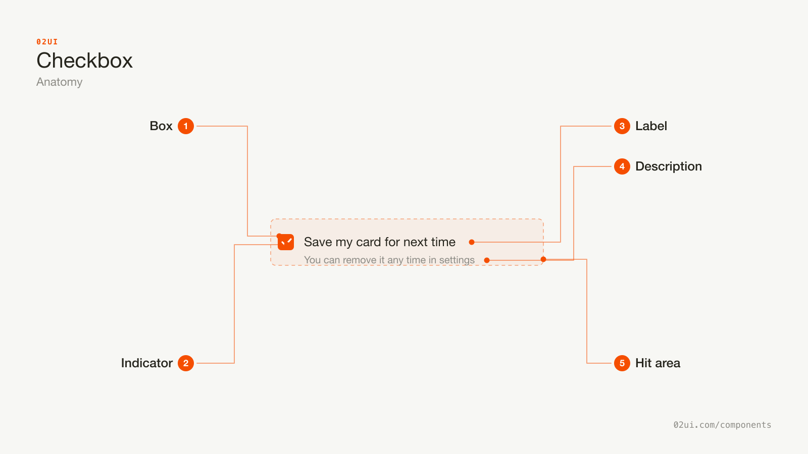
- 1Box. The control. Its border needs 3:1 contrast against the background when unchecked (WCAG 1.4.11).
- 2Indicator. The tick, or the dash for a mixed state. Needs contrast against the filled box, not the page.
- 3Label. Sits to the right, always. Wrapping it in the label element makes the text a click target too.
- 4Description. Optional second line for consequences. Keep it to one line.
- 5Hit area. Extends past the box, at minimum 24 by 24 CSS pixels for WCAG 2.5.8 at Level AA.
The label goes on the right in left-to-right languages. Left-aligned labels break the vertical line the boxes create, which is what makes a list of checkboxes scannable.
Here it is working. Click the label text, not just the box, and it still toggles.
Three independent choices and a save button. Click the label text, not just the box, and it still toggles. That is the label association doing its job.
When to use a checkbox
Use a checkbox when
- Someone can pick several options from a list, or none of them
- A single yes or no answer needs confirming before a form is submitted
- A parent option controls a set of children and needs a mixed state
- The change should apply when they save, not the moment they click
Reach for something else when
- The change takes effect immediately with no save step. Use a switch instead.
- Exactly one option can be chosen from a visible set. Use a radio group instead.
- There are more than about 10 options to work through. Use a multi-select combobox instead.
- Ticking it performs an action, like running a filter or deleting something. Use a button instead.
Variants
The parent is live. Tick one child and it goes to the mixed state. Tick all three and it becomes checked. Click the parent to set every child at once.
Single. One yes or no answer. Terms acceptance, "remember me", "send me a copy".
With a description. For anything with a consequence the label alone cannot carry. One extra line, connected to the input so screen readers announce it with the label.
Grouped. Several related options under one legend. This is the common case.
Parent with mixed state. A parent that reflects its children. Worth building only when the group is long enough that "select all" saves real effort. Below about five items it adds a control nobody needs.
States
Mixed is a display state, not a value. A person cannot click into it. You set it in code with el.indeterminate = true, and it is never submitted. Native inputs announce it as "mixed" without any extra ARIA.
Disabled needs an explanation. A greyed-out checkbox with no reason next to it is a dead end. If the option is unavailable because of something else on the page, say so in a line under the group.
Error goes on the group, not the box. When a group needs at least one selection, no single checkbox is the one at fault. The message belongs under the legend, and focus moves to the group on submit.
How a checkbox behaves
The change waits. This is the whole component. A checkbox stages a change that a save or submit button applies. If your checkbox saves the moment it is clicked, you have built a switch with the wrong drawing on it.
Clicking the label toggles it. For free, if the markup is right. Test it by clicking the text rather than the box.
No cascading surprises. Ticking one checkbox should not tick or untick another, with one exception: an explicit parent that says what it controls.
Order is stable. Never reorder options when one is selected. People are aiming at a position as much as a word.
Independent options only. If ticking A makes B impossible, they are not checkboxes. They are a radio group or two separate questions.
Checkbox accessibility
Grouping
A group of related checkboxes needs a fieldset and a legend. Without it, a screen reader user hears each label with no idea what question they are answering.
<fieldset>
  <legend>Email preferences</legend>

  <label>
    <input type="checkbox" name="prefs" value="updates">
    Product updates
  </label>

  <label>
    <input type="checkbox" name="prefs" value="newsletter">
    Weekly newsletter
  </label>
</fieldset>
A single standalone checkbox does not need a fieldset. Its own label is the whole question.
Keyboard
| Key | What happens |
|---|---|
Tab | Moves to the next checkbox. Every checkbox in a group is its own tab stop, unlike radios. |
Space | Toggles it. |
Enter | Nothing on the checkbox. It submits the form, if there is one. |
That last row catches people out. Space toggles, Enter submits. If you rebuild a checkbox from a div, you have to implement both, plus the focus ring, plus the mixed state announcement. Use the native input.
The rest
- Contrast. The unchecked border needs 3:1 against the page. The tick needs 3:1 against the filled box. A light grey border on a white background is the standard failure.
- Never colour alone. An error state needs a message, not just a red box.
- Target size. 24 by 24 CSS pixels at Level AA (WCAG 2.5.8). Wrapping the box and its label in one
labelelement usually gets you there without redrawing anything. - Spacing. At least 8px between adjacent checkboxes so nobody hits the wrong one on a phone.
- Focus ring. Visible, and not the same colour as the checked state, so the two are distinguishable.
What a checkbox should say
Write it positively. "Send me product updates" beats "Do not send me product updates". Unticking a negative is two mental operations, and people get it wrong.
Say what ticking does. The label describes the state when checked. "Save my card for next time" is clear. "Card saving" is not.
Sentence case, no full stop. "Remember me on this device".
Front-load the meaningful word. People scan the first two words of each option. "Weekly newsletter" beats "Receive our weekly newsletter".
Consequences go in the description. Legal detail, pricing, anything with weight. The label stays short and the detail sits underneath.
Never pre-tick consent. Pre-ticked marketing consent is unlawful under GDPR, and pre-ticking anything with a cost is the kind of thing people remember about a product.
Common checkbox mistakes
A legend gives the group a question. Positive wording. Both options read cleanly on their own.
Two negatives, no group label, and a ticked box that means the thing is off. Nobody can read this quickly and be sure.
1. Using a checkbox where the change is immediate. The most common one. If there is no save button, it is a switch.
2. Negative labels. "Do not send me emails" makes a ticked box mean off.
3. No fieldset on a group. Screen reader users get a list of options with no question attached.
4. Custom checkboxes built from divs. They lose Space, the focus ring, form submission, the mixed state, and browser autofill. Style the native input with appearance: none and keep everything else.
5. Tap targets the size of the box. 16px is fine to look at and hard to hit.
6. Triggering an action on tick. Running a search, deleting an item, applying a filter. Those need a button, and the checkbox should only mark the selection.
7. Pre-ticked boxes with a cost. Consent, add-ons, subscriptions. It converts once and it costs trust permanently.
How to build a checkbox
<label class="checkbox">
  <input type="checkbox" name="terms" value="yes">
  <span>I accept the terms</span>
</label>
Style the native input rather than replacing it.
input[type="checkbox"] {
  appearance: none;          /* removes the platform drawing */
  width: 20px; height: 20px; /* keeps the box a real element */
  border: 1.5px solid …;
}
input[type="checkbox"]:checked::after { /* the tick */ }
input[type="checkbox"]:indeterminate::after { /* the dash */ }
appearance: none strips the platform styling and keeps everything else: keyboard handling, form submission, label association, the indeterminate property, and the accessibility tree. Both :checked and :indeterminate are real CSS pseudo-classes, so the mixed state needs no extra class.
Setting the mixed state is the one thing CSS cannot do, because it is a DOM property rather than an attribute:
parent.indeterminate = someChecked && !allChecked;
parent.checked = allChecked;
Edge cases
Long labels. They wrap. Keep the box aligned to the first line, not vertically centred against three lines of text.
Right-to-left. The box moves to the right of the label. Logical properties handle it.
One checkbox that is required. Terms acceptance. It needs its own error message, and focus should move to it on failed submit.
Very long lists. Past roughly 10 options, a checkbox list becomes a scrolling chore. Add a search filter, or move to a multi-select combobox.
Windows High Contrast Mode. Custom-drawn ticks made with borders can vanish. Test it, and use forced-colors media queries to restore a visible indicator.
Saving in the background. If your checkbox does save immediately, and you have decided that is right for your product, you still need to say so. Show a saved confirmation, and handle the failure case, because a silent failure means the person believes a setting changed when it did not.
Checkboxes in real products
GOV.UK puts the whole option inside a large clickable block with generous spacing, which makes their forms usable on a phone in one hand. Their guidance to never use a checkbox for something that takes effect immediately is the clearest statement of the rule anywhere.
Gmail uses the mixed-state parent well. Select some messages and the header checkbox shows a dash, and clicking it selects everything, which is the behaviour people expect from that control.
Stripe Checkout keeps "save my card" unticked by default, with the consequence written underneath rather than hidden in a tooltip. It costs them some saved cards and buys them a lot of trust.
Common questions
- Checkbox or switch?
- Ask when the change happens. If it applies the moment they click, use a switch. If it waits for a save or submit button, use a checkbox. Being in a settings screen does not make it a switch, and being in a form does not make it a checkbox.
- What is the indeterminate state for?
- A parent checkbox controlling a group, where some but not all children are ticked. It is a display state only. A person can never set it by clicking, and it is never submitted as a value.
- Should checkboxes be required?
- A single checkbox can be, for things like accepting terms. A group of checkboxes where at least one is required needs its own error message on the group, because no individual box is the one at fault.
- How big should the tap target be?
- The visible box is usually 16 to 20px. The clickable area needs to be larger. WCAG 2.2 asks for 24 by 24 CSS pixels at Level AA. Apple's guidance is 44 by 44 points. Wrapping the box and its label in one label element gets you there without changing the drawing.
Last reviewed 29 JUL 2026