
Button
A button performs an action and leaves you on the same page. If the click takes you somewhere else, it is a link, whatever it looks like.
<button type="button">Also called CTA, Call to action, Action.
A button is four decisions in a small box: what it says, how loud it is, what it shows while you wait, and whether it should have been a link. The drawing is the easy part.
Anatomy of a button
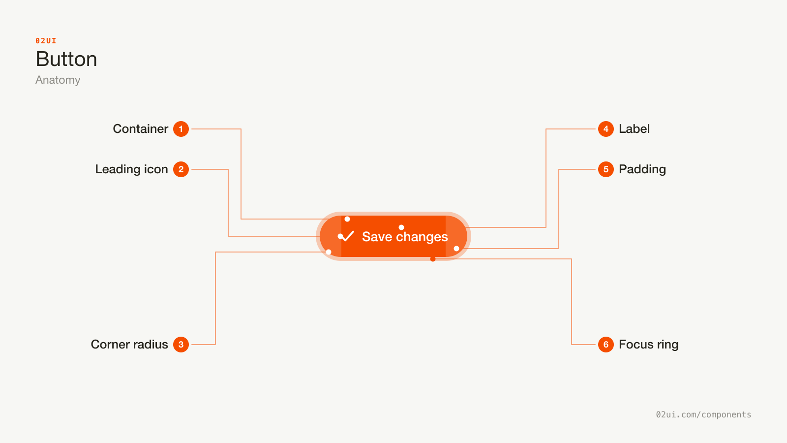
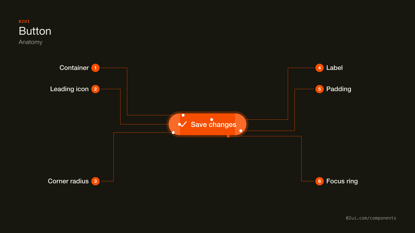
- 1Container. The fill. Its weight is the hierarchy, so the loudest button on a screen should be the action you most want taken.
- 2Leading icon. Optional. Decorative once the label names the action, so it carries
aria-hidden="true"and stays out of the accessibility tree. - 3Corner radius. One value, shared by every button in the product. A pill, 8px or 4px all work. Two different radii on one screen do not.
- 4Label. A verb, in one to three words. The part people read, and often the only part.
- 5Padding. Horizontal padding around double the vertical. It is what makes the button a target instead of a word with a background.
- 6Focus ring. Drawn here so you can see it. It appears on keyboard focus only, and removing it without a replacement fails WCAG 2.4.7.
The label does most of the work. Everything around it sets how important the action looks and how easy it is to hit, which is why a button sized to fit its text exactly looks tidy in Figma and gets missed under a thumb.
Here it is working. Press Tab to reach it with the keyboard and the ring appears.
A primary action and a quiet one beside it. Press Tab to reach them with the keyboard: the ring that appears is the one drawn on the diagram above.
When to use a button
Use a button when
- Something happens and the person stays on the same page
- A form needs submitting
- It opens a dialog, a drawer or a panel
- It is the one thing you most want someone to do on this screen
Reach for something else when
- The click loads another page or another site. Use a link instead.
- It reveals a list of actions to choose from. Use a menu instead.
- It turns something on or off and applies the change straight away. Use a switch instead.
- It marks a choice that a save button will apply later. Use a checkbox instead.
Variants
Five weights and three icon treatments, all from the same component. Hierarchy is the variant doing the work, so the filled one is used once per screen.
Primary. The filled one, on the action you most want taken. One per screen.
Secondary. The alternative a reasonable person might pick. Same size as the primary, quieter fill.
Outline and ghost. For actions that have to be available without competing: toolbars, table rows, the corner of a card. Give a ghost button a real hover state, because at rest it reads as text.
Destructive. Delete, remove, revoke. Red, and usually unfilled, so the colour works as a warning.
Icon only. No visible text, so it needs a name in code and a tooltip on hover, and the two should say the same words.
With an icon. One icon, on the leading edge. An icon that means direction goes on the trailing edge.
Sizes are a separate axis. This system ships four heights, from 24px to 40px. Pick two for your product and stop, because a third size is usually someone avoiding a spacing decision.
States
| State | What changes | Watch out for |
|---|---|---|
| Default | The resting fill | Two buttons at the same weight on one screen |
| Hover | The fill moves one step | Hover does not exist on touch, so it can never be the only cue |
| Focus | A visible ring | Removing it without a replacement (WCAG 2.4.7) |
| Pressed | A 1px shift, or a darker fill | Skipping it, which makes a slow network feel broken |
| Loading | A spinner appears and the button stops accepting presses | The button resizing and dragging the layout with it |
| Disabled | Reduced opacity, no pointer events | Nothing on the screen saying why |
Disabled is the state worth arguing about. The advice to grey out a submit button until the form is valid gets repeated everywhere. It reads well on a slide and it tests badly in a room. A disabled button gives no reason, drops out of the tab order, and sits outside the contrast rules in WCAG 1.4.3. Keep the button live, let people press it, and put the errors next to the fields that caused them. Disable it for one thing: the seconds while a request is in flight.
Loading has to hold its size. Swapping "Save changes" for "Saving" shrinks the button and drags the layout up with it. Reserve the width, or keep the label and put the spinner beside it.
How a button behaves
One press, one action. If a button does two things, one of them belongs somewhere else.
It answers inside a second. Jakob Nielsen's response-time limits have not moved since 1993: 0.1 seconds reads as instant, 1 second holds attention, past 10 seconds people go elsewhere. Under 100ms you owe them no loading state. Past a second you owe them one.
It stays still. A button that moves on hover, or resizes when its label changes, makes people miss.
Inside a form it submits by default. A <button> with no type is type="submit". An "Add another row" button that reloads the page is almost always this.
Twice is once. Double clicks happen, on slow connections most of all. Guard the handler as well as the button, because an attribute set after the second click arrives too late.
Button accessibility
Naming an icon-only button
A button with only an icon in it has no name in the accessibility tree. Give it one.
<button type="button" aria-label="Delete invoice">
  <svg aria-hidden="true" focusable="false">…</svg>
</button>
The aria-hidden on the icon earns its place. Without it a screen reader can pick up the SVG's own title as well, and the button ends up with two names.
Whatever the tooltip says, the aria-label should say. When the two differ, someone using voice control says the words they can see and nothing happens (WCAG 2.5.3, Label in Name).
Keyboard
| Key | What happens |
|---|---|
Tab | Moves focus to the button. Every button is its own tab stop. |
Enter | Activates it, on key down. |
Space | Activates it, on key up. That gap is why the pressed state exists. |
Rebuild a button from a div and you lose all three, plus form submission, plus the pressed state. role="button" puts the name back in the accessibility tree and gives you none of the behaviour.
The rest
- Contrast. The label needs 4.5:1 against the fill (WCAG 1.4.3). Where the fill is the only thing marking the button's edge, that fill needs 3:1 against the page behind it (1.4.11).
- Focus visible. Required at Level AA (2.4.7).
- Target size. 24 by 24 CSS pixels at Level AA (2.5.8). Apple asks for 44 by 44 points, Android for 48dp.
- Never colour alone. Around 8% of men have some form of colour vision deficiency, so a red button and a grey button can be the same button. The word carries the meaning.
What a button should say
Start with a verb. "Save changes", "Create account", "Send invite". The verb is what people scan for.
Name the object when more than one thing could be acted on. "Delete 3 files" beats "Delete".
One to three words. Past that it reads as a sentence and stops looking pressable.
Match the label to what happens next. A button that says "Continue" and opens a payment screen has told you nothing. "Go to payment" has.
Watch the word cancel. In a dialog that ends a subscription, a button marked "Cancel" means two opposite things at once. Name both actions: "Keep subscription" and "Cancel subscription".
Sentence case, no full stop.
"My" or "your" is unsettled. "Start my trial" and "Start your trial" both have people who swear by them, and the published tests are old and small. Pick one, use it everywhere, and spend the argument somewhere it pays.
Common button mistakes
One filled button, one quiet one, and both labels say what happens next. The screen has an obvious answer.
Three buttons at the same weight, and not one of them says what it does. Everybody who lands here has to stop and work it out.
The most common button on the internet says "Submit". That word describes what happens to the form. Nobody presses a button to help a form.
1. Two primary buttons on one screen. Both are shouting, so neither is. Demote one.
2. A link built as a button. Middle-click, right-click, open in a new tab, copy link address and browser history all break. Anything that loads a page is an <a href>.
3. Labels that name the control. "OK", "Submit", "Yes". Each one leaves the person to work out the consequence.
4. The greyed-out submit button. It hides the reason at the exact moment somebody needs it.
5. Removing the focus ring. It fails WCAG 2.4.7 and strands every keyboard user. If the default ring is ugly, draw a better one.
6. A filled red button as the default answer in a delete dialog. The loudest thing on the screen is the one you want people to think about.
7. No loading state. People press again. Then a third time. Then support gets an email about three identical invoices.
How to build a button
<!-- An action on this page -->
<button type="button">Save changes</button>

<!-- The form's submit. The type attribute decides this. -->
<button type="submit">Create account</button>

<!-- Navigation, styled however the design needs -->
<a href="/pricing/" class="button">See pricing</a>
The element decides the behaviour. A <button> gives you Enter and Space, the pressed state, form submission and a name in the accessibility tree. An <a href> gives you middle-click, new tab, copy link address and history. A div gives you none of it, and the code to fake it runs longer than the markup it replaced.
The loading state wants care.
<button type="submit" aria-disabled="true" aria-busy="true">
  <svg aria-hidden="true" focusable="false" class="spin">…</svg>
  Saving
</button>
aria-disabled keeps the button focusable, so a keyboard user holds their place while the request runs. The real disabled attribute takes it out of the tab order and, in most browsers, drops focus to the body. Block the second submit in the handler.
Edge cases
Translation. "Save" is four characters in English and nine in German. The W3C's text expansion guidance puts strings under 10 characters at up to 200% longer once translated. Let buttons wrap, and never truncate a label.
Buttons in a table row. Every row carries the same "Edit", so a screen reader user hears "Edit, Edit, Edit". Put the row in the name: aria-label="Edit invoice 4482".
The spinner that flashes. A request that returns in 80ms shows a loading state and removes it, which reads as a glitch. Most systems wait around 300ms before showing a spinner and hold it for at least 500ms once it appears. Both numbers are conventions, not standards.
Right to left. A leading icon moves to the right of the label, and an arrow meaning "next" points left. A save icon stays as it is.
The bottom of a long form on a phone. A sticky footer keeps the button in reach. WCAG 2.2 asks that the footer never sits over the field that has focus (2.4.11).
Windows High Contrast Mode. System colours replace background fills, so a ghost button with no border vanishes. Give quiet buttons a transparent border for the forced-colors mode to paint.
Buttons in real products
GOV.UK gives most pages a single green button and sends everything else down to a link. The labels are verbs, and the same verbs every time: "Continue", "Save and continue". On a service somebody uses once, in a hurry, there is one obvious next step.
Apple marks the destructive choice in an iOS alert with red text and leaves the other option in the normal weight, so red works as a warning. A filled red button in that slot would read as the recommended answer.
Shopify Polaris documents one primary action per page and puts the rest behind a menu. Writing the rule down is the part most systems skip, and it is what keeps their admin screens readable as a page grows.
Common questions
- Button or link?
- Ask what happens when it is clicked. If a new page loads, it is a link, even when it is painted to look like a button. If something happens and you stay where you are, it is a button. The outcome decides it, and the styling can be whatever the design needs.
- Should you ever disable a button?
- For the seconds a request is in flight, yes, so nobody submits twice. For an incomplete form, a live button that explains what is missing works better than a greyed-out one. A disabled button gives no reason, cannot be focused, and is exempt from the contrast rules in WCAG 1.4.3, which is exactly why it ends up unreadable.
- Where does the primary button go, left or right?
- Match the platform. macOS and iOS put the confirming action on the right of the pair. Windows puts it on the left. On the web, pick one order and use it on every screen, because what costs people time is the order changing between dialogs.
- How many buttons should be on one screen?
- One primary. As many quiet ones as the screen honestly needs. Two filled buttons side by side means the decision has been handed back to the reader, and they have less context than you do.
- How big should a button be on touch?
- WCAG 2.5.8 asks for 24 by 24 CSS pixels at Level AA, which most buttons already clear. Apple's guidance is 44 by 44 points and Android's is 48dp. Ship a larger size on small screens instead of one height everywhere.
Last reviewed 29 JUL 2026