
Tooltip
A tooltip is a short, non-interactive label that appears when someone hovers or focuses a control. It names things. Anything a person has to read to finish the task belongs on the page instead.
role="tooltip"Also called Hint, Info bubble, Hover label.
A tooltip is the smallest overlay in the interface and the one designers reach for most often when they run out of room. That is usually a sign the layout needs work rather than a tooltip.
Anatomy of a tooltip
Four parts, and only two of them are always present.
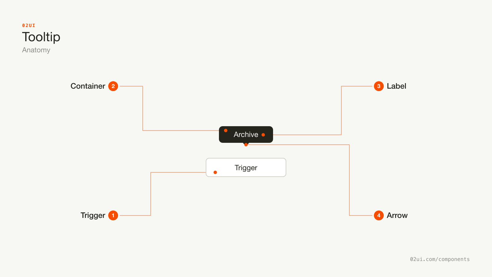
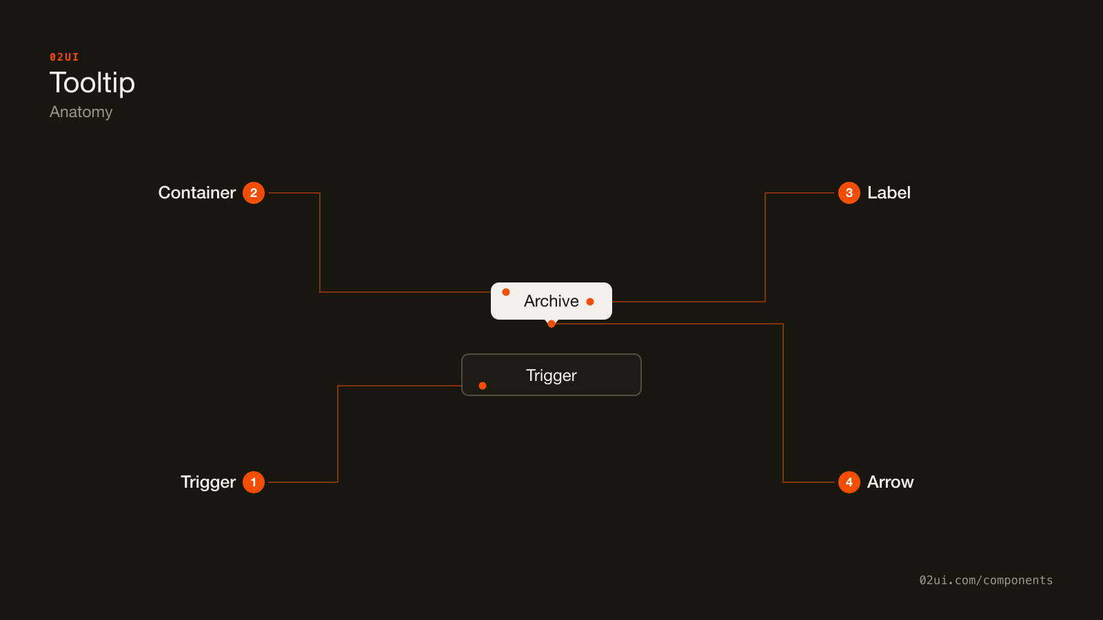
- 1Trigger. The control the tooltip describes. It has to be focusable, which in practice means a button, a link or an input. A plain div cannot be a trigger.
- 2Container. The floating surface. Carries
role="tooltip"and anidthe trigger points at. - 3Label. The text. One line, ideally under 8 words.
- 4Arrow. Optional. It helps when several triggers sit close together and the tooltip could belong to any of them. Skip it otherwise.
There is no title, no heading, no close button, and no second paragraph. Adding any of those turns it into a popover, which is a different component with different rules.
Here it is working. Hover an icon, then press Tab to reach it with the keyboard and watch the same tooltip appear.
Three icon buttons with no visible text. Without the tooltip a new user has to guess, and a screen reader user gets nothing at all. Press Tab to reach them with the keyboard: the same tooltip appears.
When to use a tooltip
Use a tooltip when
- An icon-only button needs a name, and there is no room for a visible label
- A truncated label needs to be readable in full
- A short piece of context helps but is not required to complete the task
- A keyboard shortcut or a technical value is worth showing on demand
Reach for something else when
- The content is needed to complete the task. Use a visible hint under the field instead.
- The content contains a link, a button, or anything else clickable. Use a popover instead.
- The message is longer than about 12 words, or has more than one sentence. Use a popover instead.
- The trigger already has a visible text label saying the same thing. Delete the tooltip.
- You need the message to appear without the user asking for it. Use a banner instead.
Variants
Three worth building. Everything else is decoration.
Plain label, label with a shortcut, and the wrapping variant. Cap the wrapping one so it never becomes a paragraph.
Plain label. The default. One short line.
With a keyboard shortcut. Pairs the name with the shortcut. Genuinely useful in an editor or any tool people live inside all day.
Wrapping. For labels that cannot be cut further, capped at a fixed width. Treat reaching for this as a signal that the copy needs another edit.
States
A tooltip has fewer states than most components, and the two that matter are about the trigger, not the tooltip.
Hover and keyboard focus produce the same tooltip. If yours only appears on hover, roughly the entire keyboard-using population never sees it, and that includes anyone driving your product with a screen reader.
The disabled state is the awkward one. A disabled button fires no pointer events in any browser, so the tooltip never opens, which is exactly when a person most needs to know why the button is off. Two ways out, covered in implementation.
How a tooltip behaves
Opening. Show on mouseenter after a delay, and on focus-visible with no delay at all. A keyboard user has already made a deliberate choice by tabbing to the control, so making them wait is punishment for using a keyboard.
The delay. 300 to 500ms is the common range. Radix UI ships 700ms as its default. The number matters less than being consistent across your whole product.
Skip the delay in a group. Once a person has seen one tooltip in a toolbar, show the rest instantly while they keep moving across it. Reset the delay once they leave the group for about 300ms. Every serious tooltip library does this, and it is the single change that makes a toolbar feel quick.
Closing. Hide immediately on mouseleave, on blur, on Esc, and on scroll. No delay on the way out.
Escape must work. WCAG 2.1 success criterion 1.4.13 (Content on Hover or Focus) requires that content shown on hover can be dismissed without moving the pointer. Escape is how.
Hovering the tooltip itself. The same criterion requires that a person can move the pointer onto the tooltip without it disappearing, which matters for anyone using screen magnification. Give it pointer-events: none only when it is short enough that nobody would need to.
Motion. A 120ms fade is plenty. Anything that slides, bounces, or scales draws attention to a component whose entire job is to stay out of the way.
Tooltip accessibility
This is where most tooltip implementations fall down, and the fixes are small.
Naming versus describing
The choice depends on whether the trigger has any other name.
| Situation | Attribute | Why |
|---|---|---|
| Icon-only button, no visible text | aria-labelledby | The tooltip is the button's only name. A description cannot substitute for a name. |
| Button with a visible label | aria-describedby | The visible text is the name. The tooltip adds detail on top. |
| Truncated text | aria-label on the element | Screen readers get the full string regardless of what the CSS clipped. |
Using aria-describedby on an icon-only button leaves it with no accessible name at all. The screen reader announces "button" and stops.
Keyboard
| Key | What happens |
|---|---|
Tab | Moves focus to the trigger. The tooltip appears immediately. |
Tab again | Moves focus away. The tooltip hides. |
Esc | Hides the tooltip, focus stays on the trigger. |
The tooltip itself never receives focus. It is not in the tab order, it has no interactive content, and it needs no close button.
The rest
- Contrast. The tooltip text needs 4.5:1 against the tooltip background (WCAG 1.4.3). Dark grey on black is the usual failure.
- Target size. WCAG 2.2 asks for 24 by 24 CSS pixels at Level AA (2.5.8), and 44 by 44 at Level AAA (2.5.5). Apple's guidance is 44 by 44 points. Icon buttons that need tooltips are exactly the ones that tend to be too small.
- Zoom. At 200 percent zoom the tooltip must stay inside the viewport. Flip its placement rather than letting it clip.
- Never put a tooltip on a non-focusable element. If a
divneeds a tooltip, either make it a button or accept that keyboard users will never see it.
What a tooltip should say
Under 8 words. If it needs more, the interface has a bigger problem than the tooltip.
Name the action, do not describe the icon. "Archive" beats "Click to move this item to the archive folder."
Match the button's accessible name. If the tooltip says "Archive" and the aria-label says "Move to archive", a voice-control user saying "click archive" may hit nothing.
No full stops on a single label. "Archive" not "Archive."
Sentence case. "Add to favourites" not "Add To Favourites".
Never repeat visible text. A button labelled "Save" with a tooltip that says "Save" is noise. If the tooltip adds nothing, delete it.
Common tooltip mistakes
The most common tooltip on the internet says the same thing as the control it sits on. The second most common holds information the user cannot finish the task without.
Required information sits on the page, visible on every device, readable by everyone.
Hidden behind a hover that does not exist on a phone, on the one field people most often get wrong.
1. Hover-only. No focus handler, so keyboard and screen reader users never see it. The most common bug in this component by a distance.
2. Interactive content inside. A link in a tooltip is unreachable, because the tooltip closes the moment the pointer leaves the trigger. Anything clickable makes it a popover.
3. Required information hidden behind hover. Password rules, pricing caveats, format requirements. All of it belongs on the page.
4. No dismissal. A tooltip that ignores Esc fails WCAG 1.4.13.
5. Tooltips on touch. There is no hover on a phone. The tooltip either never fires or fires on a long press nobody attempts.
6. Clipped by a parent. A tooltip inside a container with overflow: hidden gets cut off. Render it in a portal at the end of body, or use the CSS anchor positioning API where you can rely on browser support.
How to build a tooltip
Native HTML gives you one option, and it is weak.
<!-- Fine for the merely curious. Not a plan. -->
<button title="Archive">…</button>
title does not appear on keyboard focus, cannot be styled, has a browser-controlled delay of around a second, is announced inconsistently, and does nothing on touch. Use it as a fallback and nothing more.
A real tooltip is three connected pieces.
<!-- Icon-only: the tooltip IS the name -->
<button aria-labelledby="tip-archive">
  <svg aria-hidden="true">…</svg>
</button>
<div role="tooltip" id="tip-archive">Archive</div>

<!-- Labelled button: the tooltip adds detail -->
<button aria-describedby="tip-save">Save</button>
<div role="tooltip" id="tip-save">Saves to your drafts</div>
Positioning. Render the tooltip in a portal at the end of body so no ancestor with overflow: hidden or a stacking context can clip it. Position it with Floating UI, which handles flipping and shifting when the tooltip would leave the viewport.
Disabled triggers. Disabled buttons fire no pointer events, so the tooltip never opens. Two workarounds:
- Wrap the button in a focusable span that carries the tooltip. Works, adds a node.
- Use
aria-disabled="true"with a real, focusable button that blocks the action in its handler. Better in almost every case, because the user can still reach the control and find out why it is off.
The second option is worth taking seriously beyond tooltips. A greyed-out button with no explanation is a dead end, and an explained-but-blocked one is not.
Edge cases
Long text with no line breaks. Cap the width at around 240px and let it wrap. Never let a tooltip run the width of the viewport.
Right-to-left layouts. Placements flip. left becomes right. Use logical properties or let Floating UI handle it.
Near the viewport edge. Flip the placement rather than letting it clip. A tooltip that opens off-screen is worse than no tooltip.
The trigger moves. Virtualised lists and animated toolbars move triggers under the pointer. Recalculate position on scroll and resize, or close on scroll (simpler, and usually right).
Slow networks. If the tooltip content is fetched, do not show an empty box. Show nothing until the content arrives.
Windows High Contrast Mode. Background colours get stripped. Give the tooltip a real border, so it stays a distinct surface rather than floating text.
Tooltips in real products
Figma puts the tool name and its keyboard shortcut in one tooltip on every toolbar icon. It is the clearest argument for the shortcut variant: people learn the shortcuts without being taught them.
Linear shows tooltips instantly after the first one in a group, so moving along the toolbar feels immediate rather than staggered.
GitHub moved most of its icon buttons to visible labels over the last few years and kept tooltips for the genuinely space-constrained cases. A useful reminder that deleting the tooltip is often the better fix.
Common questions
- Do tooltips work on touch screens?
- No. There is no hover on a touch screen, so a tooltip either never appears or appears on a long press that most people never try. If the information matters on a phone, put it on the page.
- How long should the delay be before a tooltip appears?
- Between 300 and 500ms is the usual range. Radix UI defaults to 700ms. Once one tooltip in a group has opened, show the next one immediately so a person scanning a toolbar is not waiting each time. Hide instantly on exit.
- Should a tooltip use aria-describedby or aria-labelledby?
- Use aria-labelledby when the tooltip is the only name the control has, which is the case for icon-only buttons. Use aria-describedby when the control already has a visible label and the tooltip adds detail.
- Can I just use the HTML title attribute?
- Only for things nobody needs. The title attribute does not appear on keyboard focus, cannot be styled, has an unpredictable delay, and behaves inconsistently across screen readers. It is fine as a fallback and wrong as a plan.
Last reviewed 29 JUL 2026