
Radio group
A radio group shows every option at once and lets someone pick exactly one. Every choice stays visible, which is the whole reason to reach for it instead of a select.
<input type="radio">Also called Radio buttons, Radio list.
A radio group is the rare control where every option stays visible and only one of them can be true. Most controls trade one of those properties for the other: a select hides the list to save space, a checkbox group keeps everything visible but allows any number of picks. A radio group insists on both, which is why it only works when there's room for it.
Anatomy of a radio group
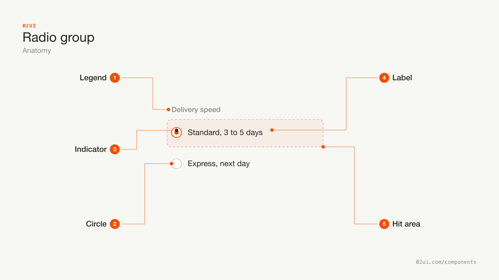
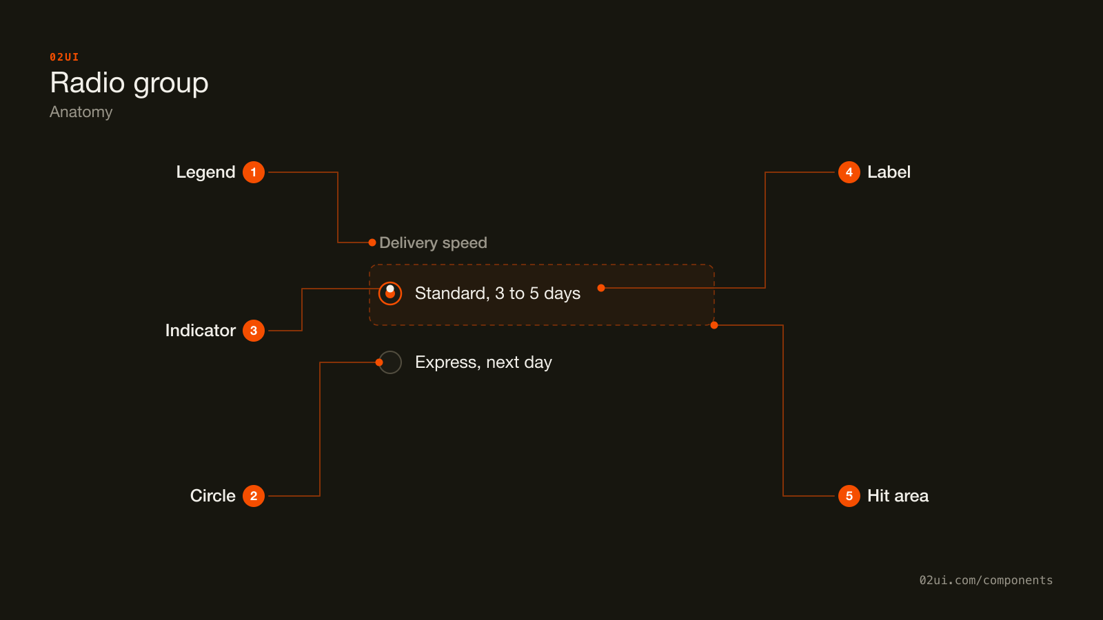
- 1Legend. The question the whole group answers. Every group needs one, without exception.
- 2Circle. The ring. Needs 3:1 contrast against the background when unselected (WCAG 1.4.11).
- 3Indicator. The dot inside the selected option. Needs contrast against the ring's fill, not the page.
- 4Label. Sits to the right, always. Wrapping it in the label element makes the text a click target too.
- 5Hit area. Extends past the circle, at minimum 24 by 24 CSS pixels for WCAG 2.5.8 at Level AA.
The label goes on the right in left-to-right languages, matching a checkbox. Unlike a checkbox, one radio button is never enough. The circle only tells someone what "selected" looks like once there's a second one to compare it against.
Here it is working. Use the arrow keys once one option has focus, and the selection moves with them.
Give the group keyboard focus, then use the arrow keys. The selection moves with them, no extra key to confirm it.
When to use a radio group
Use a radio group when
- Exactly one option must be chosen from a visible set
- There are roughly 2 to 5 options and the layout has room to show them all
- Comparing the options side by side helps the decision, like a delivery method or a billing interval
Reach for something else when
- There are more than about 7 options, or the layout can't fit them all. Use a select instead.
- More than one option can be true at once. Use a group of checkboxes instead.
- There are only two options and the choice takes effect immediately, with no save step. Use a switch instead.
- Someone needs to type to filter a long list of options. Use a combobox instead.
Variants
The card style is still a radio group underneath. Only the paint changes, so it needs a plan for what's checked, same as the plain list.
Plain list. The default. Options stacked vertically, one legend above them.
With a description. A second line under a label for detail the label alone can't carry, like what a shipping speed actually costs.
Card style. Each option drawn as a bordered card rather than a bare circle and label. Common for plan pickers and payment methods, where the option needs room for a price or an icon. The underlying control is still a radio group. Only the paint changes.
States
| State | What changes | Watch out for |
|---|---|---|
| Unselected | Empty ring | Needs 3:1 contrast against the background (WCAG 1.4.11) |
| Selected | Filled dot inside the ring | The dot needs contrast against the fill, not the page |
| Focus | Visible ring around the circle | Only one option in the group holds focus at a time |
| Disabled | Faded ring and label | Say why, in a line under the group |
| Error | Message on the group | No single option is the one at fault |
Only one option can carry focus. Tab moves onto the group once and lands on the checked option, or the first option if nothing is checked yet. This is the detail people rebuild wrong most often when they replace native inputs with styled divs.
How a radio group behaves
Selecting one clears the rest, automatically. This is native browser behaviour tied to a shared name attribute. No JavaScript required.
Arrow keys move and select at once. Press the down arrow and focus moves to the next option, already selected. There's no separate confirm step.
A single radio button is never valid on its own. If there's only one option, the question isn't "yes or no", it's "on or off", and that's a checkbox or a switch depending on when the change should apply.
Order is stable. Never reorder options once one is selected. Someone navigating by arrow keys is aiming at a position, not just a word.
Mutually exclusive options only. If two options could both be true, they were never a radio group. They're independent checkboxes, or two separate questions.
Radio group accessibility
Grouping
Every radio group needs a fieldset and a legend, without exception. A single stray radio input with no group around it is a sign something else should have been built instead.
<fieldset>
  <legend>Delivery speed</legend>

  <label>
    <input type="radio" name="delivery" value="standard" checked>
    Standard, 3 to 5 days
  </label>

  <label>
    <input type="radio" name="delivery" value="express">
    Express, next day
  </label>
</fieldset>
Keyboard
| Key | What happens |
|---|---|
Tab | Moves onto the group once, landing on the checked option or the first option if none is checked. The rest of the group is skipped. |
Arrow down / Arrow right | Moves to the next option and selects it. |
Arrow up / Arrow left | Moves to the previous option and selects it. |
Space | Selects the focused option, if it isn't already selected. |
That first row is the one custom implementations miss. Every checkbox in a group is its own tab stop. A radio group is one tab stop for the whole set, with the arrow keys doing the work of moving between options.
The rest
- Contrast. The unselected ring needs 3:1 against the background. The selected dot needs 3:1 against the ring's fill.
- Never colour alone. An error state needs a message under the group, not just a red ring.
- Target size. 24 by 24 CSS pixels at Level AA (WCAG 2.5.8). Wrap the circle and its label in one
labelelement to get there without redrawing anything. - Spacing. At least 8px between options so nobody selects the wrong one on a phone.
- Focus ring. Visible on the focused option, and distinguishable from the selected state so the two don't read as the same thing.
What a radio group should say
The legend is the question. "Delivery speed", not "Options" or nothing at all.
Options are short and front-loaded. "Express, next day" beats "Get it delivered the next day for an extra fee". Consequences that don't fit go in a description line underneath.
Sentence case, no full stop. "Standard, 3 to 5 days".
Every option reads on its own. Someone should be able to understand one option without reading the others first.
Common radio group mistakes
A legend gives the group a question, and picking one option visibly clears the other. Nothing else to confirm.
One radio button with nothing to be exclusive against. There's no second option, so this is a checkbox or a switch wearing the wrong control.
Most radio group problems come from treating it like a lighter version of a checkbox list, when the two solve different problems.
1. A single radio button with no group. If there's only one option, it isn't a choice. It's a checkbox or a switch.
2. No fieldset on the group. A screen reader user hears a list of options with no idea what question they answer.
3. Pre-selecting the most expensive or most committing option. Technically changeable, and still a pattern people notice and resent.
4. Reordering options when one is selected. Breaks the spatial memory someone built navigating by arrow key.
5. Options that aren't actually exclusive. If picking one doesn't rule out the others, it's a checkbox group wearing the wrong control.
6. A select standing in for 3 options that would fit on screen. Hiding a short list behind a click costs a click for no reason.
7. Tap targets the size of the circle. 16 to 20px is fine to look at and hard to hit.
How to build a radio group
<fieldset>
  <legend>Payment method</legend>
  <label class="radio">
    <input type="radio" name="payment" value="card">
    <span>Card</span>
  </label>
  <label class="radio">
    <input type="radio" name="payment" value="paypal">
    <span>PayPal</span>
  </label>
</fieldset>
Every input in the group shares the same name, which is what makes the browser enforce "exactly one" without any script. Style the native input rather than replacing it:
input[type="radio"] {
  appearance: none;
  width: 20px; height: 20px;
  border-radius: 50%;
  border: 1.5px solid …;
}
input[type="radio"]:checked::after { /* the dot */ }
appearance: none strips the platform drawing and keeps everything else: the shared-name grouping, arrow key navigation, form submission, and the accessibility tree announcing "1 of 3, selected". Rebuilding a radio group from divs means reimplementing all four.
Edge cases
Long option labels. They wrap. Keep the circle aligned to the first line, not centred against the full block.
Right-to-left. The circle moves to the right of the label. Logical properties handle it without a separate layout.
No selection by default. Valid, and often correct for anything with a cost. The form's validation, not the control, should decide whether a choice is required.
More than about 7 options. A vertical stack that long is a scroll, not a glance, which is the whole advantage a radio group has over a select. Move to a select once the list outgrows the screen.
Windows High Contrast Mode. A custom-drawn dot made only from background colour can vanish. Test it, and use forced-colors media queries to keep a visible indicator.
Radio groups in real products
Stripe's billing interval picker shows monthly and yearly side by side with the saving written on the yearly option, so the comparison that matters is visible without opening anything.
Airbnb's cancellation policy selector uses cards built on radio inputs rather than plain circles, because each option needs room for a paragraph of terms. The selection behaviour underneath doesn't change.
GOV.UK's design system defaults every yes-or-no form question to two radio buttons rather than a select, on the reasoning that hiding two options behind a click adds a step for no saved space.
Common questions
- Radio group or select?
- Count the options and check the layout. Roughly 2 to 5 options that fit on the screen favour a radio group, because every choice is already visible and comparing them costs no extra click. More options, or a cramped layout, favour a select.
- Should one option be pre-selected?
- Only if there's a default that's genuinely correct for most people, like the most common shipping speed. Pre-selecting the option that costs the most or commits to the most is a dark pattern, even if someone can technically change it.
- Can a radio group start with nothing selected?
- Yes, and for anything with a cost or a consequence, it should. An unset group makes the person choose, rather than defaulting them into an option nobody actively picked.
- Why do the arrow keys select an option, when Tab doesn't?
- Radio buttons in a group share one tab stop. Once focus is inside, the arrow keys both move and select at the same time, so a person never has to press an extra key to confirm a choice they've already navigated to.
- Can radio buttons run horizontally, like a segmented control?
- Visually, yes. Structurally, keep the underlying semantics as a native radio group so keyboard support and the accessibility tree come for free. A visual segmented control that isn't built on radio inputs usually has to reimplement all of that by hand.
Last reviewed 29 JUL 2026