
Menu
A menu is a list of actions revealed by a trigger, like the three dots on a file row. Choosing an item runs it immediately and closes the menu, which is the line that separates a menu from a select.
<div role="menu">Also called Dropdown menu, Context menu, Action menu, Kebab menu.
A menu trades a row of visible buttons for one trigger and a promise: click it, and a short list of things you could do appears, in the same place, every time. The trigger has to earn that trust with a shape people already recognise, because nothing about three dots says "actions" on its own except convention.
Anatomy of a menu
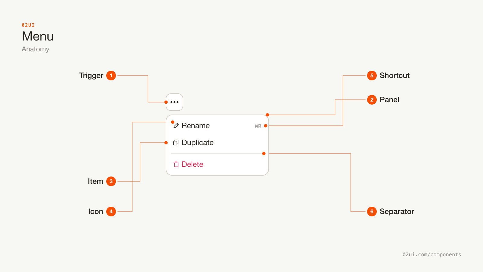
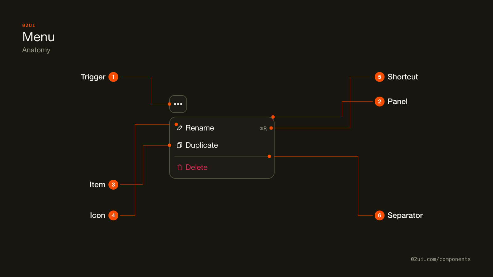
- 1Trigger. A button, usually three dots or a chevron beside a name. Needs to look interactive before anyone knows what it opens.
- 2Panel. Appears near the trigger and flips side when it would otherwise run off the screen.
- 3Item. One action, one to three words, focused with the arrow keys and activated with Enter or Space.
- 4Icon. Optional, but all-or-nothing. Half the items carrying one reads as unfinished.
- 5Shortcut. A trailing keyboard hint shown exactly as the operating system displays its own.
- 6Separator. A divider before the item that can't be undone, doing real work rather than decoration.
Everything here exists to make a short list readable in under a second: one icon style applied consistently, a divider before the item that can't be undone, and a trailing shortcut for the people who'll skip the mouse entirely next time.
Here it is working. Open it, then close it with a click on an item, with Escape, or by clicking anywhere outside.
Open it, then close it with a click on an item, with Escape, or by clicking anywhere outside.
When to use a menu
Use a menu when
- You need to offer several actions without showing every one of them at once, like Rename, Duplicate, Archive and Delete
- The trigger is a button or an icon, like three dots or a chevron beside a name, not a field holding a value
- Choosing an item performs that action immediately
- The list is short enough to read in one glance, roughly under 10 items
Reach for something else when
- The choice sets a value that persists and gets submitted, like a status or a country. Use a select instead.
- There are only 2 or 3 actions and the screen has room to show them without hiding anything. Use a row of buttons instead.
- The list is long enough that someone needs to search or filter it. Use a combobox instead.
- Every item takes someone to a different page or URL. Use a list of links instead.
Variants
Icons paired with shortcuts, an item that opens a submenu, and toggle-style checkbox items.
With icons and shortcuts. A leading icon per action and a trailing keyboard shortcut, the pattern from every desktop application's Edit menu. Consistent icons and consistent shortcut style, or skip both entirely.
With a submenu. An item that opens a second panel instead of running an action, marked with its own trailing chevron so it reads as a step rather than a choice. Reserve this for a genuinely secondary set of options, not a place to hide items that belong at the top level.
With checkbox items. A toggle-style row inside the menu, for view settings like showing or hiding a grid. Still an action list: picking one flips a setting rather than storing a value that gets submitted elsewhere.
States
| State | What changes | Watch out for |
|---|---|---|
| Closed | Only the trigger is visible | The trigger still needs to look interactive on its own, before anyone knows what it opens |
| Open | The panel appears near the trigger, first item gets focus | Only one menu open at a time. Opening a second should close the first |
| Item focused | Background fill on the highlighted row | Contrast of the fill against the panel needs 3:1 (WCAG 1.4.11) |
| Item disabled | Reduced opacity, not focusable | Skipped entirely by arrow key navigation, not just visually dimmed |
| Destructive | Red text, red fill when focused | Colour alone isn't the only signal. A divider above it does the rest of the work |
The disabled state is the one worth double-checking. A dimmed item that keyboard focus can still land on is confusing in a different way than a dimmed item that quietly skips past it, and only the second is correct.
How a menu behaves
It performs an action, not a selection. The moment an item's job is to be remembered and reused elsewhere, like a chosen country, it's a select wearing a menu's clothes.
Only one menu is open at a time. Opening a second, whether it's another menu or a select, closes whatever was open before it.
It positions itself near the trigger and flips when it runs out of room. A menu opened near the bottom of the screen should open upward rather than running off the viewport.
Choosing an item closes the panel, except for a checkbox or radio-style item, which can stay open so someone can flip more than one setting in a row.
Destructive actions get a divider and, for anything irreversible, a confirmation step afterward. A menu is a fast path to an action, not the place to build the confirmation itself.
Menu accessibility
Keyboard
| Key | What happens |
|---|---|
Enter or Space | Opens the menu from the trigger, or activates the focused item once open |
Arrow down / Arrow up | Moves focus between items, wrapping from the last back to the first |
Arrow right | Opens a submenu when the focused item has one |
Arrow left or Escape | Closes a submenu, or the whole menu if none is open |
| Typing a letter | Jumps to the next item starting with that letter |
Tab | Closes the menu and moves focus to the next element on the page |
The rest
- Follow the WAI-ARIA menu pattern. The trigger needs
aria-haspopup="menu"andaria-expanded, the panel needsrole="menu", and each action needsrole="menuitem". - Focus moves into the panel on open, usually landing on the first item, and returns to the trigger on close.
- Disabled items carry
aria-disabled="true"and are skipped by arrow key navigation, not just dimmed in appearance. - Contrast. The focused item's fill needs 3:1 against the panel background (WCAG 1.4.11).
- Target size. 24 by 24 CSS pixels minimum at Level AA (WCAG 2.5.8), comfortably clear of the item above and below it.
What a menu should say
Items are verbs. "Duplicate", "Archive", "Delete", not "Duplication" or "This will delete the file".
Keep every label to one to three words. A menu item is a command, not a sentence.
Name what a destructive action removes, when space allows. "Delete project" carries more than "Delete" once there's any doubt what's being acted on.
Shortcuts match the platform. ⌘ on macOS, Ctrl on Windows and Linux, shown exactly as the operating system displays its own.
Common menu mistakes
A divider and a colour change set Delete apart from everything safe above it.
Delete sits one row below Rename, same weight, same colour, same amount of whitespace between them.
The one that causes real damage is a destructive action sitting one row away from a harmless one, with nothing between them but the same amount of whitespace as everywhere else.
1. Delete with no divider and no distinct colour. A misclick between "Rename" and "Delete" costs someone a file, and both looked the same until the click landed.
2. A menu used to hold a value. Country, plan tier or sort order chosen from a menu instead of a select loses the check mark against the current value and the "opens a value picker" expectation people already carry.
3. Icons on some items, not others. Half a column of icons is worse than none, because the eye keeps trying to align a pattern that isn't there.
4. A menu item that just... doesn't do anything for a second. Every action needs to respond within about 100ms (feedback the person can trust as instant, per Nielsen's classic response-time guidance) even if the real work finishes later in a toast.
5. Burying a common action inside a submenu. Submenus cost an extra step. Reserve them for genuinely secondary choices, not for tidying a top-level list that's actually fine at 8 items.
6. No keyboard access to the trigger at all. A menu triggered only by an onClick handler with no button semantics is invisible to anyone navigating by keyboard.
How to build a menu
<button aria-haspopup="menu" aria-expanded="false" id="row-actions">
  Actions
</button>
<ul role="menu" aria-labelledby="row-actions" hidden>
  <li role="menuitem" tabindex="-1">Rename</li>
  <li role="menuitem" tabindex="-1">Duplicate</li>
  <li role="separator"></li>
  <li role="menuitem" tabindex="-1" class="destructive">Delete</li>
</ul>
const trigger = document.getElementById("row-actions");
const menu = trigger.nextElementSibling;
trigger.addEventListener("click", () => {
  const open = trigger.getAttribute("aria-expanded") === "true";
  trigger.setAttribute("aria-expanded", String(!open));
  menu.hidden = open;
  if (!open) menu.querySelector('[role="menuitem"]').focus();
});
Building this correctly by hand means managing focus, arrow key navigation, type-ahead and outside-click dismissal yourself. Reach for a tested implementation of the WAI-ARIA menu pattern, like Radix's dropdown menu primitive, before rebuilding all of that from scratch.
Edge cases
A trigger near the edge of the screen. The panel needs to flip horizontally rather than running off the viewport, the same rule as vertical flipping.
A very long item label. Truncate with an ellipsis rather than wrapping it to a second line, which breaks the one-glance rhythm of the rest of the list.
Nested submenus more than one level deep. Two levels is already a lot to track. A third rarely earns the navigation cost it adds.
Right to left. The panel's alignment, the chevron on a submenu trigger, and the shortcut column all mirror.
Touch devices. A tap needs the same hit target as a full button, at minimum 44 by 44 points, not a shrink-to-fit row sized for a mouse pointer.
Menus in real products
GitHub uses a kebab menu on nearly every list row (a comment, a file, a workflow run) with Delete or an equivalently destructive action separated by a divider and coloured red every time, applied with total consistency across the product.
Linear pairs almost every menu item with both a leading icon and a trailing keyboard shortcut, which is the model for the "with icons and shortcuts" variant above.
Notion nests block-formatting options inside a submenu off the main block menu, keeping the top-level list short while still surfacing the full set for anyone who opens it.
Common questions
- Menu or select?
- A menu performs an action right away, like Duplicate or Delete. A select stores a value that gets used or submitted later, like a country or a status. If closing the menu is the same thing as the choice taking effect, it's a menu.
- How many items is too many for a menu?
- Past about 10 to 12, group related actions with a divider, or move a rarely used cluster into a submenu. A menu gets read top to bottom in order, so length costs more here than in a value list someone can scan for a familiar shape.
- Should destructive actions look different?
- Yes. Colour the text, usually the same red as an error message, and separate it from the safe actions above it with a divider. For anything that can't be undone, like a permanent delete, the item should open a confirmation step rather than run the action on its own.
- Dropdown menu or context menu, is there a difference?
- Same list of actions, a different way in. A dropdown menu opens from a trigger someone clicks, usually three dots or a chevron beside a name. A context menu opens from a right-click or a long press, positioned at the pointer rather than a fixed trigger.
- Does every item need an icon?
- Either all of them do or none do. A menu with icons on half its items reads as unfinished, and the eye can't build a scanning rhythm around a column that's inconsistent.
Last reviewed 29 JUL 2026