
Accordion
An accordion collapses each section behind its own heading, so a long page can be scanned by its headings before any of it is read. The sections stay in page order, which is what separates it from tabs.
<details><summary>Also called Disclosure, Collapsible, Expander, Show and hide.
Most accordions get added late, when a page has grown long and nobody wants to cut anything. That pays off when the reader is hunting for one answer out of twelve. It costs a click per section when they were going to read all of them.
Anatomy of an accordion
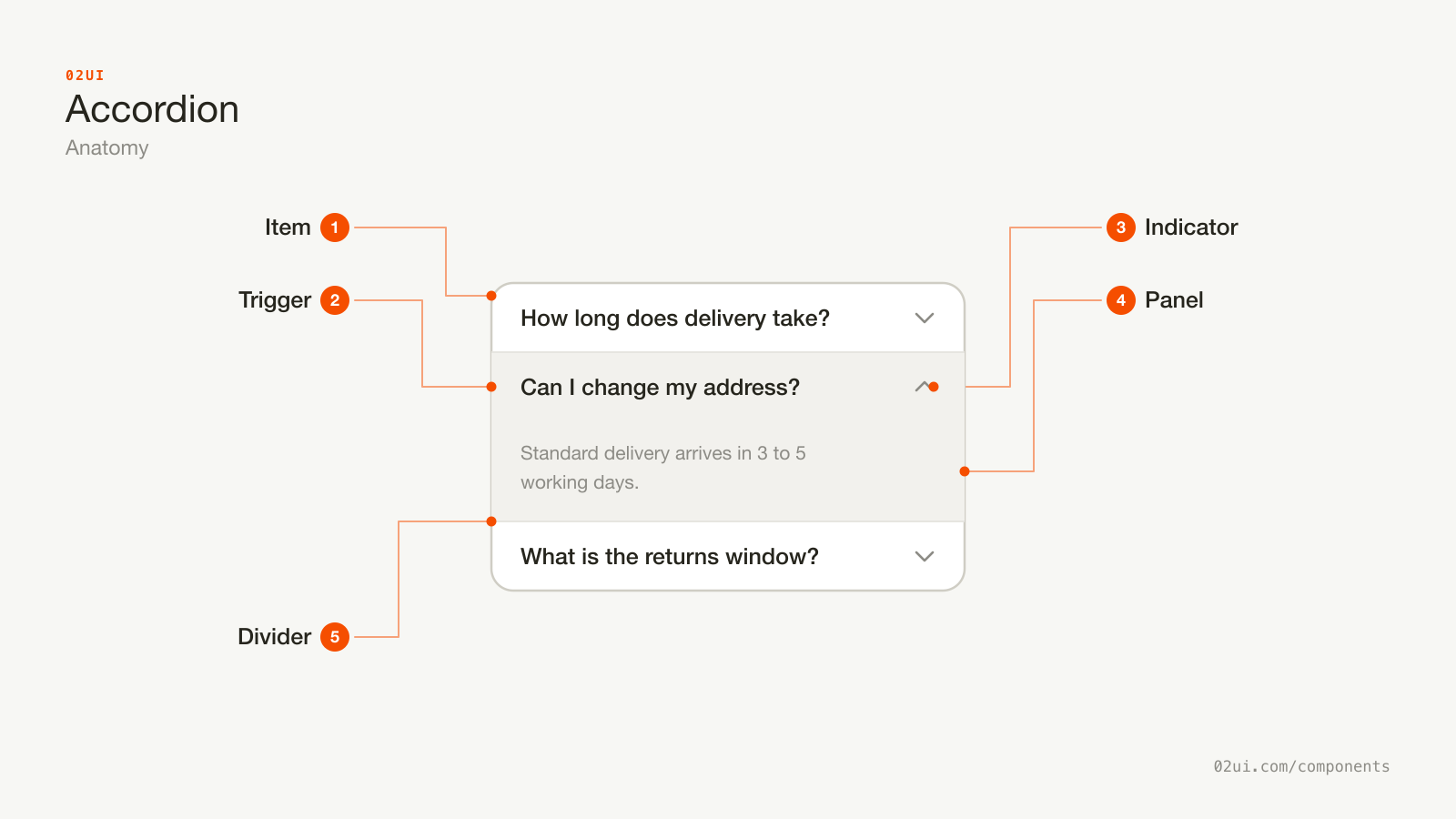
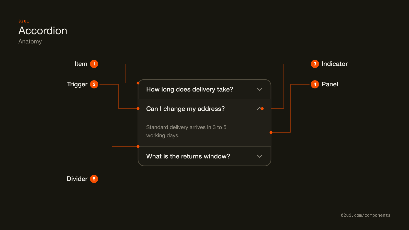
- 1Item. The repeating unit: one heading and the panel it controls. Everything else here belongs to an item.
- 2Trigger. A button wrapped in a real heading element, carrying aria-expanded and pointing at its panel with aria-controls.
- 3Indicator. The chevron that turns when the section opens. It carries state, so it needs 3:1 contrast (WCAG 1.4.11).
- 4Panel. The content revealed by an open item. Hidden rather than removed, which is why find-in-page and print styles can still reach it.
- 5Divider. The line between items. Decorative, so it's exempt from the contrast rules the indicator has to meet.
The repeating unit is one item: a heading you can activate, and the panel it reveals. That heading does two jobs. It's the control, and when everything is closed it's also the only text on screen, so the entire page gets scanned through the headings alone.
Here it is working. Open one section, then a second, and watch the first stay open.
Open one section, then a second. The first stays open, because this set allows more than one at a time.
When to use an accordion
Use an accordion when
- The page is long enough that scanning headings first saves real scrolling
- Each section is optional reading, like an FAQ, a spec sheet or advanced settings
- Someone may want two or three sections open at the same time
- The sections belong in one sequence rather than being alternatives
Reach for something else when
- Everyone reads every section anyway, so collapsing them adds a click each and hides nothing worth hiding. Use plain headings and sections instead.
- The sections are alternatives someone picks between, one at a time. Use tabs instead.
- Each header is really a link to somewhere else rather than a panel of content on this page. Use a navigation menu instead.
- The hidden content is one short sentence explaining a control next to it. Use a tooltip or an inline hint instead.
Variants
Single closes whatever was open, multiple leaves it alone, and a meta value gives the closed row something to scan besides its label.
Single. Opening one section closes whichever was open before. Suits a set where panels are tall and two of them open together would push the remaining headings off screen.
Multiple. Any number of sections open at once, and each one closes only when its own heading is activated again. The safer default for an FAQ or a spec sheet, because it never takes away something the reader chose to open.
With meta. A count, price or status sits at the end of the header, so the closed state carries a value as well as a label. Useful in settings and order summaries, where the number is often the thing being looked for.
States
| State | What changes | Watch out for |
|---|---|---|
| Collapsed | Panel hidden, indicator points down | The heading alone has to say what's inside |
| Expanded | Panel visible, indicator points up, header often gets a background | The indicator must actually turn, since a background change alone is easy to miss |
| Hover | Header background or underline shifts across the whole row | The hover area should match the click area, not just the text |
| Focus | A visible ring on the trigger | Ring sits on the button, not on the panel |
| Disabled | Reduced opacity, not reachable by keyboard | Say why nearby, the same as any other disabled control |
The indicator is the state. A chevron that points down when closed and up when open tells a reader what will happen before they commit, and it keeps working for someone who can't see the background tint. Rotating one glyph is enough; two different icons for the two states makes the pair harder to match.
Disabled accordion items are rare and usually mean something else is wrong. If a section has no content yet, an open panel with a short empty state reads better than a header nobody can press.
How an accordion behaves
Opening a section pushes everything below it down. That's the trade against tabs. The page reflows, and anything the reader was aiming at with the mouse moves. Most systems animate the open and close somewhere between 150 and 250ms, which is short enough that the movement resolves before it registers as a wait.
Closed content stays in the document. It's hidden, not removed, which is why find-in-page, print styles and search engines can all still reach it, and why the content has to be in the HTML rather than fetched on click.
The whole header row is the target. Label, spare space and indicator all toggle the panel. A chevron on its own is a 16px target in a 48px row.
Single or multiple is a content decision, not a style one. It depends on whether two panels are ever worth reading together, which is a question about the content, not about how the set looks.
Accordion accessibility
Keyboard
| Key | What happens |
|---|---|
Tab | Moves focus to the next trigger, then into an open panel's own focusable content |
Enter or Space | Toggles the focused section |
Arrow down / Arrow up | Moves focus between triggers, where implemented. The WAI-ARIA Authoring Practices list this as optional |
Home / End | Jumps to the first or last trigger, also optional |
The rest
- Wrap each trigger in a real heading element.
<h3><button>…</button></h3>, at whatever level fits the page outline. This is the single biggest accessibility win here: screen reader users navigate long pages by heading, and an accordion built from bare buttons disappears from that list entirely. - Follow the WAI-ARIA accordion pattern.
aria-expandedon the button, andaria-controlspointing at the panel's id. - Give the panel
role="region"andaria-labelledbywhen the set is small. The Authoring Practices note that a page with many panels turns into a page with many landmarks, so skip the role on a long FAQ. - Contrast. The indicator carries state, so it needs 3:1 against its background (WCAG 1.4.11), the same bar as any other meaningful non-text element.
- Target size. 24 by 24 CSS pixels minimum at Level AA (WCAG 2.5.8). Making the full header row the target clears this without any extra layout.
- Never state by colour alone. A tinted open header is a fine second signal. The rotating indicator is the first one.
What an accordion should say
Headings answer "is my answer in here". "How long does delivery take?" beats "Delivery". A reader scanning 15 closed rows is matching their question against your words, so the words have to be specific.
Front-load the distinguishing part. "Returns after 30 days" and "Returns within 30 days" are hard to tell apart at a glance. "After 30 days" and "Within 30 days" are not.
Keep headings a similar length. One heading running to three lines while its neighbours run to one makes the set look like a mistake and breaks the vertical rhythm the scan depends on.
Skip "click to expand". The indicator says it, and the same phrase repeated on eight rows costs eight lines of scanning.
Common accordion mistakes
Three optional answers, collapsed so the questions can be scanned in one screen. Nobody needs all three.
The total is what the page exists to show. Collapsing it shortens the page and moves the work onto the reader.
The one I see most often is an accordion wrapping four short sections that would have fitted on screen uncollapsed, so every reader now clicks four times to see a page that used to need none.
1. Collapsing content everyone needs to read. Shipping costs, cancellation terms and the thing the page exists to say all belong open. Collapsing them shortens the page and moves the work onto the reader.
2. A <div> with a click handler for a trigger. It can't be reached by keyboard, it has no role, and it announces nothing. A <button> inside a heading, or a <summary>, comes with all of that already attached.
3. An indicator that points the same way in both states. A plus that never becomes a minus, or a chevron that never turns, leaves the open and closed states looking identical apart from a colour change.
4. Closing the section someone is still reading. Single-open mode does this whenever a reader opens a second section to compare it with the first. If comparing is plausible, allow multiple.
5. Only the chevron responds to a click. People aim at the label, because the label is what they read. Make the whole header row the target.
6. Accordions inside accordions. Two levels of collapse means a reader can't tell whether a section is empty or just closed again. Split the content across pages, or promote the inner sections to their own headings.
7. No way to link to an open section. Support articles get shared as links to one answer. Without a fragment or query parameter that opens the right section, every shared link lands on a wall of closed headings.
How to build an accordion
Native HTML covers most of it:
<details>
  <summary>How long does delivery take?</summary>
  <p>Standard delivery arrives in 3 to 5 working days.</p>
</details>

<details>
  <summary>Can I change my address after ordering?</summary>
  <p>Yes, until the order is packed. After that, contact support.</p>
</details>
That gives you keyboard support, screen reader support and find-in-page with no script. Add name="faq" to each <details> to get one-open-at-a-time behaviour without JavaScript, in browsers that support it.
The ARIA pattern is what you write when you need an animation that works everywhere, or open state synced to the URL:
<h3>
  <button id="acc-trigger-1" aria-expanded="true" aria-controls="acc-panel-1">
    How long does delivery take?
  </button>
</h3>
<div id="acc-panel-1" role="region" aria-labelledby="acc-trigger-1">
  <p>Standard delivery arrives in 3 to 5 working days.</p>
</div>

<h3>
  <button id="acc-trigger-2" aria-expanded="false" aria-controls="acc-panel-2">
    Can I change my address after ordering?
  </button>
</h3>
<div id="acc-panel-2" role="region" aria-labelledby="acc-trigger-2" hidden>
  <p>Yes, until the order is packed. After that, contact support.</p>
</div>
The heading level is the part worth arguing over in review. <h3> here assumes an <h2> above the set. Match the page outline rather than picking a level for its font size.
Edge cases
Deep linking to one section. Read a fragment or query parameter on load, open the matching section and scroll it into view. Write it back when a section opens, so the reader can copy the address bar and send the answer rather than the page.
Find-in-page over collapsed text. Chrome supports hidden="until-found", which lets the browser expand a collapsed panel when a find-in-page match lands inside it. Support isn't universal yet, so treat it as a bonus rather than the reason your content is reachable.
A panel that changes height after it opens. An image or an embed that loads late will jump the layout a second time, after the open animation has finished. Reserve the space with width and height attributes.
Printing. Print styles should force every panel open. A printed page of headings with no answers is a common and quiet failure.
One item on its own. A single collapsible section is a disclosure, and that's a perfectly good thing to build. It just doesn't need arrow key navigation or single-open logic.
Accordions in real products
The GOV.UK Design System accordion puts a "Show all sections" control above the set, which fixes the worst case in one control: a reader who wants everything gets it in one click instead of nine.
Stripe's API reference collapses nested object attributes inside each endpoint, so the response shape can be read at one level and drilled into where it matters. The page would run to thousands of lines fully expanded.
Amazon's product pages collapse technical details and warranty text below the buying area, where a small share of visitors go looking and everyone else scrolls past.
Common questions
- Accordion or tabs?
- An accordion keeps every section in the page flow and can have several open together, which suits content people scan in sequence, like an FAQ or a spec sheet. Tabs show one panel at a time and hide the rest completely, which suits content people pick between, like Overview versus Reviews. On a narrow screen the accordion usually wins, because stacked headings read fine at any width while a row of tabs starts truncating or scrolling.
- Should more than one section be open at once?
- Allow it whenever someone might compare two sections, which covers most FAQs, spec sheets and settings pages. Close-the-others behaviour is worth it only when an open panel is tall enough that two of them would bury the rest of the list. Closing a section the reader opened deliberately, while they are still reading it, is the part that annoys people.
- Should the first section start open?
- Open one section when the page has a clear first answer, so the reader sees what a panel contains before deciding whether to open the rest. Start everything closed when the point of the page is the list of headings, like an FAQ with 15 questions. Either way, pick one rule and apply it to every accordion on the site.
- Does Google index content inside a collapsed accordion?
- Yes. Google has said repeatedly that under mobile-first indexing, content hidden behind an accordion or a tab is indexed and weighted the same as visible content, because collapsing sections is normal on small screens. The content has to be in the HTML, though. If a panel only fetches its text after someone clicks, there is nothing on the page to index.
- Is the native details element enough, or do I need JavaScript?
- A stack of details and summary elements gives you keyboard support, screen reader support and find-in-page for free, with no script at all. Reach for the ARIA pattern when you need something details cannot do on its own: one-open-at-a-time behaviour, a height animation that works in every browser, or open state synced to the URL.
Last reviewed 30 JUL 2026