
Switch
A switch turns something on or off and applies the change immediately. That immediacy is the whole component, and it's the line that separates it from a checkbox.
<button role="switch">Also called Toggle, Toggle switch.
A switch looks like a light fixture because it works like one. Flip it and the thing it controls changes right there, with nothing left to confirm. That immediacy is the entire case for using a switch, and the entire case against using one anywhere the change needs a second step.
Anatomy of a switch
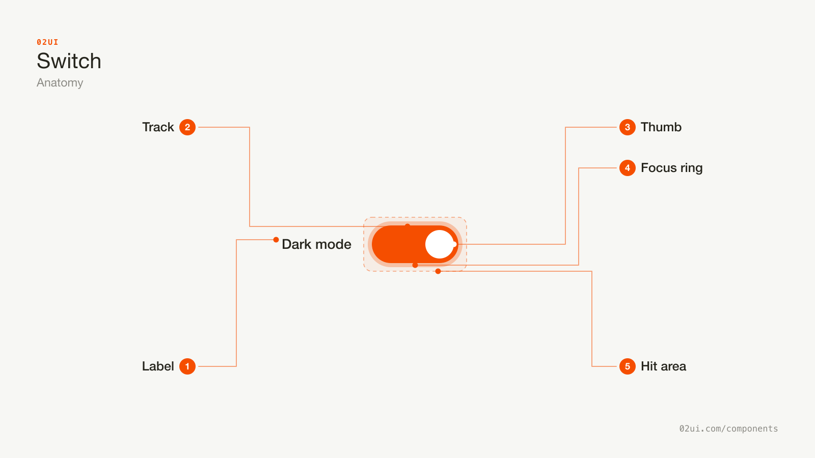
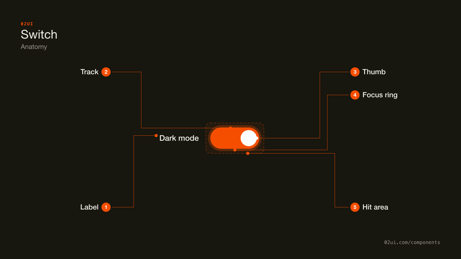
- 1Label. Sits to the left, the reverse of a checkbox. Names the setting, not its state.
- 2Track. The rail. Its fill colour changes with state, but colour is never the only cue (WCAG 1.4.11 covers its 3:1 contrast at rest).
- 3Thumb. Slides from one end to the other. The position change is what actually carries the state.
- 4Focus ring. Drawn here so you can see it. Appears on keyboard focus only, and needs to hold up against both track colours.
- 5Hit area. Extends past the track, at minimum 24 by 24 CSS pixels for WCAG 2.5.8 at Level AA.
The label sits to the left of the track, the reverse of a checkbox. That's a deliberate swap: a switch shows up most often in a settings list, where the name of the thing being controlled matters more than the control itself, so the eye should meet the words first.
Here it is working. Flip it and watch the preview above change, with nothing to save.
No save button anywhere on this stage. Flip it and the preview above updates on its own.
When to use a switch
Use a switch when
- The change should apply the moment it's flipped, with no save step
- There are exactly two states, on and off, with nothing in between
- The setting is independent of the others around it
- You can revert it instantly if the change fails to save
Reach for something else when
- The change should wait for a save or submit button. Use a checkbox instead.
- The control needs a mixed or indeterminate state. Use a checkbox instead.
- Exactly one option must be chosen from several visible choices. Use a radio group instead.
- Flipping it should trigger a one-time action rather than hold a state. Use a button instead.
Variants
The compact row uses the small size, for a list where a full-size switch on every row would crowd the page.
Single. One on or off setting, standing alone. Feature flags, notification toggles, dark mode.
With a description. A second line under the label for a consequence the label alone can't carry, like "Applies to new files only."
Compact. The small size, for a dense list where a full-size switch on every row would crowd the page.
Grouped list. Several independent switches stacked with dividers between rows. Independent is the operative word: flipping one should never move another, unless the relationship is stated outright, the way Airplane Mode names what it's about to disable.
States
| State | What changes | Watch out for |
|---|---|---|
| Off | Track is empty, thumb sits at the start | Contrast still needs 3:1 against the background at rest (WCAG 1.4.11), even with nothing filled in |
| On | Track fills, thumb slides to the end | The fill colour is not the cue on its own. The thumb's position carries the state, so a "reduced motion" preference should slow that slide, never remove it |
| Focus | A ring appears around the track | Needs to stay visible against both the on fill and the off fill |
| Saving | Thumb shows a small spinner, control is inert | Exists only because the change already applied before anyone confirmed it worked. Skip this state and a failed save just looks like nothing happened |
| Disabled | Track and thumb desaturate | Needs a reason nearby, same as a disabled checkbox. A greyed-out switch with no explanation is a dead end |
| Disabled, on | Same treatment, holding the on position | The common case for a setting an admin or a plan tier has locked on |
Saving is the state most switches skip and the one that matters most. A switch applies before anyone presses confirm, which means the request behind it can still fail after the interface has already said yes. Flip it, hold it in a saving state, and either land on the new value or send it back with a reason.
How a switch behaves
The change applies now. This is the whole component. If your switch waits for a save button before doing anything, you've built a checkbox with the wrong drawing on it.
Clicking the label moves it too, for free, once the label and the control are properly associated. Test it by clicking the words, not the track.
A flipped switch confirms or reverts. Treat the request behind it like any other asynchronous action: show it applying, then land on success or send it back with a message.
No cascading surprises, with one named exception. Flipping one switch shouldn't move another, unless the dependency is visible and named, the way turning on Airplane Mode visibly disables wifi and bluetooth rather than silently doing it.
It's always binary. No mixed state, no third option. The moment you need one of those, you're describing a checkbox with a parent, not a switch.
Switch accessibility
Keyboard
| Key | What happens |
|---|---|
Tab | Moves to the next switch. |
Space | Toggles it. |
Enter | Also toggles it. A checkbox reserves Enter for submitting the form; a switch built as a real button gets both keys acting the same way, at no extra cost. |
The rest
- Contrast. The track needs 3:1 against the page in both the on and off fill (WCAG 1.4.11).
- Never colour alone. The thumb's position change already satisfies this for a native switch. A custom build that only recolours the track without moving anything fails it.
- Announce state as on and off, not checked.
role="switch"witharia-checkedgets a screen reader to say "on" or "off", which matches how people already talk about a switch. Announcing "checked" borrows the wrong control's language. - Target size. 24 by 24 CSS pixels at Level AA (WCAG 2.5.8). The track alone is usually smaller than that, so extend the hit area rather than redrawing it larger.
- Focus ring. Visible, and distinguishable from the colour the on state already uses.
What a switch should say
Name the setting, not its state. "Dark mode" beats "Dark mode: on". The switch is already showing the state.
Sentence case, no full stop, no question mark. It's a label for a setting, not a question asking permission.
One sentence in the description line, for the consequence only. "Others can see when you're active" is enough. Save the detail for a help link if there's more to say.
Skip the on and off captions at the track's ends. One label, naming the setting, is enough. See the FAQ above.
Common switch mistakes
One label naming the setting, and the position of the thumb is the only thing saying whether it's on.
Two captions and a control all saying the same thing. The label naming the setting is missing entirely.
The one that shows up most in real products is a switch sitting inside a form next to a save button, so half the fields on the page apply immediately and half wait, with no visual difference between them.
1. A switch inside a form that needs saving. If the rest of the page waits for a submit button, that one control needs to as well, or it needs to be pulled out and marked as different.
2. No revert on a failed save. The switch stays flipped, the request failed silently, and the person now believes something is true that isn't.
3. Labels on both ends of the track. "Off" and "On" printed either side of a switch that already moves to show its state. One label naming the setting replaces both.
4. Custom switches built from two divs. They lose role="switch", the Space and Enter handling, and the "on"/"off" announcement, all of which a real button and aria-checked give you for nothing.
5. A switch standing in for three or more options. "Public", "Private" and "Unlisted" forced into one on/off control loses the middle option. That's a radio group or a select.
6. Tap targets the size of the track. A 20px-tall switch with no padding around it is a common miss on a phone.
How to build a switch
<div class="switch-row">
  <span id="dark-mode-label">Dark mode</span>
  <button
    type="button"
    role="switch"
    aria-checked="false"
    aria-labelledby="dark-mode-label"
    id="dark-mode"
  >
    <span class="switch-thumb" aria-hidden="true"></span>
  </button>
</div>
const button = document.getElementById("dark-mode");
button.addEventListener("click", () => {
  const isOn = button.getAttribute("aria-checked") === "true";
  button.setAttribute("aria-checked", String(!isOn));
});
Building the control on a real <button> means Space and Enter already activate it, so the only state to manage by hand is aria-checked. Safari added a native switch attribute on <input type="checkbox"> in 2024, but support elsewhere isn't there yet, which makes the role="switch" button pattern above the safe default for now.
Edge cases
A switch mixed into a form that also needs a save step. Give it its own visual treatment, a divider or a card, so it reads as a different kind of control rather than one field that happens to behave differently from the rest.
A destructive or hard-to-reverse change. Making a private workspace public, for instance. Add a confirmation step before it applies. This bends the rule that a switch never waits, and that's fine: the rule exists to protect ordinary preferences, not to force an irreversible action through with one click.
A slow backend save. Show the saving state from the table above, and disable the control while the request is in flight so a second flip can't race the first.
Right to left. The on position mirrors. The thumb moves left, not right, when the setting is on.
Dependent switches. Only build a cascade the person can see happening, name what it affects, and let them override the dependent switches afterward if they need to.
Switches in real products
iOS Settings is the reference pattern: label on the left, switch on the right, applied the instant it's touched. Airplane Mode is the one documented exception to "no cascading surprises": turning it on visibly disables wifi and bluetooth, and either one can still be switched back on by hand while Airplane Mode stays engaged.
Notion uses page-level switches (small text, full width, page analytics) that apply the moment they're flipped, with no save button anywhere on that panel.
Slack pairs most of its notification switches with a description line explaining the consequence underneath, which is the model for the "with a description" variant above.
Common questions
- Checkbox or switch?
- Ask when the change happens. If it applies the moment someone clicks it, use a switch. If it waits for a save or submit button, use a checkbox. A settings screen doesn't automatically mean a switch, and a form doesn't automatically mean a checkbox.
- Should a switch have a label on both sides?
- No. One label, naming the setting, positioned consistently (usually to the left of the control in a settings list). Printing "Off" and "On" at either end of the track repeats what the thumb's position already shows.
- Does a switch need a confirmation dialog?
- Only when the change is destructive or hard to reverse, like making a private repository public. For an ordinary preference, a confirmation step defeats the point of a switch, which is that the change is small enough to apply on its own.
- What happens if the change fails to save?
- The switch moves back to where it started and says why. A switch that stays flipped after a failed request tells the person their setting changed when it didn't.
- Is a switch the same as a toggle button?
- Close, but not quite. A toggle button (the bold button in a text editor, held active while bold is on) usually sits inline among other actions and carries no label of its own. A switch always has a label naming the setting it controls.
Last reviewed 29 JUL 2026