
Toast
A toast is a message that appears to confirm something just happened, then leaves on its own within a few seconds. If someone needs to still see it after a reload, it isn't a toast.
<div role="status">Also called Snackbar, Notification, Flash message.
A toast confirms something that already happened and then gets out of the way. That's the whole contract: it shows up, it says what finished, and it leaves before anyone has to do anything about it. The moment a toast needs a decision attached, it's carrying a job it wasn't built for.
Anatomy of a toast
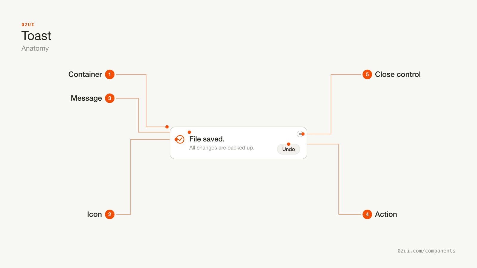
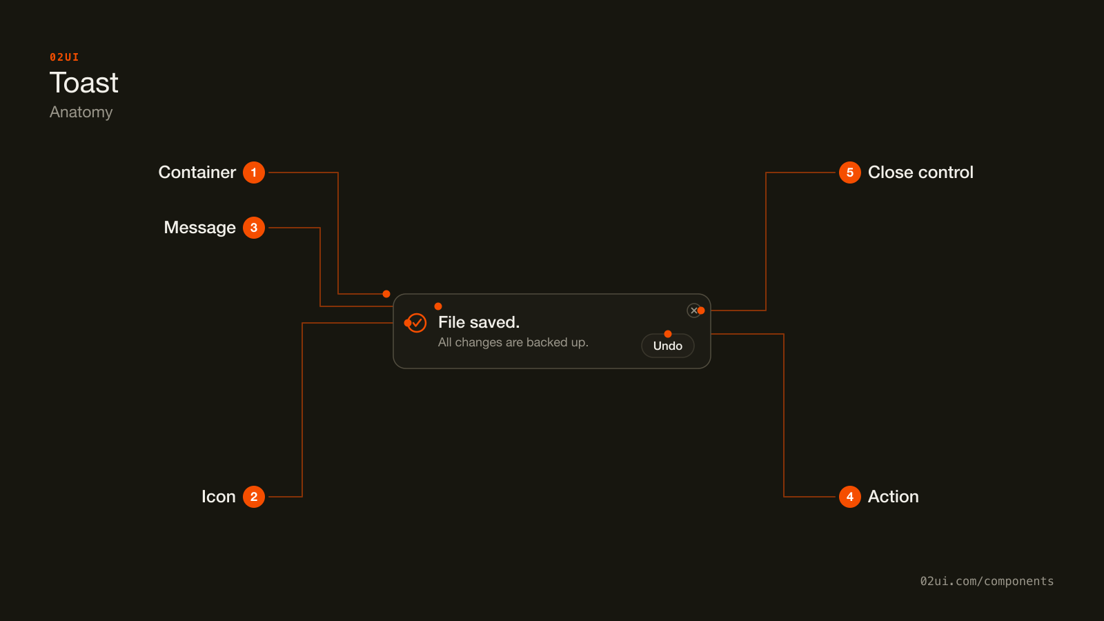
- 1Container. A floating surface, anchored to the same corner every time and stacked above whichever toast came before it.
- 2Icon. Signals success or failure before anyone reads the words, and repeats the meaning for a reader who can't rely on colour.
- 3Message. One short sentence in the past tense, plus an optional lighter line underneath for detail that doesn't fit in the first.
- 4Action. One button at most, usually an undo, that reverses exactly what the message just confirmed.
- 5Close control. An explicit way to dismiss it before the timer would, for anyone who needs longer than the default gives them.
The icon signals success or failure before anyone reads a word, the message says what happened in plain language, and the action, when there is one, is the single thing worth doing about it. The close control exists for anyone who needs longer than the timer gives them.
Here it is working. Click the button and watch how little the toast asks of you.
Click to trigger a real toast, bottom-right of the screen. It leaves on its own in 4 seconds, or press its close control.
When to use a toast
Use a toast when
- Something just finished and the person needs a brief confirmation, not a decision
- The message still makes sense once the screen that triggered it has moved on
- It's fine if someone looks away and misses it entirely
- At most one thing needs undoing, and the undo fits in a single button
Reach for something else when
- The condition is still true after a reload, like a failed payment or an outage. Use a banner instead.
- The problem belongs to one specific field in a form. Use an inline field error instead.
- Someone has to make a decision before continuing. Use a modal instead.
- It's reporting a short status word, not a sentence. Use a badge instead.
Variants
Success, error, a promise that resolves into one or the other, an undo action, and a description line.
Success. Confirms something finished the way it was supposed to. "File saved."
Error. Something failed. Worth a longer duration or no auto-dismiss at all, since the person still needs to read what to do next.
Loading, then resolving. Starts as a spinner for a request in flight and swaps its own icon and message once the promise settles, rather than showing a separate toast for each step.
With an action. One button, usually undo, that reverses the thing the toast just confirmed. "Message deleted. Undo."
With a description. A bolded first line plus a quieter second line for detail that doesn't fit in one sentence, like a filename or a size.
States
| State | What changes | Watch out for |
|---|---|---|
| Entering | Slides or fades in, usually from the edge it's anchored to | Keep it under about 300ms. A slow entrance makes a quick confirmation feel like it's arriving late |
| Visible | Sits on its timer, counting down toward auto-dismiss | The timer starts the moment it renders, not when someone actually looks at it |
| Paused | Hovering or focusing the toast stops the countdown | This has to work with keyboard focus too, not just the mouse (WCAG 2.2.1) |
| Action pressed | The action runs, then the toast usually dismisses itself | Confirm the action actually completed before the toast disappears, or the confirmation is a lie |
| Stacked | A new toast pushes older ones back or off, depending on how many are visible at once | Cap how many render at full height, and collapse the rest rather than filling the screen |
| Exiting | Fades or slides out, reversing the entrance | The layout under it shouldn't jump, since a toast floats above the page rather than sitting in its flow |
How a toast behaves
It leaves on a timer, not a condition. This is the entire difference from a banner. If your toast needs to stay until someone deals with it, the component underneath it is wrong, not the duration.
It never blocks the page. No overlay, no focus trap. Someone can keep working while it's on screen, which is the point of using one instead of a modal.
Only the newest matters when several stack. Older toasts compress, move back, or expire early rather than piling up as a wall of messages nobody reads in order.
Hover or keyboard focus pauses the countdown. Reading a toast shouldn't be a race against its own timer, and this is the mechanism that keeps it from being one.
It announces itself without moving focus. A screen reader hears it through a live region while keyboard focus stays exactly where it was, so triggering a toast never interrupts whatever someone was already doing.
Toast accessibility
Keyboard
| Key | What happens |
|---|---|
Tab | Reaches the action or close button if the toast currently has focus. It isn't part of the normal tab order otherwise, so it never steals focus from the page. |
Escape | Dismisses the focused toast early. |
Alt + T | Sonner's own default: jumps focus straight into the toast region, useful for a keyboard user who wants to reach a toast without tabbing through the whole page first. |
The rest
- Live region, matched to severity.
role="status"(aria-live="polite") for most toasts, so it's announced without interrupting other speech.role="alert"(aria-live="assertive") for an error worth interrupting for. - Timing is adjustable. Pausing on hover and focus is the accommodation WCAG 2.2.1 is asking for, short of removing the time limit entirely.
- Contrast. 4.5:1 for the message text against the toast's background (WCAG 1.4.3), checked for every severity variant, not just the default.
- Never colour alone. The icon and the wording carry success or failure. Colour is what a sighted reader notices first, not what carries the meaning (WCAG 1.4.1).
- Target size. 24 by 24 CSS pixels for the close control and any action button (WCAG 2.5.8).
What a toast should say
State what happened, in the past tense. "File saved" or "Invite sent" beats "Saving..." left on screen after the save already finished.
Name the object. "Report.pdf deleted" beats "Item deleted." A reader with three tabs open needs the noun, not just the verb.
Keep the action's label literal. "Undo" undoes. "View" navigates. Don't make someone guess what a vague label like "Details" is about to do.
Skip the toast for anything already visible elsewhere. A field that already shows a green checkmark doesn't need a second confirmation floating over it.
Common toast mistakes
One confirmation, one action to reverse it. Gone in a few seconds either way.
This can't be undone.
A decision that can vanish on a 4-second timer. This is a modal wearing a toast's shape.
The most common failure isn't a toast that looks wrong. It's one that vanished before anyone finished reading it.
1. A toast for a condition that's still true tomorrow. A failed payment or an expired trial belongs in a banner, not a message that disappears in 4 seconds.
2. No pause on hover or focus. Reading becomes a race against a timer nobody agreed to.
3. An error that auto-dismisses like a success would. Someone needs time to actually read what to fix, not four seconds and a guess.
4. Toasts stacking without a limit. Five confirmations queued at once just means the oldest four get skipped.
5. A toast sitting on top of the exact control someone needs next. Anchor it somewhere that doesn't cover the primary action on the screen it belongs to.
6. An undo button with nothing left to undo. If the delete already ran and can't be reversed, don't offer an action that quietly does nothing.
How to build a toast
<div class="toast" role="status" aria-live="polite">
  <svg aria-hidden="true"><!-- success icon --></svg>
  <div class="toast__content">
    <p class="toast__message">Message deleted.</p>
  </div>
  <button type="button" class="toast__action">Undo</button>
  <button type="button" class="toast__close" aria-label="Dismiss">×</button>
</div>
Swap role="status" for role="alert" on an error worth interrupting for. Pausing the dismiss timer on :hover and :focus-within is what keeps this accessible, not just polite.
Edge cases
Several toasts fire in quick succession. Cap the number rendered at full height, usually 3 to 5, and either replace or stack the rest rather than covering more of the screen with each one.
The tab loses focus while a toast is showing. Its timer still runs in the background. Decide whether it should still be there when someone returns, or whether it should have already expired.
A duplicate action fires twice. Debounce or disable the trigger for the action a toast confirmed, so someone can't click undo on a toast that's already gone.
Right to left. The icon, the action and the close control mirror to the opposite side, and the whole toast anchors to the opposite screen edge.
Reduced motion. Cut the slide or fade to an opacity change, or skip the animation outright, for anyone with prefers-reduced-motion set.
Toasts in real products
Gmail shows a toast with an undo action every time an email is archived or deleted, timed long enough to catch a misclick before it becomes permanent.
Figma confirms a file rename or duplicate with a brief toast in the corner, never blocking the canvas someone is still working on.
Linear uses a toast to confirm an issue moved between states, stacking a second one on top rather than replacing the first if two updates land close together.
Common questions
- Toast or banner?
- Ask whether the message would still be true on a reload. A toast confirms something that already finished, like a saved file, so there's nothing left to track once it's gone. A banner describes a condition that's still there the next time the page loads, like an unpaid invoice.
- How long should a toast stay on screen?
- Material Design's snackbar spec suggests 4 seconds for a short message and up to 10 for one carrying an action. Sonner, the library behind this site's demos, defaults to 4,000ms. Whatever the number, pause the timer on hover or keyboard focus, which WCAG 2.2.1 effectively requires for anything with a fixed time limit.
- Should a toast have a close button?
- Yes, even though it disappears on its own. Someone reading slowly, or using a screen reader that needs to stop and process the announcement, needs a way to keep it open past the timer, and a visible close control is the simplest way to give them one.
- Can a toast hold more than one action?
- No. One action, usually an undo. A second option turns a passive confirmation into a decision, and a decision that can vanish in 4 seconds is the wrong shape for that job.
- Where should toasts appear on screen?
- Bottom-right is the common desktop convention, and it's sonner's default position. Top-center works better on mobile, where a thumb often rests near the bottom edge. The exact corner matters less than picking one and never moving it.
Last reviewed 30 JUL 2026