
Card
A card groups related content into one visible unit, so a person can scan several of them at once and compare. That comparison is the only reason to draw the border in the first place.
<article>Also called Tile, Panel.
A card is a border doing a job: telling someone where one unit of content ends and the next one starts. That job only matters when there's a next one. A single card sitting alone on a page is a box around something that didn't need a box.
Anatomy of a card
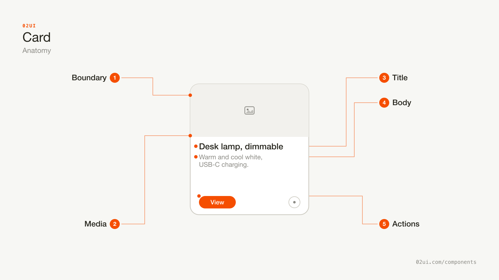
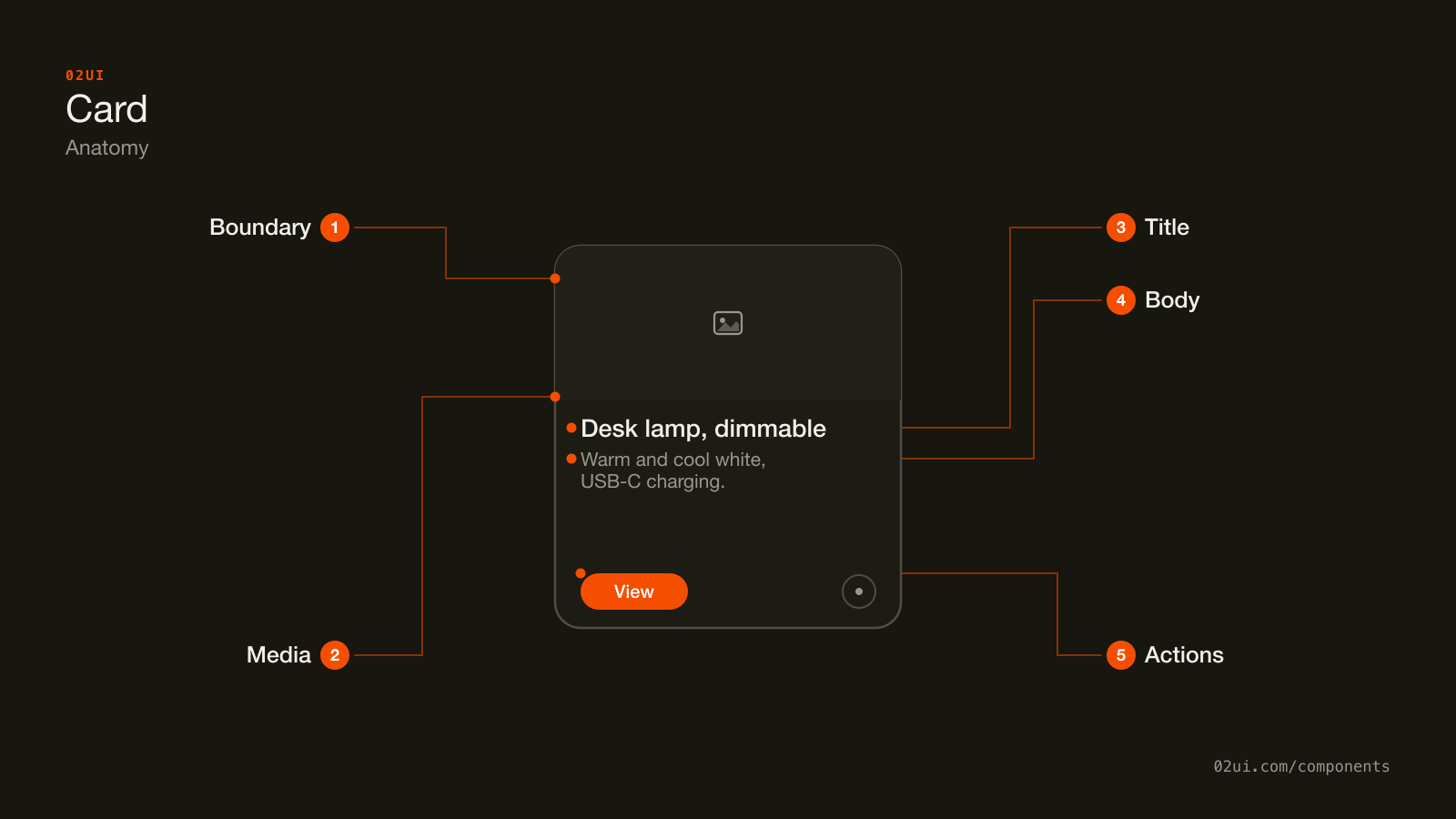
- 1Boundary. The border or shadow marking where this unit ends and the next one starts. Needs 3:1 contrast against the page (WCAG 1.4.11).
- 2Media. Optional. An image or icon, useful when it helps someone tell cards apart at a glance.
- 3Title. The one thing the card is about. Uses a real heading level, and carries the stretched link when the card is clickable.
- 4Body. Supporting text or metadata. Stays selectable even when the rest of the card is one click target.
- 5Actions. The primary destination, plus any secondary control positioned above it so it stays independently clickable.
Media is optional. A card built from a title and a line of text needs no image at all. What it can't skip is the boundary, because that's the one part doing the actual job of separating this unit from its neighbours.
Here it is working. Click anywhere on the card, then try selecting the body text.
Wireless keyboard, backlit
The title carries the real anchor, stretched over the whole card. Click anywhere on the card, then try selecting this paragraph.
When to use a card
Use a card when
- A group of content forms one unit that makes sense lifted out and dropped somewhere else, like a product, a post preview, or a contact
- Several of those units repeat in a grid or list, and a visible boundary helps compare them at a glance
- Each unit carries its own destination or action, separate from the one beside it
Reach for something else when
- The content is rows of the same attributes, meant to be scanned down a column and compared. Use a table instead.
- There's a single destination and nothing else on the page needs comparing against it. Use a plain link instead.
- Exactly one option from a small set needs choosing, even if it's drawn as a bordered block. Use a radio group instead.
- It's a short label or count attached to something else, not a standalone unit. Use a badge instead.
Variants
Wireless keyboard
Invoice #4021
Desk lamp, dimmable
The list row skips the image entirely. The footer variant keeps the save button outside the stretched link, layered above it with z-index. The selectable variant is a radio group wearing a card's paint.
Media card. Image on top, title and description below. The default for products, posts, and listings.
List row. No image, just a title and metadata in a single line. Reaches for a card's boundary without the space a media card needs, useful in a sidebar or a narrow column.
With footer actions. A primary destination plus one or two secondary controls, like a save icon or an overflow menu, sitting outside the card's own stretched link.
Selectable card. A card-shaped option inside a radio group or a checkbox group, for plans and payment methods where the option needs room for a price or a description. The paint is a card. The control underneath is a radio or a checkbox, not a click handler on a div.
States
| State | What changes | Watch out for |
|---|---|---|
| Default | Border and, optionally, a shadow | The border needs 3:1 contrast against the page (WCAG 1.4.11) |
| Hover | Border, shadow, or background shifts | Only meaningful if the card is actually clickable |
| Focus | A visible ring around the card | Lands on the stretched link, not the whole rectangle as a separate stop |
| Loading | Image and text replaced with a skeleton | Match the real card's proportions so nothing reflows when content arrives |
| Disabled | Faded, no hover or focus state | Say why nearby, the same rule as a disabled button |
Loading is worth its own look. A card-shaped skeleton that doesn't match the eventual card's proportions causes a layout jump the moment real content lands. Build the skeleton from the same dimensions.
How a card behaves
One destination. A card that links somewhere sends the whole rectangle to the same place. If there's a genuinely separate second action, like save or delete, it sits visibly apart from the stretched link, usually in a corner, with its own focus stop.
The title is the accessible name. Whatever the anchor wraps becomes what a screen reader announces for the whole card. Wrap the title, not the description, not the image.
Nothing nests inside the stretched link. A button placed inside the anchor that stretches over the card either fails to render, because browsers don't allow interactive elements nested inside other interactive elements, or captures the click and breaks the stretch. Secondary actions live outside the anchor and are positioned on top of it with position: relative and a higher z-index.
Equal height in a grid. Cards of wildly different heights in the same row break the left-to-right scan a grid exists to support. Fix uneven content with a fixed image aspect ratio and a line-clamped description, not by hoping the text lengths match.
Card accessibility
Heading level
A card's title should use whatever heading level is correct for its position in the page outline, usually an h2 or h3, not a div sized to look like one. Screen reader users navigate by heading level, and a grid of cards with no real headings is a grid of unlabelled stops.
Keyboard
| Key | What happens |
|---|---|
Tab | Moves to the card's stretched link, and separately to any secondary action inside it. |
Enter | Activates whichever of those currently holds focus. |
A card is not its own separate control. It's a container around a link, or a container around a link and a button. The keyboard behaviour is entirely inherited from whatever real interactive elements sit inside it.
The rest
- Contrast. The border needs 3:1 against the page background at Level AA (WCAG 1.4.11).
- Focus visible. The ring shows on the stretched link, sized to the card, not a thin outline around the small piece of text underneath.
- Target size. The whole card is the hit area once the link is stretched, well past the 24 by 24 CSS pixel minimum (WCAG 2.5.8).
- Alt text. Empty for decorative images, descriptive when the image adds information the title doesn't cover.
What a card should say
Front-load the title. "Wireless keyboard, backlit" beats "A backlit keyboard that connects wirelessly", because someone scanning a grid reads the first two or three words of each card and decides whether to keep reading.
Never repeat the same call to action across a grid. A dozen cards all saying "Learn more" pass WCAG 2.4.4, which accepts link text that makes sense in context, but fail 2.4.9, which asks it to make sense pulled out of context, the way a screen reader's links list pulls it. Name the thing: "See the wireless keyboard".
Metadata stays short. A date, a price, a count. If it needs a sentence, it belongs in the description, not sitting next to the title as a label.
Common card mistakes
The title carries the only anchor, stretched over the card. The save icon sits outside it and stays independently clickable.
One anchor around everything. The heart looks clickable and isn't, the price can't be selected, and the accessible name reads as the whole card said out loud.
Cards get reached for by habit more than by decision, and most of what goes wrong traces back to that.
1. The whole card wrapped in one anchor. Every word inside becomes unselectable, and the accessible name becomes the entire card read as a single sentence. Stretch the link from the title instead.
2. A button nested inside the stretched anchor. Breaks in every browser that enforces no nested interactive elements, which is all of them.
3. A card around a single item with nothing beside it. The border is comparing this thing to a neighbour that doesn't exist.
4. The same CTA text on every card in a grid. Passes the letter of WCAG 2.4.4 and fails what a screen reader user actually needs.
5. A shadow with no border, tested only in light mode. Ships invisible in dark mode, or on any background the shadow wasn't tuned against.
6. Uneven card heights breaking the grid's scan line. Fix the image ratio and clamp the description rather than letting content length decide the shape.
7. A click handler on a div standing in for a real link or button. Loses focus, loses Enter and Space, loses "open in a new tab". If it goes somewhere, it's an anchor underneath. If it does something, it's a button.
How to build a card
<article class="card">
  <img src="keyboard.jpg" alt="">
  <h3><a href="/products/wireless-keyboard">Wireless keyboard, backlit</a></h3>
  <p>Bluetooth, USB-C charging, three device slots.</p>
  <button class="card-save" aria-label="Save for later">♡</button>
</article>
.card { position: relative; }
.card h3 a::after {
  content: "";
  position: absolute;
  inset: 0;
}
.card-save {
  position: relative; /* sits above the stretched pseudo-element */
  z-index: 1;
}
::after on the title's anchor stretches an invisible layer over the whole card, so a click anywhere lands on that one real link. The position: relative and z-index: 1 on the secondary button lift it back above that layer, which is what keeps it independently clickable rather than getting swallowed by the stretch.
Edge cases
A card inside a card. Nested boundaries read as a single confused unit. If content genuinely needs a card within a card, at least one of them isn't really a card.
Long titles. Clamp with -webkit-line-clamp and a fixed number of lines, rather than letting the card grow to fit. The full title stays in the DOM and in the accessible name either way, only the paint is clamped.
No image. Fall back to the list-row variant rather than a placeholder box, which reads as a broken image to anyone glancing at the grid.
Right-to-left. The stretched-link technique and the secondary action's position both use logical properties without any change, since inset and z-index aren't directional.
A grid that never ends. Past a few dozen cards, add pagination or load more, the same threshold problem a long list has anywhere else on the page.
Cards in real products
Airbnb's listing cards stretch the link across the whole image and title, with the save heart sitting in the top corner as a separate button layered above it, which is the pattern this page recommends built at scale.
Trello's board cards are the whole interaction model of the product: each one opens a detail view on click and can be dragged to another list, so the card itself carries more state than a typical preview card ever needs to.
Stripe's dashboard summary cards are deliberately not clickable at all. They display a number and a trend line and nothing else, which is a fair reminder that a card is a layout unit first and a link second, not the other way round.
Common questions
- Should the whole card be clickable, or just the title?
- Visually, the whole card. Structurally, only the title should be the anchor, stretched over the card with a pseudo-element. That keeps the title as the accessible name, keeps the body text selectable, and still lets a click anywhere on the card navigate.
- Card or table?
- Ask how the content gets read. If someone scans down a column comparing the same attribute across rows, that's a table. If each item stands alone and gets read as a unit, that's a card. Product listings are cards. A pricing comparison of the same three attributes across five plans is a table wearing a grid layout.
- Is a shadow enough, or does a card need a border?
- A shadow alone assumes a light source and a background that shows it, and it often disappears against a dark background entirely. A 1px border holds up in both themes and at every zoom level. Use both if you like the depth, but the border is the one doing the accessibility work.
- How many actions can one card have?
- One primary destination, plus optional secondary actions that sit outside the stretched link, like a save icon or an overflow menu. More than one primary action competing for attention is the point where a card should probably split into two.
- Does a card's image need alt text?
- If the image adds information the title doesn't already say, yes, write it. If it's decorative, an empty alt="" is correct and stops a screen reader announcing a filename nobody needs.
Last reviewed 29 JUL 2026