
Popover
A popover is floating content anchored to a trigger, and the one thing that separates it from a tooltip is that someone can click inside it. The moment content needs a click, it's a popover, not a tooltip.
<div popover>Also called Flyout, Card popup, Overlay panel.
A popover is the overlay with the least agreement on what it actually is, because almost anything floating and anchored to a trigger gets called one. The test that actually matters: if a person can click something inside it, it's a popover. If not, it's a tooltip wearing a bigger box.
Anatomy of a popover
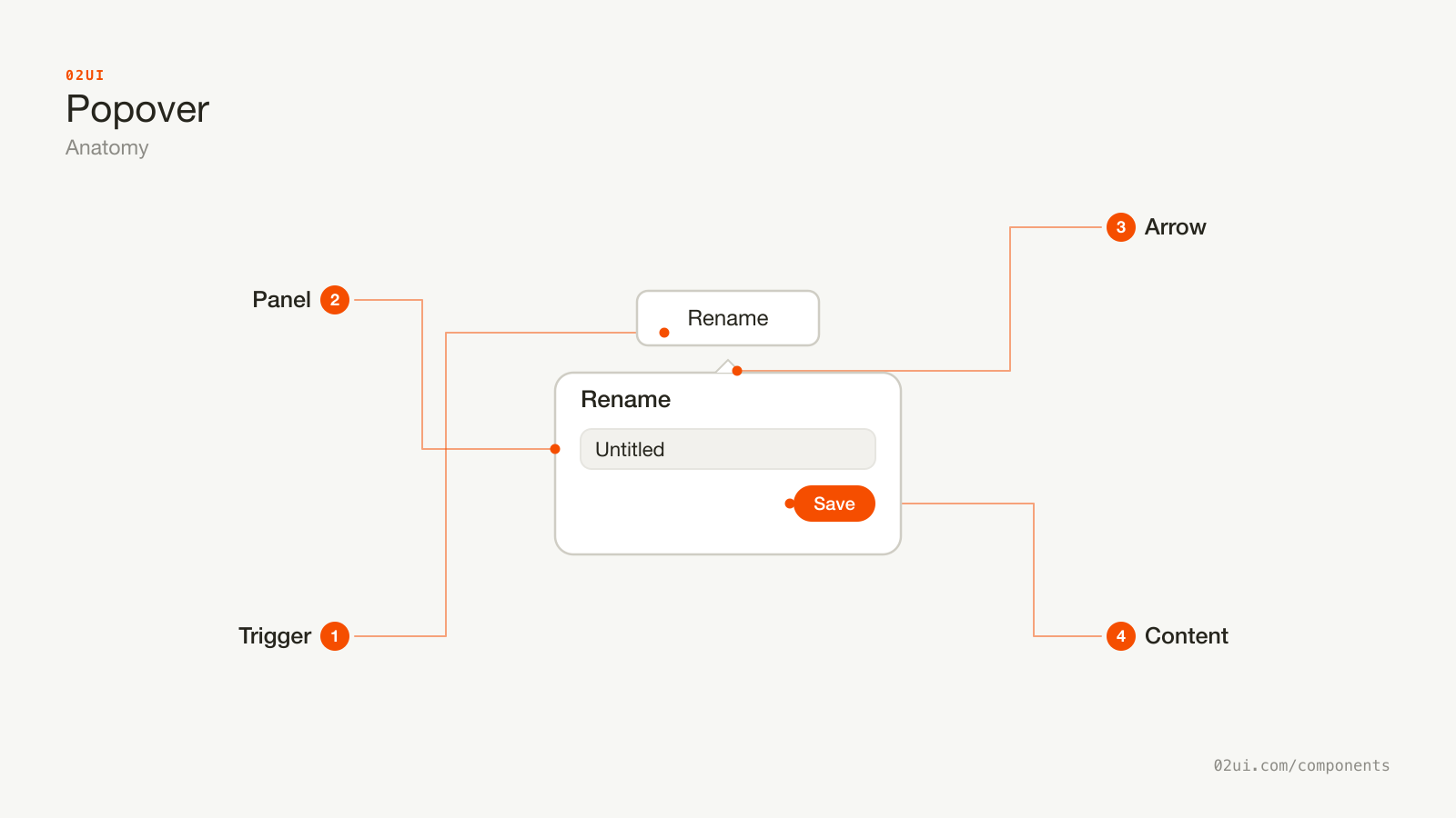
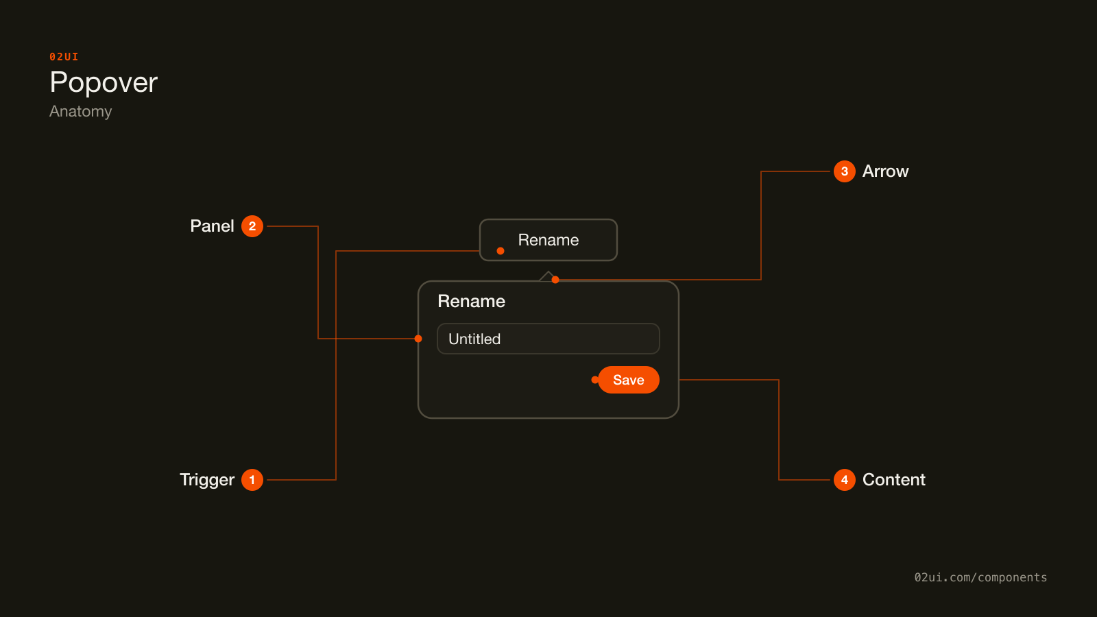
- 1Trigger. The control that opens the panel, usually a button with its own visible affordance.
- 2Panel. The floating container, positioned by the anchoring logic and flipped to the opposite side near a viewport edge.
- 3Arrow. Optional. Worth it only when more than one trigger sits close enough that the panel's owner could be ambiguous.
- 4Content. Whatever the popover holds: a field, a link, a small form. Unlike a tooltip, every part of this can be clicked into.
The arrow is optional, same as a tooltip's, and for the same reason: skip it unless more than one trigger sits close enough that the popover's owner would otherwise be ambiguous.
Here it is working. Open it, click into the field, then press Tab until focus leaves the panel and watch it close on its own.
Open it, click into the field, then press Tab until focus leaves the panel and watch it close on its own.
When to use a popover
Use a popover when
- The content includes something clickable: a link, a button, a form field, a colour swatch
- It's a short, self-contained task tied to one specific control, like editing a due date or choosing a label
- Losing the surrounding page is fine because the popover only needs a moment of attention
- The trigger's context matters. Anchoring near it, unlike a modal, keeps the connection visible
Reach for something else when
- The content is a short, non-interactive label with nothing to click. That's simpler and cheaper. Use a tooltip instead.
- The task is significant enough to justify blocking the whole page, like a destructive confirmation. Use a modal instead.
- It's a list of actions that each run something immediately, like Rename or Delete. Use a menu instead.
- The content needs real space, more than a small form or a short list, or benefits from staying open while someone scans the page behind it. Use a drawer instead.
Variants
Info panel, a short form, and a date picker. All three close on outside click and Escape, none of them trap focus.
Info panel. A richer version of a tooltip's job, for content with more than one sentence or a link inside it, like an explanation with a "Learn more" link attached.
Form. A short, self-contained input tied to the trigger, like renaming an item or editing one field without leaving the page.
Date picker. A calendar anchored to a field, closing the moment a date is chosen. Covered in full on its own page.
States
| State | What changes | Watch out for |
|---|---|---|
| Closed | Only the trigger is visible | The trigger needs its own clear affordance, since nothing about a plain button says "opens a panel" without one |
| Open | Panel appears anchored to the trigger, first field or element gets focus | Only one popover open at a time, same rule a menu follows |
| Focus inside | Tab moves between the panel's own controls | Reaching the last control and pressing Tab again should leave the panel, not loop back to the first one |
| Repositioned | Panel flips side when it would run off the viewport | Flipping shouldn't detach it from the trigger it belongs to |
The "focus inside" state is where popovers most often get built wrong, usually by copying a modal's focus trap wholesale. A popover isn't a modal in miniature. Tab is allowed to leave it.
How a popover behaves
Anchors to its trigger and repositions if the trigger moves or the viewport is too small for its current placement, flipping side rather than running off screen.
Opens on click, not hover. Hover is a tooltip's job, and using it for something with clickable content inside makes that content unreachable for anyone who can't hover precisely enough to keep it open.
Does not trap focus. Tab moves through the panel's own controls and then continues into the rest of the page, closing the popover as it leaves. This is the single biggest difference from a modal.
Closes on outside click, on Escape, and often after committing a choice (a date picked, a colour selected), the same as a menu closes once an item is chosen.
Only one popover open at a time. Opening a second, or opening a menu or a select, closes whatever popover was already open.
Repositions on scroll and resize. A popover that stays glued to a stale position once its trigger has moved is pointing at nothing.
Popover accessibility
Keyboard
| Key | What happens |
|---|---|
Enter or Space | Opens the popover from the trigger |
Tab | Moves focus through the panel's controls, then out onto the rest of the page, closing the popover |
Shift+Tab from the first control | Moves focus back to the trigger and closes the popover |
Escape | Closes the popover and returns focus to the trigger |
The rest
- Role and relationship. The trigger needs
aria-haspopup="dialog"(or the more specific role the content calls for) andaria-expanded. The panel itself commonly carriesrole="dialog"withoutaria-modal, the detail that tells assistive tech it doesn't block the page. - No focus trap. Unlike a modal, letting focus leave into the page is correct here, not a bug to fix.
- Contrast. The panel needs to read as a distinct surface against the page behind it, and its text needs 4.5:1 against the panel background (WCAG 1.4.3).
- Target size. Every clickable element inside needs 24 by 24 CSS pixels at minimum (WCAG 2.5.8).
- Zoom. At 200 percent zoom the panel has to stay inside the viewport. Flip its placement rather than letting it clip off screen.
What a popover should say
Title only if the content needs one to make sense on its own. A single form field rarely does. A multi-step form or a longer explanation usually does.
Keep it to one task. A popover holding two unrelated forms is a sign the trigger is doing two jobs and needs to be split into two triggers.
A visible primary action for anything that needs committing, like "Save" on a rename field, rather than relying on outside-click alone to imply the value was saved.
Common popover mistakes
The most common one looks identical to a tooltip bug: something opens on hover that has a link inside it, and the link is unreachable the moment the pointer moves toward it.
Opens on click, so the link inside is reachable by anyone who opens it, mouse or keyboard.
A tooltip closes the moment the pointer leaves the trigger, so the link mentioned inside it can never actually be reached.
1. Opens on hover. Anything clickable inside becomes unreachable, because leaving the trigger to reach the content closes the popover first.
2. A focus trap copied from a modal. Tab should be able to leave the panel and close it, not cycle forever inside a form that was never meant to block the page.
3. No visible trigger affordance. A plain-looking button that happens to open a panel gives no signal that anything will appear.
4. Stacking a popover from inside another popover. Two floating panels competing for the same outside-click and Escape handling is confusing to build and to use. Combine the content into one panel instead.
5. Content that needed a whole page. A popover holding a five-field form with its own validation and a multi-step flow inside it has outgrown the component. Move it to a page or a drawer.
6. No repositioning near the viewport edge. A popover that opens partially off screen because it never learned to flip sides is unreadable for anyone who can't scroll it back into view.
How to build a popover
<button aria-haspopup="dialog" aria-expanded="false" id="rename-trigger">
  Rename
</button>
<div role="dialog" aria-labelledby="rename-trigger" hidden>
  <label for="rename-input">New name</label>
  <input id="rename-input" type="text" />
  <button>Save</button>
</div>
Anchoring correctly, the part every hand-rolled version underestimates, means computing available space on every side of the trigger, flipping when the preferred side would clip, and recalculating on scroll and resize. Floating UI is the library most implementations reach for to solve this without reinventing it. Reach for a tested implementation of the WAI-ARIA pattern, like Radix's popover primitive, before building the rest (outside-click detection, Escape handling, returning focus on close) from scratch.
Edge cases
Near a viewport edge. Flip placement to the opposite side rather than clipping, the same rule a tooltip and a menu both follow.
The trigger moves or unmounts while the popover is open, in a virtualised list or an animated layout. Recalculate position on scroll, or close on scroll, which is simpler and usually right.
Content taller than the remaining viewport space. Scroll inside the panel rather than letting it run off the bottom of the screen.
Nested inside a modal. A popover opened from a trigger inside a modal is fine, since it doesn't trap focus itself. The modal's own trap still applies to the page as a whole, and the popover just adds a second floating layer within it.
Right to left. Placement and the arrow direction both mirror, the same as a tooltip.
Popovers in real products
Linear uses a popover for setting a due date on an issue, anchored right at the field it edits, closing the instant a date is picked rather than needing an explicit save.
Figma opens a colour picker as a popover from a fill swatch, keeping the canvas visible and interactive-adjacent while someone dials in a value.
Notion uses a popover for the page icon and cover picker, a short, self-contained choice tied to one control, closing the moment something is selected.
Common questions
- Popover or tooltip, what's the actual test?
- Can someone click something inside it? A tooltip is read-only and disappears the moment the pointer leaves the trigger, which makes anything clickable inside one unreachable. If the content needs a click, even a single link, it's a popover.
- Does a popover need a focus trap like a modal?
- No, and this is the detail most implementations get wrong by copying the modal pattern wholesale. A popover traps nothing. Tab can walk out of it and onto the rest of the page, which then closes the popover, the same way a click outside does.
- Should a popover close when someone clicks outside it?
- Yes, always, along with Escape. Unlike a modal, a popover has no alert-dialog equivalent that ignores dismissal. If the content is important enough to force a decision, it's not a popover's job.
- How is a popover different from a dropdown menu?
- A menu holds a list of actions where choosing one closes the panel and runs the action. A popover can hold anything: a form, a calendar, a colour picker, more than one field. If someone can only pick one item from a list and nothing else, it's a menu wearing a popover's clothes.
- What happens if the trigger scrolls out of view while the popover is open?
- Close it, or recalculate its position on every scroll and resize event. A popover that stays anchored to a trigger's old position after the trigger has moved points at nothing.
Last reviewed 29 JUL 2026