
Date picker
A date picker opens a calendar so someone can choose a date by tapping it instead of typing it. That calendar is worth the extra click only when seeing the days actually helps, which is less often than the component gets reached for.
<input type="date">Also called Calendar picker, Date field.
A date picker trades one interaction, typing six or eight characters, for another, opening a calendar and tapping a day. That trade is only a win when the calendar view adds something typing can't, like which days are already booked or how a chosen date sits against today.
Anatomy of a date picker
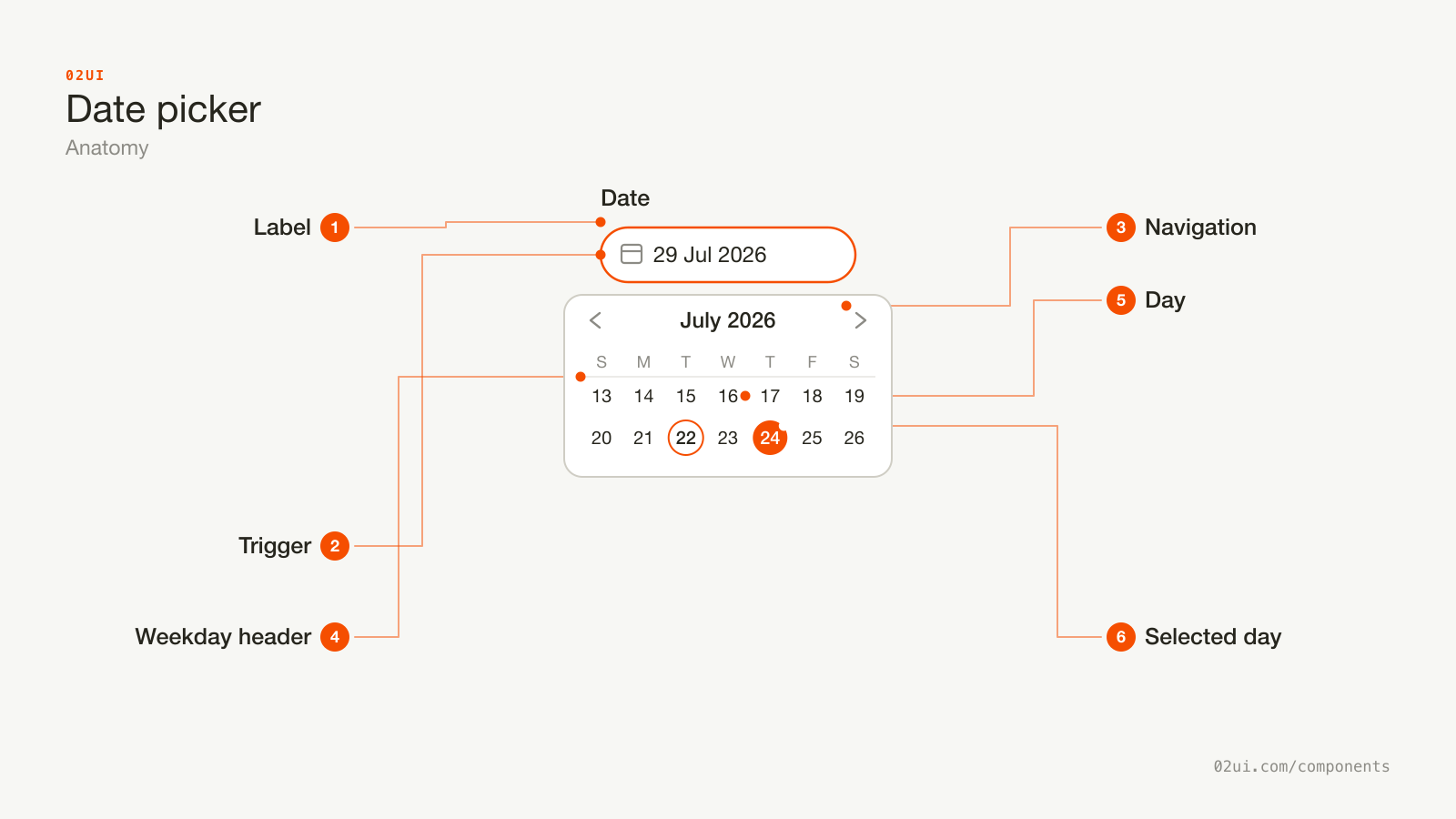
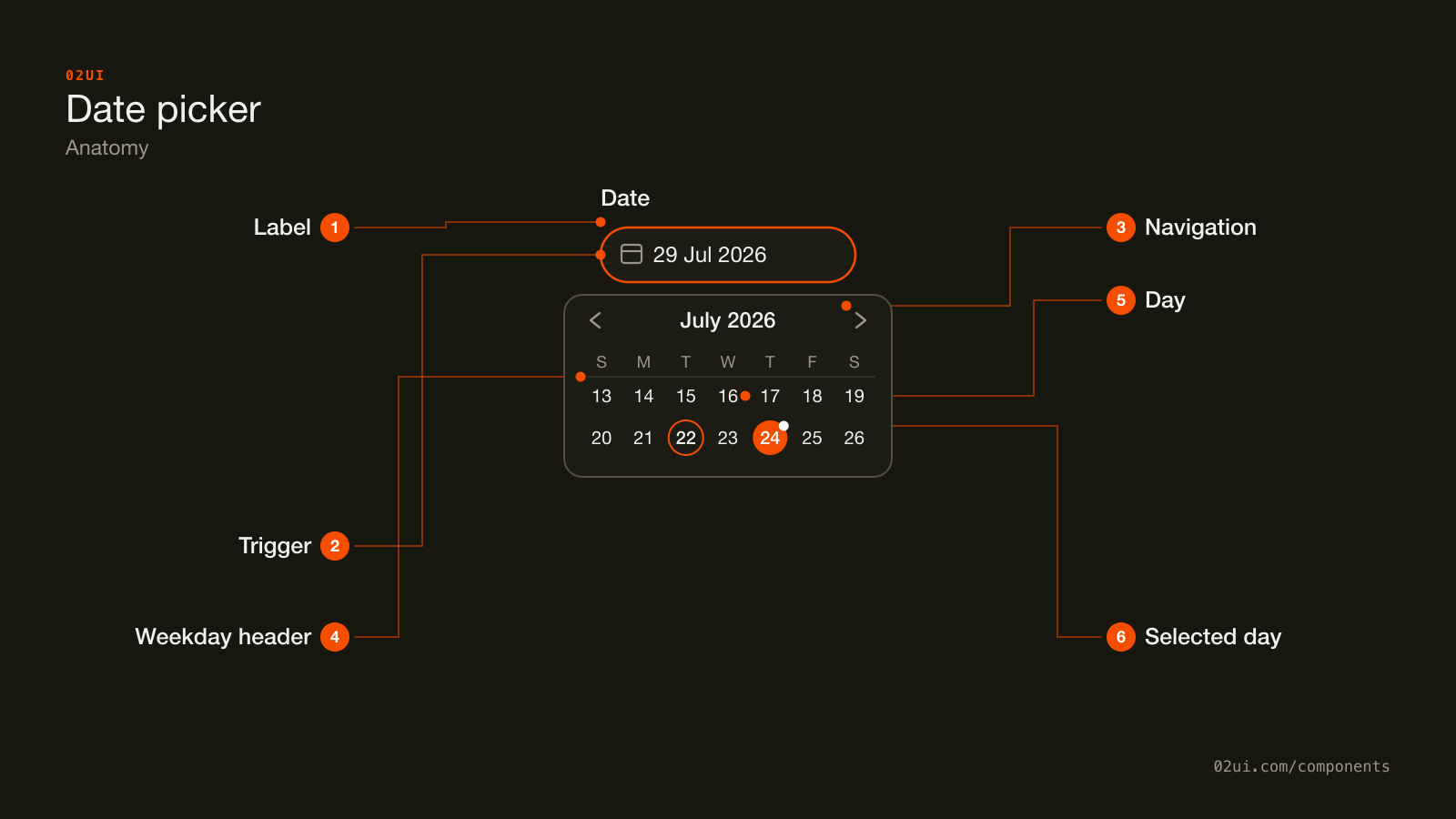
- 1Label. Above the trigger, connected with for and id, same as any other field.
- 2Trigger. Shows the chosen date written out in full, or a placeholder naming the action.
- 3Navigation. Moves the grid one month at a time. A slow way to travel a year needs a month or year dropdown too.
- 4Weekday header. Names each column once, locale-aware, so the grid underneath doesn't repeat it per cell.
- 5Day. One cell per date, at least 24 by 24 CSS pixels for WCAG 2.5.8 at Level AA.
- 6Selected day. A filled marker distinct from today's own outline, so the two never read as the same thing.
The trigger reads like a text field but opens a calendar instead of a keyboard-only cursor. Once it's open, the month heading and the navigation around it matter as much as the grid of days, since a picker that's slow to reach next month is a picker people abandon for typing.
Here it is working. Open it, move to another month, and pick a day.
Open it, move to another month with the arrows, and pick a day.
When to use a date picker
Use a date picker when
- The date is far enough out, or unfamiliar enough, that seeing it next to a day of the week actually helps someone place it
- A range is being chosen, like check-in and check-out, where seeing both ends on one calendar beats two separate fields
- Certain dates need to be visually ruled out, like fully booked days or a business's closed dates
Reach for something else when
- The date is close, well known, or something people already know by heart, like a birth date or an anniversary. Use a text field with a clear format hint instead.
- The real choice is a handful of named options, like Today, Tomorrow or Next week. Use a select of presets instead.
- The value needs a time as much as a date, and a calendar alone can't carry that. Use a text field paired with a time control instead.
Variants
Range picking both ends from one calendar, specific days ruled out and unclickable, and a calendar with no trigger at all.
Range. Two dates from one calendar, a start and an end, with the days between them shaded as soon as both are picked. Built for check-in and check-out, or any start-and-end pair.
With disabled dates. Specific days rendered unreachable, greyed out and unclickable, for anything already booked, closed, or otherwise not a valid choice.
Inline. The calendar sits directly on the page with no trigger or popover, for a booking flow where the date is the main thing being decided and deserves the space.
States
| State | What changes | Watch out for |
|---|---|---|
| Empty | Placeholder names the format or the action, nothing chosen | Distinct from a real date, same as any other field's placeholder |
| Filled | The chosen date shows in full, written-out form | Never a bare numeric format that could be read two ways |
| Focus | A visible ring appears on the trigger | Never removed without a visible replacement |
| Error | Red border, message below, aria-invalid="true" | State what's wrong, like a date outside the allowed range |
| Disabled | Reduced opacity, not focusable, not submitted | State the reason nearby |
| Open | The calendar appears, today and the selected day both marked distinctly | Today's marker and the selected marker need to read as two different things |
Today and selected get confused most often once a design leans on a single accent colour for both. Today needs a mark, usually an outline or a dot, and selected needs a fill. The same day being both at once should combine, not pick one.
How a date picker behaves
Opening the calendar doesn't commit anything. A date only counts as chosen once a day is clicked or confirmed, exactly like a select's listbox opening and closing without changing the value on its own.
The calendar opens on a relevant month, not always the current one. Editing an existing date should open to the month that date is already in, not force a scroll back from today.
Out-of-range days are visibly different from merely unavailable ones. A day before a minimum date or after a maximum one usually renders muted and unclickable, while a specifically blacked-out day, like a holiday, benefits from its own distinct treatment so the two reasons for being disabled don't blur together.
Selecting a date closes the picker, for a single-date field. A range picker stays open after the first click, since one date rarely means the choice is finished.
Date picker accessibility
Keyboard
| Key | What happens |
|---|---|
Arrow keys | Move focus one day at a time, in the visual direction of the arrow |
Page Up / Page Down | Move focus one month back or forward |
Home / End | Jump to the first or last day of the current week |
Enter or Space | Chooses the focused day |
Escape | Closes the calendar without changing the value |
The rest
- Follow the WAI-ARIA date picker pattern's grid. The calendar body is
role="grid", each week arow, and each day agridcell, so a screen reader can announce a date's position the same way it would a table cell. - Give every day an unambiguous accessible name. "Wednesday, July 29, 2026," not just "29," so nothing depends on already knowing which month is showing.
- Announce the month on navigation. Moving to the next or previous month should update a live region or the heading in a way assistive tech picks up, not just repaint the grid silently.
- Contrast. The trigger's border needs 3:1 against the page at rest (WCAG 1.4.11), same as any other input, and the selected day's fill needs 3:1 against the grid background too.
- Target size. 24 by 24 CSS pixels minimum at Level AA (WCAG 2.5.8) per day cell, which rules out a grid dense enough to fit an entire year on one small screen.
What a date picker should say
The trigger shows a full, unambiguous date once chosen. "29 Jul 2026," not "29/07/26."
Placeholder text names the format or the action. "Choose a date" or a visible format hint, never a bare "Select."
Disabled-date messaging explains why, when it matters. "Fully booked" on a hovered or focused blacked-out day tells someone more than a day that's simply unclickable with no explanation.
Range labels name both ends. "Check-in" and "Check-out," not a single ambiguous "Dates" label covering two different pieces of information.
Common date picker mistakes
A stay has two ends. One calendar shows the length of it at a glance, which two separate single-date fields can't.
A birth date is typed from memory, not browsed. Reaching this field means clicking back a previous-month arrow dozens of times before the right decade even shows up.
The one that shows up constantly on booking and appointment forms is reaching for a full calendar to enter a birth date, which turns a six-digit number someone has typed a thousand times into a decade of clicking "previous month."
1. A date picker for a well-known date. A birth date is the clearest case. Nobody needs a calendar to remember their own birthday, and clicking back through 30-plus years of months is slower than typing 6 digits.
2. A numeric-only display format. "03/04/26" is genuinely ambiguous between day-first and month-first conventions. A date picker exists partly to remove that ambiguity, and a numeric trigger label puts it right back.
3. No way to jump months quickly. Arrow-clicking one month at a time to reach a date a year out turns a calendar into the slowest possible way to pick a date. A year or month dropdown in the header fixes this for anything beyond a few months' range.
4. Today and selected sharing one visual treatment. If both use the exact same fill, there's no way to tell "this is today" from "this is what's chosen" at a glance.
5. Disabled days with no explanation. A greyed-out date with nothing to say why, fully booked versus outside a valid range versus simply in the past, leaves someone guessing.
6. No typed-entry fallback. Forcing every date through calendar taps, with no way to type a known date directly, punishes exactly the people who already know what they want.
How to build a date picker
<label for="checkin">Check-in date</label>
<input type="date" id="checkin" name="checkin" min="2026-07-29" required />
The native <input type="date"> gets the OS's own date picker on mobile, a numeric field with spinners on desktop, and full keyboard support with zero JavaScript. It falls short once a design needs a range, disabled dates styled beyond a simple min/max, or a look that matches a custom design system rather than the browser's own chrome. Past that point, build on the WAI-ARIA date picker pattern: a text input combined with role="grid" for the calendar body, disclosed through a popup the same way a combobox discloses its listbox.
Edge cases
A typed date outside the valid range. Validate on blur or submit, and say specifically what's wrong, like "Check-out must be after July 29," rather than a generic "Invalid date."
Leap years and month-length differences. Generated grids need to compute the real number of days per month rather than assuming 30 or 31, or February renders a phantom 30th and 31st.
Time zones. A date meant to represent a moment, like an appointment, needs an explicit zone attached. A date meant to represent a calendar day with no time component, like a deadline, should never shift because someone's browser clock is in a different zone than the server's.
Right to left. The calendar grid mirrors, including which side "next month" points toward.
A keyboard-only user with a long range to cover. Month and year dropdowns in the header, not just Page Up and Page Down, keep a multi-year range navigable without hundreds of key presses.
Date pickers in real products
Airbnb's search bar uses a range date picker spanning two full months at once, with the shaded span between check-in and check-out updating live as a second date is hovered, before it's even clicked.
Google Calendar's event editor defaults to a plain text-style date field for a nearby date and only opens a full calendar on request, matching exactly the trade this page argues for: typing first, calendar on demand.
Stripe's dashboard date range filter offers named presets, Today, Last 7 days, Last 30 days, alongside the calendar, so a common range never requires clicking through months at all.
Common questions
- Date picker or a plain text field?
- A well-labelled text field with a visible format, like a placeholder reading 'DD/MM/YYYY,' is faster for a date someone already knows, a birth date being the clearest case. A date picker earns its extra click when the calendar view itself carries information: how far away a date is, what day of the week it falls on, or which days are already unavailable.
- Should the field still accept a typed date?
- Where the format is unambiguous, yes. Typing is faster than tapping through months for anyone who knows the exact date, and the calendar stays there for anyone who doesn't. Validate the typed value against the same constraints, like a minimum or maximum date, that the calendar itself enforces.
- What format should the trigger display?
- Written out with the month as a word, like '29 Jul 2026' or 'Jul 29, 2026' depending on locale. Numeric-only formats like 03/04/26 are genuinely ambiguous between day-first and month-first conventions, and a date picker is exactly the component that should never repeat that ambiguity back at someone.
- How should a date range work?
- One calendar, two clicks: the first click sets the start, the second sets the end, with everything between visually shaded as the click lands. Two separate single-date pickers for check-in and check-out lose the at-a-glance sense of how long the range actually is.
- Does the picker need to know about time zones?
- If the date represents a moment in time, like an appointment, yes; store it with an explicit zone and display it in the viewer's own. If it represents a calendar date with no time component, like a birth date or a deadline that's the same day everywhere, treat it as a plain date and leave time zones out of it entirely.
Last reviewed 29 JUL 2026