
Banner
A banner is a message that stays on the page until the condition behind it changes, like an unverified email or a service outage. If it would disappear on its own, it isn't a banner.
<div role="status">Also called Alert, Callout, Notice, System banner.
Most interfaces have a message that refuses to leave. Not because anyone forgot to close it, but because the thing it's describing is still true. That's a banner, and the rule that defines it is simpler than the component looks: it stays exactly as long as the condition does.
Anatomy of a banner
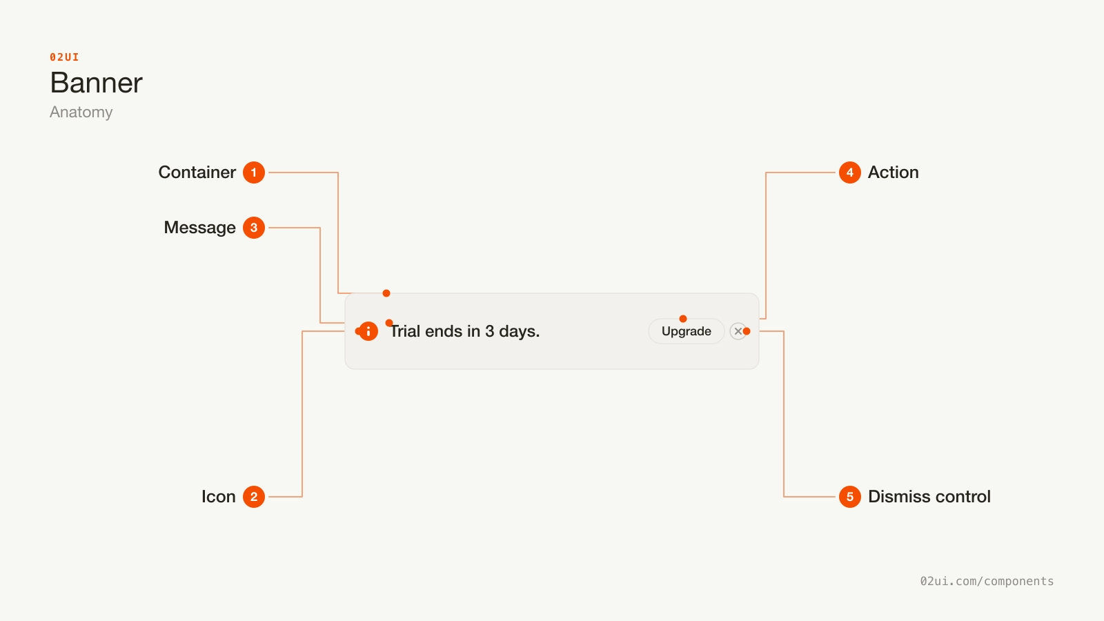
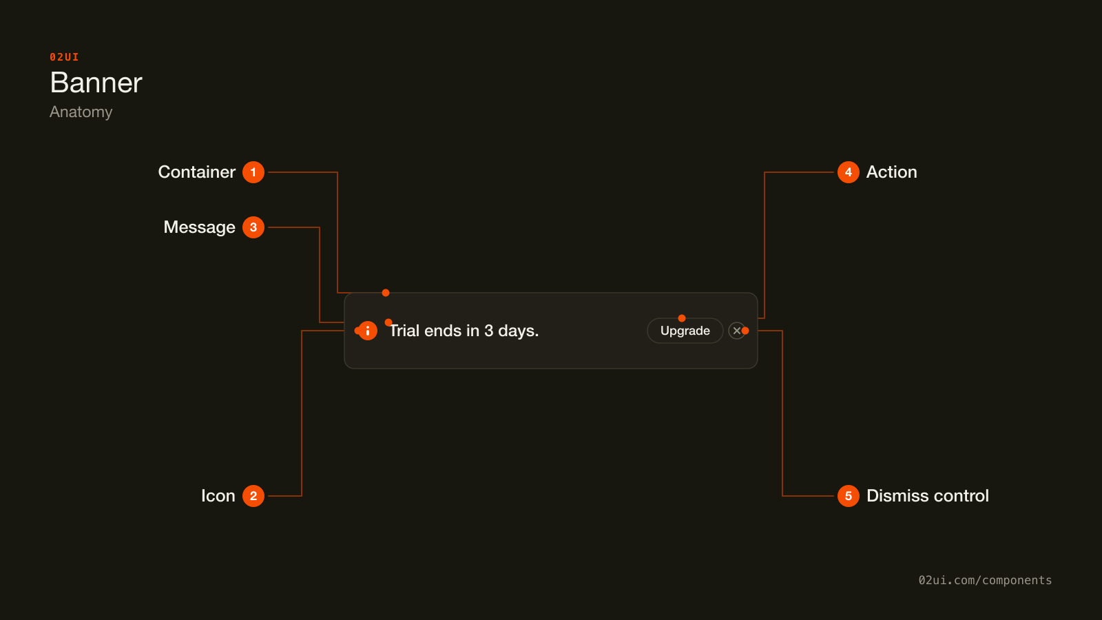
- 1Container. Its fill or border carries the severity before anyone reads a word.
- 2Icon. Repeats the severity for a reader who can't rely on colour alone (WCAG 1.4.1).
- 3Message. States what's true, in one sentence.
- 4Action. One button or link that resolves the condition directly. Never a second one.
- 5Dismiss control. Only present when the condition isn't urgent enough to need seeing on every visit.
The container's fill or border carries the severity before anyone reads a word. The icon repeats that severity for a reader who can't rely on colour, and the action is where the fix for the condition actually lives, not on some other page entirely.
Here it is working. The banner underneath describes a real condition, and it stays until that condition would actually change.
Your trial ends in 3 days.
Upgrade planA real condition, not a timer. Dismiss it and it stays gone, because dismissal here is tracked against the trial's own end date, not a session flag.
When to use a banner
Use a banner when
- The condition persists until something changes it: an unpaid invoice, an outage, an unverified email
- The message applies to the whole page or section, not one field
- It should still be there on a reload, not just for this one visit
- Dismissing it, where that's allowed, doesn't make the underlying problem go away
Reach for something else when
- It confirms something just happened and can fade on its own in a few seconds. Use a toast instead.
- The problem belongs to one specific field in a form. Use an inline field error instead.
- It's reporting a short status word, not a sentence. Use a badge instead.
- It needs to block the page until someone responds. Use a modal instead.
Variants
You're on the free plan.
Storage is almost full.
Your card ending 4242 was declined.
Your trial ends in 3 days.
Upgrade planNew: dark mode is now available in settings.
Severity first, then whether it needs an action, then whether it can be closed at all.
Informational. Neutral tone, ongoing context rather than a problem. "You're on the free plan."
Warning. A condition that turns into a real problem if it's ignored long enough. A trial ending, storage nearly full.
Critical. The highest severity. A failed payment, an outage, data that isn't saving. Usually not dismissible while the condition holds.
With an action. One button or link that resolves the condition directly, "Upgrade plan" rather than a link to a help article about plans.
Dismissible. A close control for a condition that's real but doesn't need to occupy the page on every single visit. What it remembers is the specific condition, not "banner dismissed."
States
Free plan
Storage full
Card declined
Trial ends soon
Fading out
| State | What changes | Watch out for |
|---|---|---|
| Informational | Neutral fill, no urgency implied | Still needs the same 4.5:1 text contrast as any other state (WCAG 1.4.3) |
| Warning | Amber fill or border, icon changes | Colour is reinforcement. The word "Warning" or its equivalent still has to be there (WCAG 1.4.1) |
| Critical | Red fill or border, usually no dismiss control | Removing the dismiss control needs a real reason, not just severity for its own sake |
| With action | A button or link sits inside the banner | One action only. A second one turns a notice into a decision |
| Dismissing | Fades or collapses over a couple hundred milliseconds | The layout under it shouldn't jump, so animate the height as well as the opacity |
| Dismissed | Hidden, condition recorded as acknowledged | Recorded per condition. A new, different condition should still show even if an old one was dismissed |
How a banner behaves
It stays until the condition changes, not until a timer runs out. This is the entire difference between a banner and a toast, so if yours disappears on its own after a few seconds, it was never a banner.
It sits in reading order, usually at the top of the page or the section it concerns, never floating over content the way a toast does.
One wins at a time, per surface. When two conditions are true at once, show the more severe one and count the rest, "+2 more issues", rather than stacking every qualifying banner at full height.
Dismissal is remembered by condition, not by session. Store the specific invoice ID or feature flag that triggered it. "Dismissed today" reappears tomorrow and trains people to stop reading it.
A live region only when it appears in response to something. A banner already sitting in the page on load reaches a screen reader user in normal reading order and needs nothing extra. One that appears after an action, like a failed save, needs role="status" or role="alert" so it's actually announced.
Banner accessibility
Keyboard
| Key | What happens |
|---|---|
Tab | Moves to the action button or the dismiss control, whichever is present. The banner's body itself is never a tab stop. |
Space or Enter | Activates whichever control currently has focus. |
The rest
- Live region severity.
role="status"(aria-live="polite") for most banners.role="alert"(aria-live="assertive") only for a condition serious enough to justify interrupting whatever the person is doing, like data actively failing to save. - Contrast. 4.5:1 for the message text against the banner's fill (WCAG 1.4.3), checked separately for every severity colour.
- Never colour alone. The icon and the words carry the severity. The fill colour reinforces it for a sighted reader and does nothing for anyone else (WCAG 1.4.1).
- Focus after dismissal. Moving focus to the next logical element when a banner closes, rather than letting it fall back to the body with no clear position.
- Target size. 24 by 24 CSS pixels for the dismiss control (WCAG 2.5.8).
What a banner should say
State what's true, then what to do about it. "Your card ending 4242 was declined. Update your payment method." beats "There was a payment issue."
One sentence, one action. If the explanation needs a paragraph, the banner should link to a page that can hold one, not try to become that page.
Name the actual object. The card, the invoice, the file. "Something went wrong" describes nothing anyone can act on.
Don't restate the icon. A warning triangle next to the words "Warning:" is the same information twice.
Common banner mistakes
Your card ending 4242 was declined. Update your payment method.
One banner, one condition, one action. The message names the actual card and says what to do about it.
Something went wrong.
You're on the free plan.
Two banners at once, and the one on top gives nobody anything they can act on.
The one that shows up constantly is a banner for a condition that resolved itself three page loads ago, because nothing ever told it to check again.
1. A banner that never rechecks its own condition. It renders once from stale data and outlives the problem it was describing.
2. Stacking three or four banners at once. The one that actually matters gets buried under ones that don't.
3. No dismiss control on a condition that isn't urgent. Being on a free plan is real, but forcing that banner to stay forever punishes someone for a choice they've already made.
4. A dismiss control on a condition that's actively breaking something. Letting someone hide an outage banner means they can forget the outage is still happening.
5. Vague copy with no next step. "Something went wrong" tells a reader there's a problem and nothing else useful.
6. A one-time confirmation living in a banner. "Changes saved" doesn't describe an ongoing condition. It belongs in a toast.
How to build a banner
<div class="banner banner--warning" role="status">
  <svg aria-hidden="true"><!-- warning icon --></svg>
  <p>Your trial ends in 3 days.</p>
  <a href="/billing">Upgrade plan</a>
  <button type="button" aria-label="Dismiss">×</button>
</div>
Swap role="status" for role="alert" only on the critical severity, and only when the banner appears in response to something rather than sitting in the page from load. A banner that's already part of the initial markup doesn't need a live region role at all, since assistive technology reaches it the same way it reaches any other content on the page.
Edge cases
Several conditions qualify at once. Show the highest severity and summarise the rest as a count, rather than stacking every banner that's technically true.
A condition resolves while the page is open, for something tracked in real time. Remove the banner with a short collapse animation rather than a layout jump.
Dismissal needs a stable key. Store the specific condition's ID, not a generic "banner seen" flag, or dismissing one invoice's banner silently dismisses the next one too.
Right to left. The icon and the dismiss control swap sides.
A banner sitting above a sticky header. Account for its height in whatever offset keeps the header pinned, or the banner ends up covered the moment someone scrolls.
Banners in real products
Stripe's dashboard shows a persistent, non-dismissible banner while an account is in restricted or test mode, which is the clearest real example of a banner tracking a condition rather than a timer.
GitHub marks an archived repository with a banner that never goes away, because the archived state doesn't change until someone actually unarchives it.
Linear shows a dismissible trial or plan-limit banner with a single upgrade action, and it reappears on the next visit where the same limit still applies, even after someone's dismissed it once.
Common questions
- Banner or toast?
- Ask whether the condition survives a reload. A banner describes something still true the next time the page loads, like an overdue invoice. A toast confirms something that already finished, like a saved file, and it can vanish in a few seconds because there's nothing left to track.
- Can a banner be dismissed?
- Depends what it's reporting. A condition that's real but not urgent, like being on a free plan, can be dismissed and should stay dismissed until something about it changes. A condition that's actively breaking something, like a failed payment or an outage, shouldn't be dismissible until it's resolved.
- How many banners can one page show at once?
- One is the working convention, two at most, stacked by severity. Past that, the one that actually matters gets lost in the pile and people learn to skip the whole area.
- Does a banner need an icon?
- Not strictly, but a severity icon next to the colour and the words speeds up recognition, and it's part of what keeps the colour from being the only signal (WCAG 1.4.1).
- Should a banner include more than one button?
- No. One action, matched to the one thing the message is asking for. A second button turns a notice into a decision nobody came to this page to make.
Last reviewed 29 JUL 2026