
Select
A select lets someone choose one option from a list that stays hidden until they open it. That hidden list is the whole trade: less space on the page, one extra step before any option is visible.
<select>Also called Dropdown, Picker, Combo box.
A select spends one click to save a lot of space. Everything else about the component follows from that trade: the list has to be short enough to scan once it opens, and the trigger has to say plainly what's inside before anyone opens it.
Anatomy of a select
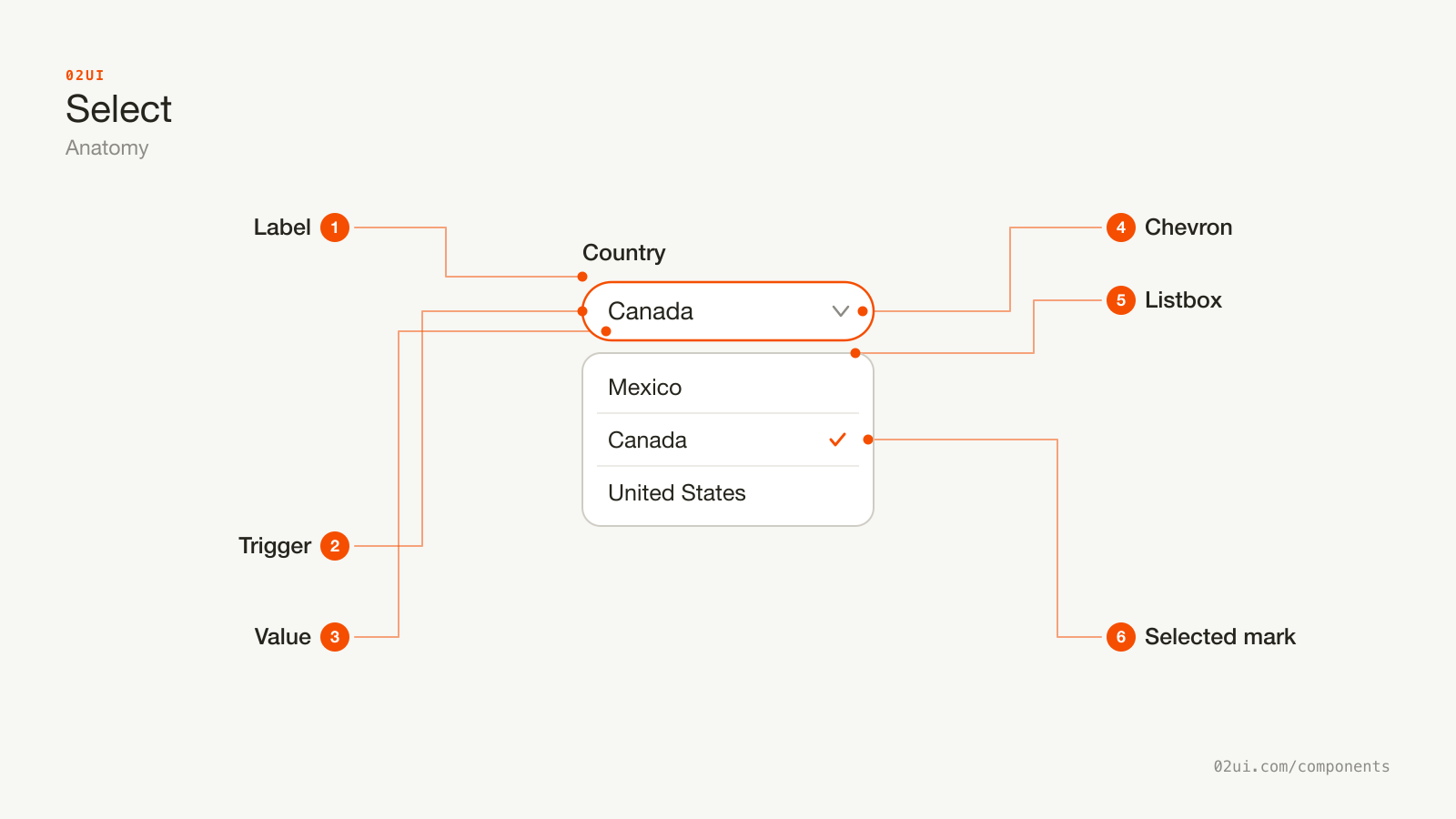
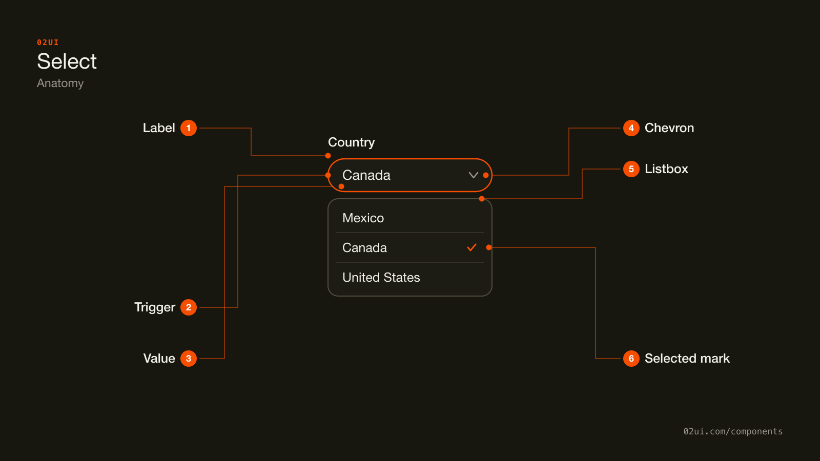
- 1Label. Above the trigger, connected with for and id, same as any other field.
- 2Trigger. A button showing the current value or a placeholder. Never blank with nothing said about what it opens.
- 3Value. The chosen option's text, or muted placeholder text naming what to choose.
- 4Chevron. The only visual sign that a click opens a list rather than performing an action straight away.
- 5Listbox. Appears on open, closes on a choice or on Escape, and scrolls internally once the list runs long.
- 6Selected mark. A check beside the current option inside the open list, so the choice already made is visible while picking a new one.
The trigger is a button wearing a different label. It shows the current value or a placeholder, never blank and unexplained, and the chevron is the only visual cue that clicking it reveals more rather than performing an action.
Here it is working. Open it and notice the currently selected option carries a check mark, the one detail a plain button never needs.
Open it. The currently selected option carries a check mark on the left, the one detail a plain button never needs.
When to use a select
Use a select when
- There's a small to medium, known list of options, roughly 5 to 15
- Exactly one option should be chosen
- The full list doesn't need to stay visible, and showing it would crowd the page
- Nobody needs to search or filter to find the right option
Reach for something else when
- There are 2 to 4 options and the screen has room to show them all. Use a radio group instead.
- The list is long enough that someone would want to type to filter it. Use a combobox instead.
- More than one option can be chosen at once. Use a group of checkboxes instead.
- The answer is a short line of free text you can't predict in advance. Use a text field instead.
Variants
Grouped by region, with a leading icon per option, and a compact trigger for a dense row.
Grouped options. A label above each cluster of related options, useful once the list crosses roughly 8 to 10 items and a structure already exists, like time zones grouped by region.
With icons. A small icon ahead of each option's text, for values people recognise visually faster than they read, like a payment method or a status.
Compact. A shorter trigger height for a dense toolbar or table row, where a full-size control on every row would crowd the layout.
States
| State | What changes | Watch out for |
|---|---|---|
| Placeholder | Muted text names what to choose, nothing is selected | Different from a real value. Style it distinctly, usually in text-muted-foreground |
| Filled | The chosen option's text replaces the placeholder | Contrast at least as strong as any other filled field |
| Open | The listbox appears, the current option carries a check mark | Only one select opens at a time. Opening a second should close the first |
| Focus | A visible ring appears on the trigger | Never remove it without a visible replacement |
| Error | Red border, message below, aria-invalid="true" | Same rule as any other field: say what's wrong and what to do |
| Disabled | Reduced opacity, not focusable, not submitted | State the reason nearby, the same as a disabled checkbox |
The placeholder and filled states get confused most often. A select styled so the placeholder looks like a real, if unremarkable, value hides the fact that nobody has chosen anything yet.
How a select behaves
Only one option is ever chosen. The moment two values need to be true at once, the control is a group of checkboxes wearing a select's trigger.
Opening one closes any other. Two open listboxes on the same screen compete for the same keyboard input and the same attention.
Selecting an option closes the panel. A select that stays open after a choice, waiting for a separate confirm step, is behaving like a form the person didn't ask to fill in.
Long lists scroll inside the panel, not the page. A fixed maximum height with scroll buttons at either end keeps the trigger's position on the page stable no matter how long the list underneath it runs.
Type-ahead jumps to a match. Typing the first letters of an option while the list is open (or while the trigger has focus and is closed) should jump straight to it. This is native behaviour in a <select> and worth rebuilding deliberately in anything custom.
Select accessibility
Keyboard
| Key | What happens |
|---|---|
Space or Enter | Opens the listbox when the trigger has focus |
Arrow down / Arrow up | Moves the highlighted option, opening the list if it's closed |
| Typing a letter | Jumps to the next option starting with that letter (type-ahead) |
Enter | Chooses the highlighted option and closes the list |
Escape | Closes the list without changing the value |
Tab | Closes the list and moves focus to the next control |
The rest
- Follow the ARIA listbox pattern, or start from a native
<select>and get it for free. A custom control needsrole="combobox"on the trigger androle="listbox"withrole="option"on each item, wired througharia-activedescendantor real DOM focus. - Label it the same way as any other field. An explicit
<label for>connection, never a placeholder acting as the only label. - Announce the selected value on open, not just its position in the list. "Canada, selected" tells someone more than "item 3 of 12".
- Contrast. The trigger's border needs 3:1 against the page at rest (WCAG 1.4.11), same as any other input.
- Target size. 24 by 24 CSS pixels minimum at Level AA (WCAG 2.5.8). A compact trigger still needs a comfortable hit area around its visible height.
What a select should say
Labels are nouns. "Country" beats "Please select your country".
Placeholder text names the choice, not the action. "Choose a country" beats "Select" or a bare dash.
Option text stays short and scannable. A sentence-length option defeats the entire point of a list meant to be read in a glance.
Sort with a reason. Alphabetical for an open set like countries, logical order for a closed one like shirt sizes. An arbitrary order forces a full read of the list every time.
Group labels are short nouns too. "Americas", not "Countries in the Americas region".
Common select mistakes
An empty placeholder that names the choice. Nobody has picked anything until they actually do.
Canada was first in the list, not a country anyone here chose. It looks exactly like a real answer.
The one that shows up constantly, and does the most damage, is a select that looks like it already has an answer the moment the page loads.
1. Pre-selecting the first option. Alphabetical or not, whatever sits first in the list ends up looking like a deliberate choice nobody actually made. Start on an empty placeholder unless a specific default is genuinely correct.
2. A long, flat, ungrouped list. Fifty country codes with no grouping and no way to search turns a two-second choice into a scroll-and-squint.
3. A select standing in for two options. "Yes" and "No" hidden behind a click a radio group or a switch would have shown for free.
4. A vague placeholder like "-- Select --". It names nothing. "Choose a shipping method" tells someone what they're about to pick.
5. A hand-rolled listbox built from styled divs. It loses type-ahead, arrow-key navigation and Escape all at once, all of which a native select or a proper ARIA listbox implementation gives for nothing.
6. No visible focus ring on the trigger. The single most common way a select becomes invisible to keyboard use.
How to build a select
<div class="field">
  <label for="country">Country</label>
  <select id="country" name="country" required>
    <option value="" disabled selected>Choose a country</option>
    <option value="ca">Canada</option>
    <option value="mx">Mexico</option>
    <option value="us">United States</option>
  </select>
</div>
The native element gets you the platform's own picker on mobile, full keyboard behaviour, and type-ahead, all with no JavaScript. Reach for a custom listbox, built on the WAI-ARIA Authoring Practices listbox pattern, only once you need something the native element can't render: icons ahead of each option, multi-line option text, or grouped headers with their own visual treatment.
Edge cases
An option's text longer than the trigger. Truncate with an ellipsis and keep the full text available on focus or through the open listbox, never only in a title attribute nobody discovers.
Right to left. The chevron and the listbox's alignment both mirror.
A very long list. Cap the panel's height and let it scroll internally, with the scroll-up and scroll-down affordances a native select gets automatically and a custom one has to rebuild.
Zoom to 200 percent. The trigger, its label and the open listbox all need to stay usable and inside the viewport (WCAG 1.4.4).
Mobile. A native <select> triggers the OS's own picker wheel or full-screen list, which most people find faster to use than a scaled-down desktop-style listbox. A heavily customised control loses this unless it explicitly falls back to something equivalent on touch devices.
Selects in real products
Stripe Checkout renders its country field as a native <select> on mobile so the OS supplies the picker, while desktop gets a custom-styled listbox with the same underlying options.
Linear uses compact selects for priority and status, each option paired with a small icon, which is the model for the "with icons" variant above.
Notion groups property-type options inside a database column's select by category, so a long list of field types stays scannable without needing a search box.
Common questions
- Select or radio group?
- Ask how much space you have and how many options exist. Fewer than about 5 options that fit visibly on the screen favour a radio group, because every choice is already there without an extra click. More options, or a layout a full list would crowd, favours a select.
- How many options is too many for a select?
- Past about 15 to 20, scanning one flat list gets slow enough that a search becomes worth the extra UI. That's the point where a combobox, which filters the list as someone types, is the better fit.
- Should a select start on a real value or an empty placeholder?
- An empty, disabled placeholder ('Choose a country') unless there's a genuinely sensible default, like the country implied by someone's browser locale. Pre-selecting the first item in the list, alphabetically or otherwise, looks like a choice nobody made.
- Does a select need a search box?
- No, and adding one is what turns it into a combobox. A select's whole value is a short list someone can scan in under a second. Once scanning stops being fast, switch components rather than bolting search onto this one.
- Native <select> or a custom built listbox?
- Start with the native element. It gets you the OS picker on mobile, full keyboard support and type-ahead for free, with no JavaScript. Reach for a custom listbox, built on the ARIA listbox pattern, only when you need something native selects can't render: icons, multi-line options, or grouped headers with their own styling.
Last reviewed 29 JUL 2026