
Tabs
Tabs show panels of related content one at a time, switched by clicking a label instead of loading a new page. That single page is the whole trade: nothing to bookmark, nothing to reload, unless you build the URL back in.
<div role="tablist">Also called Tab bar, Tab strip, Segmented control.
Tabs trade a set of separate pages for one page that changes what it shows. That trade only pays off when every panel is a peer of the others, equally worth reaching, because a tab strip presents all its options as if they cost the same click.
Anatomy of tabs
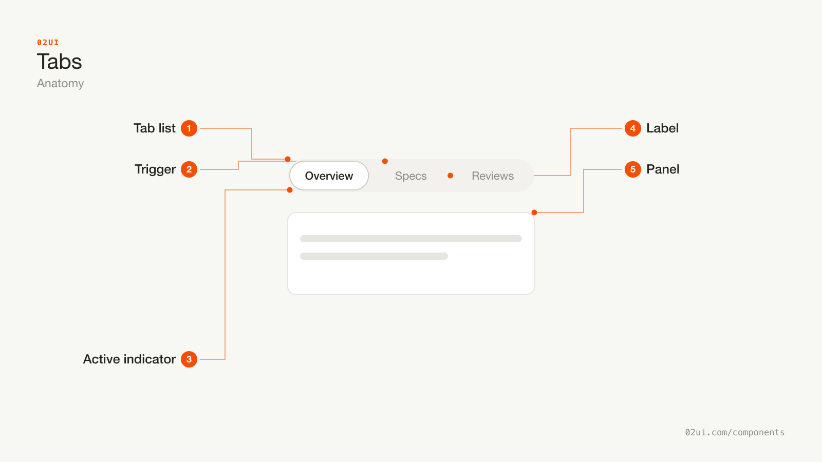
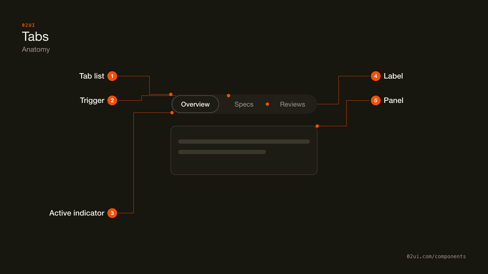
- 1Tab list. The row holding every trigger, marked role="tablist" with an accessible name of its own.
- 2Trigger. One clickable label per panel, marked role="tab" with aria-selected reflecting whether it's current.
- 3Active indicator. The underline or filled background marking the current trigger. Needs 3:1 contrast against the strip (WCAG 1.4.11).
- 4Label. Short, scannable text. Every label should read at roughly the same length as its neighbours.
- 5Panel. The content for the active tab, marked role="tabpanel" and labelled by the trigger that opens it.
The list of triggers sits above the content it controls, and only one trigger is ever marked active at a time. The active indicator has to be visible enough to answer "where am I" at a glance, because the panel underneath changes completely and gives no other clue.
Here it is working. Click through the labels and watch the indicator and the panel move together.
Click through the labels. The active indicator and the panel below move together.
When to use tabs
Use tabs when
- The panels are peers, like Overview, Specs and Reviews on one product
- Only one panel needs attention at a time
- There are roughly 2 to 7 panels, few enough to sit in one row without wrapping
- Switching panels should feel instant, with no page reload
Reach for something else when
- Someone should be able to bookmark or share a link straight to one panel, and the tabs don't sync their state to the URL. Use separate pages instead.
- People need to compare two panels at once, or scan several sections in sequence. Use an accordion instead.
- There's only one panel. A single tab is a label wearing a control's clothes. Use a plain heading instead.
Variants
Segmented for a small fixed set, underline for a strip above a large content area, counts where size is worth knowing in advance.
Segmented. Triggers sit inside a rounded, filled track, and the active one gets its own background. Reads as a single control, which suits a small, fixed set like a view switcher.
Underline. A thin line marks the active trigger against a plain background. Reads lighter and suits a strip that sits above a large content area, like a settings page.
With counts. A small number beside a label, for panels whose size is worth knowing before you open them, like "Comments (12)".
States
| State | What changes | Watch out for |
|---|---|---|
| Active | Indicator and stronger text mark the current tab | Contrast between active and inactive text, not colour alone |
| Inactive | Muted text, no indicator | Still fully clickable, never dimmed to the point of looking disabled |
| Focus | A visible ring appears on the focused trigger | Distinct from the active indicator, since a tab can be focused without being active while arrowing through the strip |
| Disabled | Reduced opacity, not reachable by keyboard | State why nearby, the same as any other disabled control |
Focus and active look similar enough to blur together if the ring is too subtle. Arrowing across a tab strip moves focus one trigger at a time without changing the active panel in some implementations, so the two states need to read as clearly different things.
How tabs behave
Only one panel renders at a time. The others unmount or stay hidden, which is what makes tabs fast to switch and unsuitable for content someone needs to compare side by side.
Selecting a tab is immediate. No confirm step, no separate button. Clicking or arrowing to a trigger and pressing Enter shows that panel right away.
The strip doesn't reorder itself. Tabs stay in the same position every time the page loads, even if usage data says one panel gets clicked more than the others. A jumping tab order breaks the spatial memory tabs are meant to build.
Content below the strip can change height. Unless every panel is padded to match the tallest one, switching tabs shifts whatever sits below them on the page. Reserve a minimum height if that shift is disruptive.
Tabs accessibility
Keyboard
| Key | What happens |
|---|---|
Tab | Moves focus into the strip, landing on the active trigger, then out to the first focusable element in the panel |
Arrow left / Arrow right | Moves focus between triggers in a horizontal strip (Arrow up / Arrow down for a vertical one) |
Home / End | Jumps focus to the first or last trigger |
Enter or Space | Activates the focused trigger, if it isn't already active on arrow |
The rest
- Follow the WAI-ARIA tabs pattern.
role="tablist"on the strip,role="tab"on each trigger witharia-selected, androle="tabpanel"on the content, connected with matchingaria-controlsandaria-labelledby. - Only the active tab sits in the normal tab order. The rest are reachable by arrow keys once focus enters the strip, following the same single-tab-stop pattern as a radio group.
- Give the tablist an accessible name with
aria-label, so a screen reader user knows what the group of tabs is for before hearing the individual labels. - Contrast. The active indicator needs 3:1 against the background it sits on (WCAG 1.4.11), the same bar as any other non-text UI indicator.
- Target size. 24 by 24 CSS pixels minimum at Level AA (WCAG 2.5.8), which usually means padding a short label rather than shrinking the strip to fit its text.
What tabs should say
Labels are short nouns. "Reviews", not "See what people are saying". A tab strip is meant to be read in one glance across its full width.
Keep every label roughly the same length. One long label beside four short ones breaks the strip's rhythm and makes the odd one out look separate from the group.
Order by what people need first. Overview before Specs before Reviews, not alphabetical. The default tab should be the one most visits actually want.
Common tabs mistakes
Three peer panels, none of them depends on the others being filled in first.
A checkout sequence, not a set of peers. Numbering the labels admits it. A stepper enforces the order this component only suggests.
The one that causes real support tickets is a required field sitting on a tab nobody opened, so the form fails to submit with no visible reason why.
1. A required field hidden on an unselected tab. The validation error has nothing to attach to on screen. Either validate before allowing a tab switch away from an incomplete panel, or route the person back to the tab that holds the problem.
2. Tabs used for a linear, step-by-step flow. Checkout steps aren't peers, they're a sequence, and a tab strip implies any of them can be opened in any order. That's a stepper's job, not this component's.
3. More tabs than fit in one row. A wrapped or horizontally scrolling strip past 7 or so items costs more attention than it saves. Group the overflow under a select or move it to a side navigation.
4. No URL sync for content worth sharing. A reader who copies the page's link and sends it lands back on the first tab, not the one they meant to show.
5. An active state that's only a colour change. Someone with low vision or colour blindness needs a second signal, like an underline or a filled background, not text colour alone.
6. Reordering tabs based on usage. Moving "Reviews" ahead of "Specs" because it gets clicked more breaks the spatial memory a returning visitor built on the last ten visits.
How to build tabs
<div role="tablist" aria-label="Product details">
  <button role="tab" id="tab-overview" aria-selected="true" aria-controls="panel-overview">
    Overview
  </button>
  <button role="tab" id="tab-specs" aria-selected="false" aria-controls="panel-specs" tabindex="-1">
    Specs
  </button>
  <button role="tab" id="tab-reviews" aria-selected="false" aria-controls="panel-reviews" tabindex="-1">
    Reviews
  </button>
</div>

<div role="tabpanel" id="panel-overview" aria-labelledby="tab-overview">
  <!-- Overview content -->
</div>
<div role="tabpanel" id="panel-specs" aria-labelledby="tab-specs" hidden>
  <!-- Specs content -->
</div>
<div role="tabpanel" id="panel-reviews" aria-labelledby="tab-reviews" hidden>
  <!-- Reviews content -->
</div>
Arrow keys move focus between triggers and update aria-selected and tabindex, so only the active trigger sits in the page's normal tab order. Panels toggle hidden to match, and each one is labelled by the trigger that opens it rather than repeating the label as a heading.
Edge cases
A panel with no content yet. Show a real empty state inside the panel rather than leaving it blank, so switching to it doesn't read like a bug.
Deep linking to one tab. Read the active tab from a query parameter or route segment on load, and write it back on every switch, so a shared link and the browser back button both land on the right panel.
A label too long for its space. Truncate with an ellipsis and keep the full label available on focus or hover, never shortened so far it stops being distinct from its neighbours.
Nested tabs. Two tab strips stacked, one controlling the other's panels, is rare and usually a sign the content needs a different structure, like a sidebar plus tabs, rather than tabs inside tabs.
Tabs in real products
Stripe's dashboard uses an underline tab strip across the top of a settings page, with the URL synced to each tab so a support link can point straight at "Webhooks" instead of "Settings".
GitHub's repository page uses tabs for Code, Issues, Pull requests and more, each one a real page with its own URL rather than a client-side panel swap, so every tab is bookmarkable and indexable on its own.
Linear's issue view uses a segmented control to switch between "Activity" and "History" on the same issue, a small, fixed set where the contained pill style reads as one control rather than a page section.
Common questions
- Tabs or an accordion?
- Tabs show one panel at a time and hide the rest completely, which suits content people pick between, like Overview versus Specs. An accordion keeps every section in the page flow and lets several open together, which suits content people scan in sequence, like an FAQ. On a narrow screen, three or four tabs also cost more taps to compare than the same sections stacked as an accordion.
- How many tabs is too many?
- Past about 7, a single row starts wrapping or scrolling, and both cost more attention than the tabs saved. A wrapped row breaks the one-line scan tabs exist for. Past that count, a select or a side navigation menu handles the same choice without fighting the layout.
- Should the URL change when someone switches tabs?
- For anything worth bookmarking, sharing or reaching with a browser back button, yes. Sync the active tab to a query parameter or route segment. For a short-lived UI state, like which chart series is showing inside a widget, it usually doesn't need to survive a reload and the URL can stay put.
- Can a tab hold a form field?
- Only if nothing outside that tab depends on it. A required field hidden behind an unselected tab can block a form submission with no visible error, because the invalid field is off-screen. If a field must be filled, either put it on the tab that's selected by default or validate per tab before allowing a submit.
- Do tabs work on mobile?
- A row of 2 to 4 short labels does. Past that, either scroll the tab strip horizontally with a clear affordance that more exist, or switch to a select or accordion, both of which handle narrow widths without truncating labels.
Last reviewed 29 JUL 2026