
Text field
A text field is a single-line input for short, free-form text. It is the densest component in UI, and the one where small decisions about labels, hints and validation timing decide whether people finish the form.
<input type="text">Also called Input, Text input, Text box, Form field.
Most form problems people blame on the user are text field problems. The label was ambiguous, the error arrived at the wrong moment, or the field silently rejected a format it could have accepted.
Anatomy of a text field
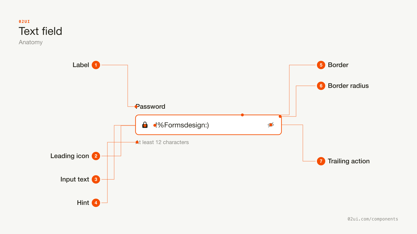
- 1Label. Always visible, always above the field. Connected with for and id, which also makes the label a second click target.
- 2Leading icon. Optional. Helps people find a field type at a glance. Decorative, so it stays out of the accessibility tree.
- 3Input text. What the person typed. 16px minimum, or Safari on iOS zooms the page in when the field is tapped.
- 4Hint. Guidance that stays visible while they type. Linked with
aria-describedby. This is where a format example belongs, rather than in the placeholder. - 5Border. Needs 3:1 contrast against the page background (WCAG 1.4.11), and a focus treatment you never remove without replacing.
- 6Border radius. One value, used by every input in the product. This is the detail people notice when it drifts.
- 7Trailing action. Reveal a password, clear the field, open a picker. It is a real button with its own accessible name, not decoration.
Here it is working. Click the label text and focus moves into the field, which is how you can tell the association is real.
Label above, hint below, both connected to the input. Click the label text and focus moves into the field, which is how you can tell the association is real.
Where the label goes
Above the field. Every time.
Labels beside the field cost horizontal space, break on narrow screens, and make the eye travel further between reading and typing. Labels that float into the border are a styling choice that removes the hint's home and hurts anyone using screen magnification, because the label scrolls out of view above the field they are filling in.
When to use a text field
Use a text field when
- The answer is short, free-form text you cannot predict: a name, an email, a reference number
- The answer is a single line and needs no formatting
- You want people to be able to paste, autofill or use a password manager
Reach for something else when
- The answer is one of a small, known set of options. Use a radio group or a select instead.
- The answer runs to several lines or a paragraph. Use a textarea instead.
- The answer is yes or no. Use a checkbox instead.
- The answer is one option from a long list you can search. Use a combobox instead.
Variants
Search, numeric and read-only. The numeric one uses inputMode rather than type=number, for the reasons below.
With an icon. Leading icons help people find a field type at a glance (search is the obvious one). Trailing icons are for actions, like clearing the field or revealing a password, and they need to be real buttons with accessible names.
Numeric. Use type="text" with inputmode="numeric" and pattern="[0-9]*" rather than type="number". Number inputs add spinner arrows nobody wants, silently reject pasted values with spaces, and let a scroll wheel change a card number by accident.
Read only. The value is shown, selectable and copyable, and cannot be edited. Different from disabled: read-only fields are still submitted with the form and still reachable by keyboard.
Password. Always pair with a reveal toggle. Hiding a password from someone typing it on their own laptop stopped being a security measure a long time ago, and it is the largest single cause of sign-in failure.
States
Hover, focus and error are all live. Tab through them to see focus behave the way a keyboard user experiences it.
| State | What changes | Watch out for |
|---|---|---|
| Default | 1px border, field background | Border contrast of at least 3:1 against the page (WCAG 1.4.11) |
| Hover | Border darkens | Subtle. It signals the target, nothing more. |
| Focus | Accent border plus a visible ring | Never remove the outline without replacing it with something visible |
| Filled | Value replaces placeholder | Value text must be higher contrast than placeholder text |
| Error | Red border, message below, aria-invalid="true" | Colour alone fails 1.4.1. The message and icon carry the meaning. |
| Disabled | Reduced opacity, no pointer | Not submitted, not focusable. Say why it is off somewhere visible. |
| Read only | Flat background, no border | Still focusable, still submitted |
How a text field behaves
Validation timing is the whole game. Get this wrong and a correct answer feels like a rejection.
The rule that holds up in practice:
- Say nothing while they type the first time
- Validate on blur, when they leave the field
- Once an error is showing, re-validate on every keystroke so it clears the instant they fix it
- Validate everything again on submit, and move focus to the first error
Validating as someone types their email means telling them murat@ is invalid while they are halfway through writing it. Correct, useless, and it makes the form feel hostile.
Never block characters silently. If a field rejects a keystroke with no explanation, people assume the keyboard is broken. Accept the input, then explain what needs to change.
Accept messy input. Strip spaces from card numbers, dashes from phone numbers, and case from postcodes. The person is trying to give you the right answer. Reformat it for them rather than making them do it.
Autofill. Set autocomplete on every field that maps to a known value (email, given-name, postal-code, cc-number, one-time-code). It fills faster, it reduces mistakes, and WCAG 1.3.5 asks for it at Level AA.
Trim on submit. A leading space from a paste should never be why someone cannot log in.
Text field accessibility
The label
Every field needs a programmatic label. Three ways, in order of preference:
<!-- 1. Best: explicit association, label is clickable -->
<label for="email">Work email</label>
<input id="email" type="email">

<!-- 2. Wrapping, when the markup suits it -->
<label>Work email <input type="email"></label>

<!-- 3. Last resort: no visible label -->
<input type="search" aria-label="Search orders">
A placeholder is not a label. It vanishes on the first keystroke, so anyone who is interrupted mid-form comes back to a screen of filled boxes with nothing saying what any of them are.
Hints and errors
Both connect through aria-describedby, and both ids can go in the same attribute.
<label for="pw">Password</label>
<input id="pw" type="password"
       aria-describedby="pw-hint pw-error"
       aria-invalid="true">
<p id="pw-hint">At least 12 characters</p>
<p id="pw-error" role="alert">Password must be at least 12 characters</p>
role="alert" makes the screen reader announce the error when it appears. Use it on the message that appears after an action, not on a hint that was always there.
Keyboard and input
| Key | What happens |
|---|---|
Tab | Focus in. The whole value is selected on some platforms, cursor at the end on others. Do not fight it. |
Esc | In a search field, clears the value. Elsewhere, leave it alone. |
Enter | Submits the form when the field sits inside one. Single-field forms depend on this. |
On phones
- 16px minimum font size. Safari on iOS zooms into any input under 16px, and the page never zooms back out. This is the single most common mobile form bug.
- Do not disable zoom.
user-scalable=nofixes the symptom and fails WCAG 1.4.4. - 44px minimum height. Comfortable to tap, and it matches Apple's guidance.
- Set
inputmode.numeric,tel,email,decimal,url. The right keyboard on the first tap saves more time than any other single change.
What a text field should say
Labels are nouns, not questions. "Work email" beats "What is your work email?"
Sentence case. "Card number" not "Card Number".
Say what you want, not what it is. "Name as it appears on your card" beats "Cardholder".
Errors need three things: what went wrong, why, and what to do. "Invalid input" has none of them. "Enter an email address in the format name@example.com" has all three.
Never blame. "You entered this wrong" and "Enter a date in the format DD/MM/YYYY" carry the same information. One of them makes someone feel stupid.
Mark whichever is rarer. If 10 of 12 fields are required, mark the 2 optional ones with "(optional)". If 2 of 12 are required, mark those. Marking everything is noise.
Common text field mistakes
The label survives typing. The format example is a hint, and it is still there when they need it.
The label and the format both disappear on the first keystroke, on the field people most often get wrong.
1. Placeholder as the label. Covered above, and still the most common mistake in the industry. Older guidance recommended always providing a placeholder. That advice has moved on, and the GOV.UK Design System now recommends against placeholder text altogether.
2. Validating too early. Red borders while someone is mid-word.
3. Removing the focus outline. outline: none with nothing in its place makes the form unusable by keyboard. If you dislike the default ring, design a better one.
4. type="number" for things that are not numbers. Card numbers, phone numbers, postcodes and PINs are strings that happen to contain digits. Number inputs mangle all four.
5. Fields sized to the wrong thing. A field for a 2-digit house number that runs the full width of the form tells people to write something longer. Size the field to the expected answer.
6. Losing input on error. Clearing a form because one field failed is the fastest way to lose someone.
7. Disabling paste. On password and card fields especially. It breaks password managers, and it has no security value.
How to build a text field
<div class="field">
  <label for="email">Work email</label>
  <input
    id="email"
    name="email"
    type="email"
    autocomplete="email"
    inputmode="email"
    aria-describedby="email-hint"
    aria-invalid="false"
  >
  <p id="email-hint">We use this for your receipt</p>
</div>
Start from the native input every time. It gives you selection, undo, spellcheck, autofill, password manager support, dictation, and platform text behaviours you would spend months rebuilding badly.
type="email" and type="tel" change the mobile keyboard. Browser-native email validation is loose (it accepts a@b), so validate on the server too.
For a contenteditable rich input, understand that you are giving up all of the above. Do it only when formatting is genuinely part of the answer.
Edge cases
Very long values. A 200-character email should scroll inside the field, not stretch the layout.
Right-to-left. The field, the label and the hint all mirror. Use logical properties (padding-inline-start) so it happens without a second stylesheet.
Zoom to 200 percent. The label, field and hint must all stay visible and inside the viewport (WCAG 1.4.4).
Autofilled values. Chrome applies its own background colour. Style :-webkit-autofill or accept it, but check that your text stays readable against it.
Slow validation. If a username check hits the server, show a pending state on the field. Silence reads as failure.
Password managers. Test with one. They inject values without firing the events your framework expects, and a field that looks empty to your code but full to the user is a support ticket waiting to happen.
Dictation. Punctuation arrives as words. Do not reject input containing "comma" or "full stop" without saying why.
Text fields in real products
GOV.UK sets the standard for this component, and their guidance to drop placeholder text entirely came from testing rather than taste. Their date input is three separate fields for day, month and year, which beats a date picker for something people already know by heart.
Stripe Checkout accepts card numbers with spaces, without spaces, and pasted from anywhere, then formats them as you type. The field does the work rather than the person.
Linear validates on blur and clears the error the moment the input becomes valid again. The error never outstays the problem.
Common questions
- Should a text field have a placeholder?
- Usually no. Placeholder text disappears the moment someone types, fails contrast checks at most default greys, and gets mistaken for a filled-in value. Put the guidance in a hint under the label instead. Placeholders earn their place only for format examples on genuinely ambiguous inputs.
- When should a field show its error?
- On blur for the first check, then on every keystroke once an error is already showing. Validating while someone is still typing their email tells them it is wrong before they have finished writing it.
- Why does the page zoom in when I tap a field on iPhone?
- Safari zooms whenever an input's font size is under 16px. Set the input font size to 16px or more. Do not disable zoom with a viewport meta tag, because that breaks pinch-to-zoom for everyone.
- Do I need a label if the design does not have room for one?
- Yes. Every field needs a programmatic label. If there is genuinely no room, use a visually hidden label or aria-label, and treat the missing space as a layout problem worth fixing.
Last reviewed 29 JUL 2026