
Badge and tag
A badge is a status the system sets, like Active or Draft. A tag is a label a person applied, like a filter or a skill. They look alike and solve different problems.
<span>Also called Chip, Pill, Label, Status indicator.
A badge and a tag are the same shape wearing two different jobs. Look at ten products and you'll find both drawn as a small rounded pill, sometimes by the exact same component, which is exactly how the confusion starts.
Anatomy of a badge and tag
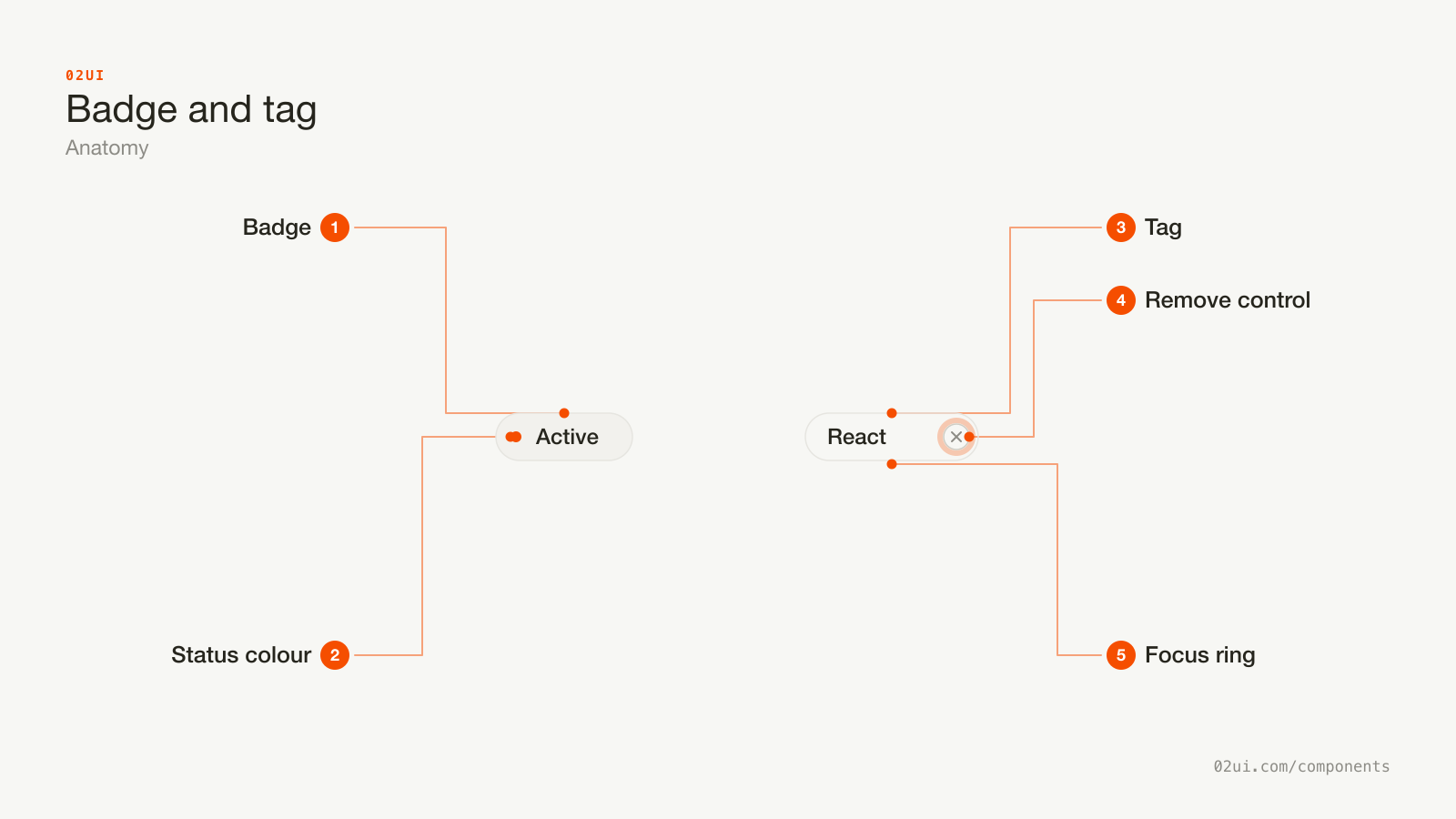
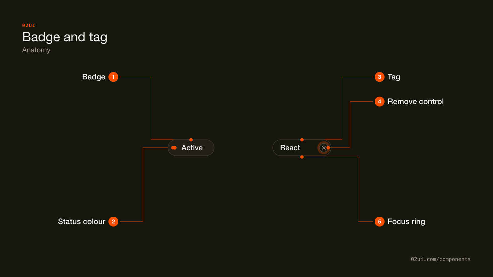
- 1Badge. A read-only pill. Never a tab stop, never a hover state.
- 2Status colour. Reinforces the word next to it. Colour alone fails WCAG 1.4.1, so the label carries the meaning on its own.
- 3Tag. An outlined pill for something a person attached, not something the system computed.
- 4Remove control. The only interactive part. Needs its own accessible name, like
aria-label="Remove Design tag". - 5Focus ring. Sits on the remove control alone, since that's the only part that ever takes focus.
A badge on the left, a tag on the right. Only one of them owns a remove control, because only one of them was ever meant to come back off.
Here they are working. Notice the badge never responds to your cursor, and the tag's remove button is the only part of it that does.
The order badge never responds to a click. Remove a filter tag and the rest hold their order.
When to use badge and tag
Use badge and tag when
- The system needs to report a state at a glance, like Active, Draft or Failed (a badge)
- A person applied a label they can see and remove, like a filter or a skill (a tag)
- The information is a word or two, never a sentence
- It needs to sit inline with other content without breaking the line height
Reach for something else when
- Clicking it should trigger an action, like running a filter or opening a page. Use a button instead.
- The message needs a full sentence of explanation. Use a banner instead.
- Someone is choosing from a longer list of options, not viewing ones already applied. Use a checkbox instead.
- It exists purely to navigate somewhere, with no state or label attached. Use a link instead.
Variants
Five variants, two components. The count badge is the only one that isn't pill-shaped, because a circle reads faster at a glance on a nav icon.
Neutral badge. A plain status word with no colour coding. Draft, Archived, anything without an urgency of its own.
Semantic badge. Colour paired with a word: success, warning, error, info. The colour reinforces the word. It never replaces it.
Count badge. A number, usually small and round rather than pill-shaped, sitting on an icon or a nav item. Past 99 it shows "99+" rather than breaking its own shape.
Tag. An outlined pill with a label and a remove control, for something a person chose to attach.
Icon tag. A tag with a small leading mark, a colour swatch or a file type glyph, before the label. The icon adds a cue, not the whole meaning.
States
| State | What changes | Watch out for |
|---|---|---|
| Badge, neutral | Flat fill, no colour meaning attached | Nothing to watch for. This is the default a status badge falls back to |
| Badge, semantic | Fill or text takes on a status colour | Colour reinforces the word next to it. It's never the only signal (WCAG 1.4.1) |
| Tag, default | Outline, label, remove control visible | The remove control needs its own accessible name, not just the label the tag already carries |
| Tag, focus | A ring appears around the remove control | Lives on the control itself, not the whole pill, since only the control is a tab stop |
| Tag, hover on remove | The remove control's background darkens | The tag body stays inert. Only the small control responds |
| Tag, disabled | Remove control is hidden or inert | Hiding it needs a reason nearby, same as any other disabled control |
How a badge and tag behave
A badge never responds to anything. No hover state, no focus ring, no cursor change. If it needs one of those, it has stopped being a badge.
A tag's remove control is the only interactive part. The label and the outline around it are static. Only the small control at the end takes focus and a click.
A badge updates on its own. The system changes the underlying state and the badge follows, with nobody touching it directly. A tag changes only when a person adds or removes it.
Removing a tag shouldn't reshuffle the rest. Take one out of a row and the remaining tags hold their order, the same rule a checkbox group follows for the same reason: people aim at a position as much as a word.
Badge and tag accessibility
Keyboard
| Key | What happens |
|---|---|
Tab | Moves to a tag's remove control. A badge is never in the tab order, because it isn't a control. |
Space or Enter | Activates the remove control and takes the tag off. |
The rest
- Contrast. Text against the badge's fill needs 4.5:1 for normal-size text (WCAG 1.4.3), same bar as any other label.
- Never colour alone. A red "Error" badge needs the word "Error" printed on it. Colour by itself fails WCAG 1.4.1, and a screenshot that loses colour or a colourblind reader loses the badge's entire meaning otherwise.
- Name the thing being removed. A remove control labelled only "×" announces as "button" with no context.
aria-label="Remove Design tag"tells a screen reader user which tag is about to disappear. - Target size. 24 by 24 CSS pixels for the remove control (WCAG 2.5.8), even though the tag around it can stay smaller.
What a badge and tag should say
One or two words. "Active", not "This item is currently active". The shape is built for a label, not a sentence.
One vocabulary per state, product-wide. If a status is "Active" on one screen, don't call the same thing "Live" on another. Consistency here is what makes a badge scannable rather than something to be read.
The tag repeats exactly what was applied. Whatever a person typed or picked, verbatim. If it needs shortening to fit, use an ellipsis with the full value available on hover or focus, never a silent cut.
Counts cap out before they get unreadable. "99+" rather than a four-digit number stretching a small round badge into an oval.
Common badge and tag mistakes
The badge sits flat with no hover state. The tag's only interactive part is its own small remove control, clearly separate from the label.
A badge dressed up to look pressable, with no action behind the press. A tag with an × baked into the label text instead of a control anyone can focus or activate.
The most common one is a status badge that also looks clickable, hover shadow and all, so people click it and nothing happens.
1. A badge styled like a button. Hover states, a pointer cursor, a shadow that lifts on press. All of it promises an action the badge never performs.
2. A tag nobody can remove, on a product that let them apply it in the first place. If adding it was one click, taking it off should be too.
3. Colour as the only signal. A green dot and a red dot mean nothing to a reader who can't tell them apart, and nothing at all once the screenshot loses its colour.
4. A remove control with no accessible name. Just an "×" character with nothing behind it for a screen reader to announce.
5. A full sentence squeezed into the pill. "Your payment could not be processed" belongs in a banner, not stretched across a badge.
6. The same word covering two different states. "Active" meaning both "turned on" and "currently viewing" in the same product asks people to guess which one they're looking at.
How to build a badge and tag
<span class="badge badge--success">
  <span aria-hidden="true">●</span> Active
</span>

<span class="tag">
  Design
  <button type="button" aria-label="Remove Design tag">×</button>
</span>
The badge is a plain span. It carries no interaction, so it needs none of a control's machinery, only enough markup for the colour dot to stay decorative and out of the accessibility tree. The tag's remove control is a real button nested inside the label, which is what gives it focus, Space, Enter and a place in the tab order for nothing extra.
Edge cases
A long row of tags wraps across lines. Keep the gap between them consistent, and consider a "+3 more" badge summarising the overflow rather than letting the row run unbounded.
A tag someone doesn't have permission to remove yet. Drop the remove control entirely rather than showing a disabled "×" that never explains why it doesn't work.
A badge inside a table cell. Align it to the text baseline next to it. Letting its height stretch the row taller than its neighbours is the usual mistake.
Right to left. The remove control moves to the tag's left edge.
Dark mode. A semantic colour that passes contrast on a white background can glow or wash out against a near-black surface. Check each one again in dark mode rather than assuming the light-mode value still holds.
Badges and tags in real products
GitHub pairs colour with a word on every pull request badge (green "Open", purple "Merged", grey "Closed"), and its per-repository topics are exactly this page's tag: applied by a person, removable by a maintainer, browsable by anyone who clicks one.
Gmail calls its coloured, removable per-email pills labels in the interface, which is the same object this page calls a tag, filterable and removable one at a time.
Linear keeps issue status ("Todo", "In Progress", "Done") strictly non-interactive, while the filter bar sitting right above the issue list uses removable tag chips for every active filter, a clean side-by-side example of the exact split this page describes.
Common questions
- Badge or tag?
- Ask who set the value. If the system computed it from data, like an order's status, it's a badge, and nobody removes it directly. If a person attached it, like a filter or a skill they picked, it's a tag, and it usually comes with a way to take it off.
- Can a badge be clickable?
- No. Clicking it means it's actually a button or a link wearing a badge's shape. Give that job to a button or a link, and borrow the badge's visual weight for it if you want to.
- Is a chip the same thing?
- Chip is the umbrella term some design systems use for both. This page splits it in two because the two follow different rules: one is read-only, the other is usually removable.
- How much text fits in one?
- One or two words. Past about 20 characters, the pill stops reading as a label and starts reading as a sentence squeezed into the wrong shape.
- Should a badge repeat something already visible on the screen?
- No. If the row's title already says "Draft", a Draft badge sitting beside it repeats what the words already said.
Last reviewed 29 JUL 2026