
Modal
A modal is a window that sits above the page and blocks everything behind it until the task inside is finished or cancelled. That blocking is the whole point, and it's also why a modal is the overlay most often reached for when a smaller one would do.
<dialog>Also called Dialog, Overlay, Popup, Lightbox.
A modal is the most disruptive thing an interface can do without navigating away, which makes it the right tool for fewer tasks than it gets used for. Reach for it when the interruption is the point, not because it was the first overlay that came to mind.
Anatomy of a modal
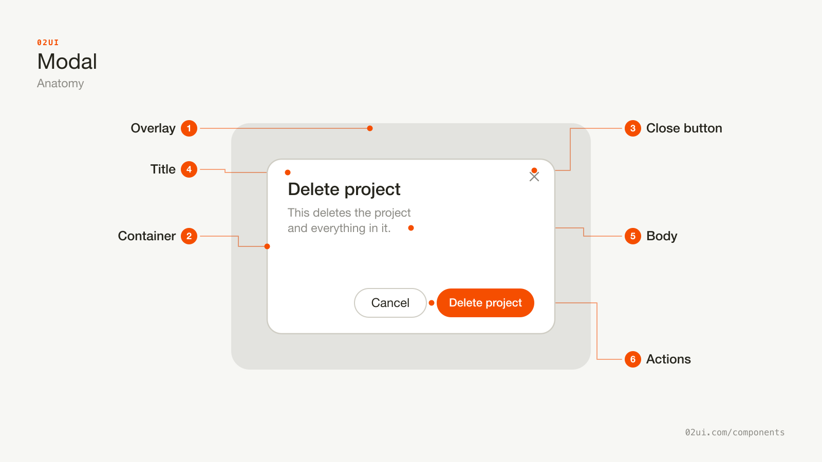
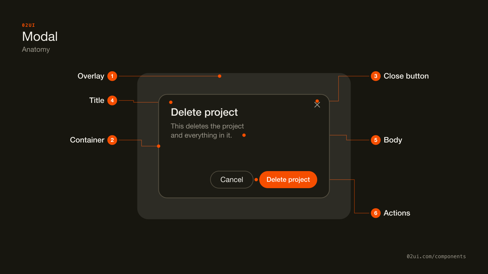
- 1Overlay. Dims the page behind the dialog and blocks clicks from reaching it. Removing it is what turns a modal into a plain floating panel.
- 2Container. Everything else lives inside this surface, and this is where focus is trapped for as long as the modal stays open.
- 3Close button. A visible exit in the corner, so closing never depends on someone knowing Escape works.
- 4Title. Names the task, tied to the container with
aria-labelledbyso a screen reader announces it the moment the dialog opens. - 5Body. The task itself: a message, a form, whatever the modal exists to hold.
- 6Actions. Cancel and a primary verb. The primary action names what it does rather than reading OK.
Five parts, and the overlay is doing more work than it looks like. It isn't decoration: it's what tells a screen reader and a sighted user, in the same instant, that everything behind it is off limits until this is dealt with.
Here it is working. Open it, try clicking outside, then press Tab a few times and notice focus never leaves the dialog.
Open it, try clicking outside, then press Tab a few times and notice focus never leaves the dialog.
When to use a modal
Use a modal when
- The task must be finished or cancelled before anything else on the page can happen, like confirming a destructive action
- Losing the page behind it costs nothing, because the task is short and self-contained
- The action is rare enough that a dedicated page would sit unused most of the time, like editing one field or confirming a sign-out
- The interruption is deliberate. An error that blocks progress, a payment step, a legal confirmation someone has to read
Reach for something else when
- The task can happen without blocking the rest of the screen, like a filter panel or a details view someone might want to compare against the list behind it. Use a drawer instead.
- It's a small piece of information anchored to one control, like a colour picker or a short form tied to a single field. Use a popover instead.
- It's confirming that something already happened, with nothing left to decide. Use a toast instead.
- The content deserves its own URL, its own back button, or a bookmark someone might return to. That's a page, not an overlay.
- You're opening a modal from inside another modal. Close the first one, or rethink why the task needs two layers.
Variants
Standard, alert dialog, and full screen. The alert dialog drops backdrop and Escape dismissal on purpose.
Standard. A title, a body, and one or two footer actions. Covers most use cases: editing a record, confirming a choice, showing a form that doesn't need its own page.
Alert dialog. No backdrop dismissal and often no Escape. Used for a destructive confirmation or a message someone has to actively acknowledge, where an accidental close would undo the point of asking.
Full screen. Fills the viewport instead of floating in the middle, for a task complex enough to need real space, like a multi-step form, without the weight of leaving to a new page.
States
This can't be undone.
This can't be undone.
No backdrop or Escape dismissal. The decision has to be made here.
| State | What changes | Watch out for |
|---|---|---|
| Closed | Nothing is rendered, or the dialog sits hidden | The trigger keeps a normal, interactive appearance |
| Opening | Overlay fades in, dialog scales or slides into place | Keep it under 200ms. A slow open reads as a slow product |
| Open | Focus lands inside, page behind is inert | The rest of the page must be unreachable by mouse, keyboard and screen reader alike, not just visually dimmed |
| Closing | Reverse of opening, then focus returns to the trigger | Losing track of where focus should go next is the most common bug here |
The open state hides a detail worth calling out on its own: "inert" means the background can't be tabbed into, can't be clicked, and isn't announced by a screen reader scanning the page, not just that it looks faded under an overlay.
How a modal behaves
Focus moves into the dialog on open, usually to the first focusable element or the heading, and never stays on whatever was behind it.
Focus is trapped inside while it's open. Tab and Shift+Tab cycle through the dialog's own controls only. The moment focus can land back on the page behind it, the modal has stopped actually blocking anything.
The page behind it is inert, not just dimmed. Use the native inert attribute (or aria-hidden="true" paired with removing every background element from the tab order) on everything outside the dialog.
Escape closes it, unless it's an alert dialog forcing a decision.
Focus returns to the element that opened it on close. Without this, a keyboard user closes a modal and lands back at the top of the document, having lost their place entirely.
Scrolling the page behind it is locked while the modal is open, so a long dialog doesn't leave the page scrolling underneath it in a way nobody can see.
Only one modal is open at a time. A modal opened from inside another modal means the task didn't fit in one dialog and needs restructuring, not a second layer.
Modal accessibility
Keyboard
| Key | What happens |
|---|---|
Tab / Shift+Tab | Cycles focus through the dialog's controls only, wrapping at both ends |
Escape | Closes the dialog and returns focus to the trigger, except in an alert dialog |
Enter | Activates the focused control, same as anywhere else |
The rest
- Role and modal state.
role="dialog"(orrole="alertdialog"for the alert variant) witharia-modal="true", or use the native<dialog>element'sshowModal(), which sets this up correctly on its own. - Name it.
aria-labelledbypointing at the title. Without it, a screen reader announces "dialog" with nothing else to go on. - Background inert. WAI-ARIA's modal dialog pattern requires everything outside the dialog to be unreachable, which is exactly what
inertgives you in one attribute. - Contrast. The dialog's border or shadow against the overlay needs to read as a distinct surface, and title text needs 4.5:1 against the dialog background (WCAG 1.4.3).
- Target size. Close buttons and footer actions need 24 by 24 CSS pixels at minimum (WCAG 2.5.8), comfortably clear of each other.
What a modal should say
Title names the task, not the component. "Delete project" beats "Confirm" or "Are you sure?", because it survives being read on its own by a screen reader, out of context.
One sentence of body copy for a confirmation. If it needs three, the modal is doing too much and some of it belongs on the page underneath.
Name what happens, plainly, for anything destructive. "This deletes the project and everything in it. This can't be undone" beats a generic warning icon and "Are you sure?"
Primary action is a verb, not "OK" or "Submit." "Delete project", "Save changes", "Send invite." A person scanning two buttons should be able to tell which one does what without reading the title again.
Cancel is always the way out. Losing the escape hatch because the primary action got renamed to something scarier defeats the point of asking first.
Common modal mistakes
The most common modal on the internet asks a question it already knows the answer to, with a title that could belong to any of a hundred other modals on a hundred other sites.
This deletes the project and everything in it. This can't be undone.
Names the action and its consequence, and the button repeats the verb rather than a generic OK.
This action cannot be undone.
Sure about what? Nothing here says what gets deleted or that it's the project, not one file inside it.
1. "Are you sure?" as the entire message. Sure about what? Name the action and its consequence in the body, not just the title.
2. No focus trap. Tab walks straight past the dialog and into the page behind it, which for a screen reader user means the modal is announced as open while everything else on the page is still reachable and confusing to land on.
3. Backdrop click discards unsaved work. A stray click outside a form modal shouldn't silently lose what someone typed. Either confirm first or disable backdrop dismissal for that case.
4. Nested modals. A modal opened from inside another modal is two layers of trapped focus and two overlays stacked on top of each other. It almost always means the task should have been one dialog, not two.
5. A modal for something that deserved a page. Long forms, multi-step flows, or anything worth a bookmark and a back button belong at their own URL, not floating over one.
6. Primary button disabled with no explanation. A grey "Save" button with nothing telling the user what's missing is a dead end. Keep it enabled and validate on submit, or say exactly what's required.
7. No visible way to close it. Relying on Escape alone leaves out anyone who doesn't know the shortcut. Always ship a close control someone can see and click.
How to build a modal
<dialog id="confirm-delete" aria-labelledby="confirm-title">
  <h2 id="confirm-title">Delete project</h2>
  <p>This deletes the project and everything in it. This can't be undone.</p>
  <button value="cancel">Cancel</button>
  <button value="delete">Delete project</button>
</dialog>
const dialog = document.getElementById("confirm-delete");
const trigger = document.getElementById("delete-button");

trigger.addEventListener("click", () => dialog.showModal());
dialog.addEventListener("close", () => trigger.focus());
The native <dialog> element with showModal() gives you focus trapping, Escape to close, a ::backdrop pseudo-element, and returning focus to the trigger, all without a line of extra JavaScript. Browser support has been solid across Chrome, Firefox and Safari since 2022.
Where it needs help: showModal() doesn't make the rest of the page inert on its own in every browser, so pair it with the inert attribute on a wrapping element around your app's main content, and clicking the ::backdrop doesn't close the dialog by default, so add a click handler on the dialog element that checks whether the click landed on the backdrop rather than the content inside it.
Building this from scratch without <dialog> means implementing all of the above by hand: focus trap, inert background, Escape handling, scroll lock, and returning focus on close. Reach for a tested implementation of the WAI-ARIA dialog pattern, like Radix's dialog primitive, before rebuilding it.
Edge cases
Small viewports. A dialog sized for desktop leaves almost no margin on a phone, and the keyboard covering half the screen makes a lower field unreachable. Expand to full screen below a breakpoint rather than shrinking the desktop layout down.
Content taller than the viewport. Scroll inside the dialog body, with the header and footer pinned, rather than letting the whole dialog run off the top and bottom of the screen.
A modal that opens another modal. Close the first one before opening the second, or combine them into one dialog with steps. Two stacked focus traps is not a supported pattern in any of the major implementations.
Reduced motion. Respect prefers-reduced-motion and drop the scale or slide-in animation to a plain fade, or nothing at all.
Async close. If closing triggers a save, disable the close controls until it resolves, rather than letting someone close the dialog mid-request and lose track of whether it worked.
Modals in real products
GitHub asks you to type the repository's name to confirm a delete, turning a single click into a deliberate act for the one action in the product that can't be undone.
Linear uses a modal for creating an issue from anywhere in the app, keeping the person on the page they were looking at while still giving the form enough room to be usable.
Stripe Checkout runs its entire payment flow inside a modal on many integrations, betting that keeping the merchant's page visible behind it builds more trust than navigating away to a separate domain.
Common questions
- Is a modal the same thing as a dialog?
- In practice, yes. "Dialog" is the more precise term, and it's what the native <dialog> element and the ARIA role are both named after. "Modal" describes the behaviour: it blocks the page behind it. A dialog can be non-modal (a floating panel someone can ignore), but almost everything called a modal in a product is a modal dialog, and the two words get used interchangeably.
- Should a modal close when someone clicks the backdrop?
- For anything read-only or low-stakes, yes, it's a fast and expected exit. For a form with unsaved input or a destructive confirmation, no. A stray click outside the modal shouldn't silently discard a half-filled form or dismiss a warning nobody read.
- What's the difference between a modal and an alert dialog?
- An alert dialog is a modal with the exits removed. No backdrop dismissal, sometimes no Escape either, and it exists to force a decision, usually a destructive confirmation. Reserve it for cases where an accidental dismissal would be worse than the interruption. Everything else is a regular modal.
- Can a modal be full screen on mobile?
- Often it should be. A 400px dialog centred on a 375px viewport leaves almost no margin and forces the keyboard to cover half of it the moment a field gets focus. Expanding to fill the screen on small viewports, the same pattern a drawer uses, usually reads better than shrinking a desktop layout down.
- Do I need to build focus trapping myself?
- The native <dialog> element's showModal() method handles it: focus moves in in, Tab cycles inside the dialog, and it returns to the trigger on close. A custom implementation, or a fallback for the small share of usage on older browsers, needs to do all of that by hand. See implementation below.
Last reviewed 29 JUL 2026